
Over the years, we’ve done many letterpress projects. This is THE project. One to combine our love of letterpress with our love of the Tour de France. For the five years, 2011 - 2015, we followed the Tour live on TV and then, the same day, went to the studio to produce a 14.5” x 22.5” broadside to represent that stage or rest day. A collective effort that totaled approximately 8,750 hours, resulting in 130 broadsides and a stack of clamshell boxes.
Below you can see all 135 broadsides, sorted by stage and rest day.
Day 1 - 2011 thru 2015 Tour de Lead Graffiti
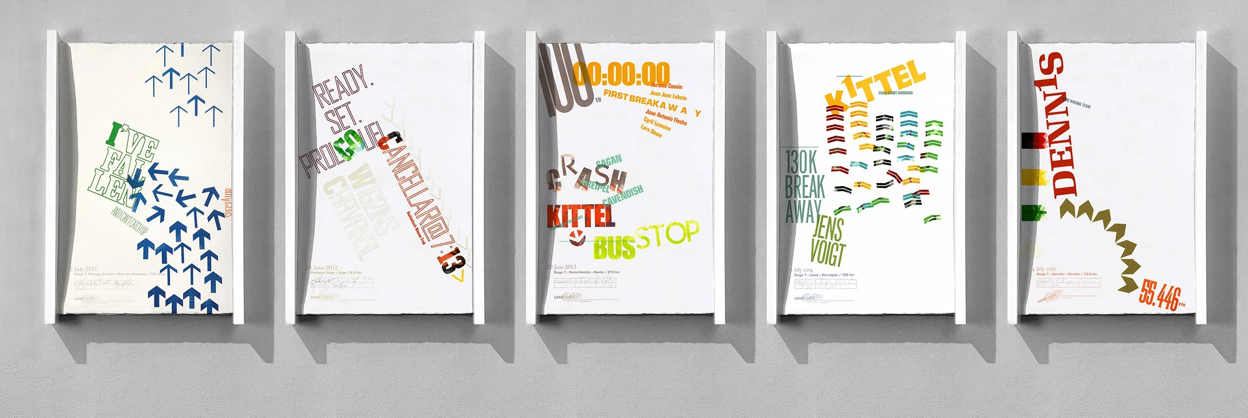
2011 (left) was the first poster, so it was special, but in the end it is one of the best at visually explaining something very hard to imagine. The spectator on the side of the road, his hand on his hip, rotated as the peloton went by. His rotation caused a rider to hit his elbow, triggering a pile-up of nearly 100 riders.
In the first year, we started to feel that 17-hour days would break us. We hung the previous day’s broadside, and strangely it felt like 4 “AND A HALF” days and not 5 days.
Seriously, it was a strange feeling.
The first one (2011) came from 10 crashes that never should have happened. Just out of nowhere, pedals and bikes collided, and riders went down. The 3rd one (2013) was killer important and had early VC grad Mark Deshon collaborating. One of our Instagram followers was married to a Sports Illustrated writer. He just happened to write about the Tour de France and college basketball. She told him about us.
It wasn’t a long article, but it appeared in the magazine’s 3,125,000 printed copies and its digital version.
Day 2 - 2011 thru 2015 Tour de Lead Graffiti
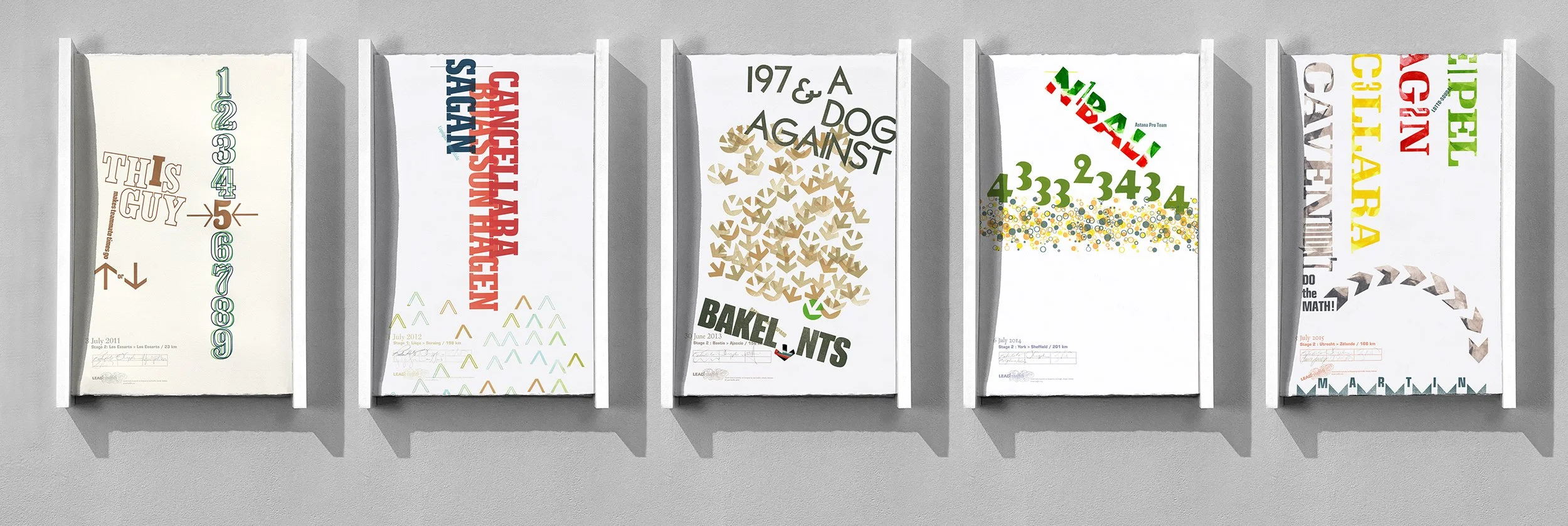
We probably should be calling these stages, but it will be hard to keep things straight, as they typically have a rest day on the second and third Mondays, but then move those to the next day if Bastille Day falls on it. And rest days aren’t stages.
So we’ll just keep calling them days.
Day 3 - 2011 thru 2015 Tour de Lead Graffiti
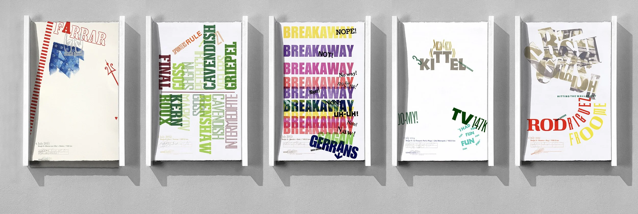
In the first year, we began to feel that 17-hour days would break us. We hung the previous day’s broadside, and it felt like 3 lllllooooonnnnnggggg days. The first one here was on July 4th and was a collaboration with a good friend and her daughter—definitely one of our favorites. Generally, we tried not to repeat layouts, and these five show that pretty well.
Day 4 - 2011 thru 2015 Tour de Lead Graffiti
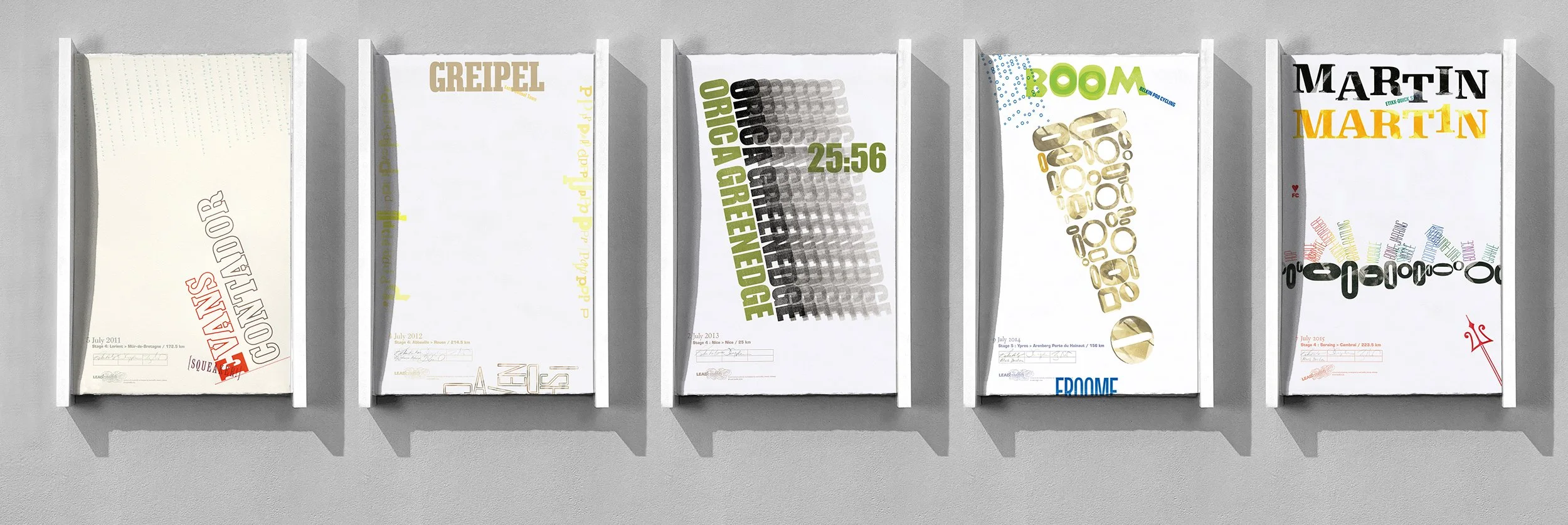
Yes, this starts to repeat, but it will change tomorrow.
In the first year, we began to feel that 17-hour days would break us. We hung the previous day’s broadside, and it felt like 4 lllllooooonnnnnggggg days. The middle one (2013) turned out to be an interesting printing test with a black run of the team’s name, followed by 7 ghost prints, each offset by 3 picas. We used this technique on our “Putin” broadside 13 years later. Go to our website and search for “putin” to see our No More War. No More Putin.” broadside with, as I remember, 18 ghost prints.
The 5th image (2015) has a nice double rainbow run (2 passes through the press) and uses various “o”s to represent cobblestones. This one would make it to our favorite dozen list.
I also think the horizontal bar of images is looking pretty cool. Imagine after 23. I’ll show them in a Keynote presentation on the 3rd of August using a “push” dissolve to make it look like one long photograph.
Day 6 - 2011 thru 2015 Tour de Lead Graffiti
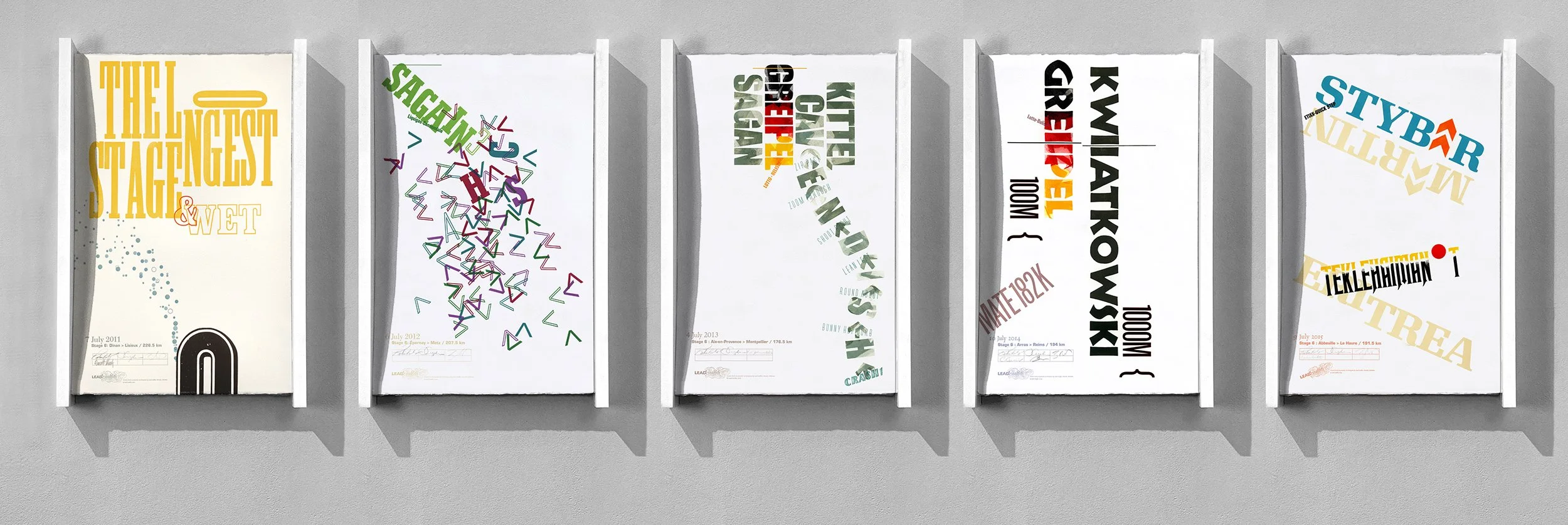
I think, for the first time in my life, I felt “in the zone,” which may be a bit of how those Tour de France riders do it day after day after day after day. It felt the same way until the day before the last day, and we literally started to fall apart. I think our brains caught up with our bodies.
Seriously, it was a strange feeling.
The first one (2011) does a rather amazing job of showing the rain spray that flies off 200 jammed-together bike riders. The second one is an interesting way to typographically show a multi-bike crash, which we needed to do on a couple of different posters. Really love the lock-up of the type in the 3rd one. The 5th one had a nice flap that we would flip back and forth to handroll the type while protecting another part of it.
Day 7 - 2011 thru 2015 Tour de Lead Graffiti
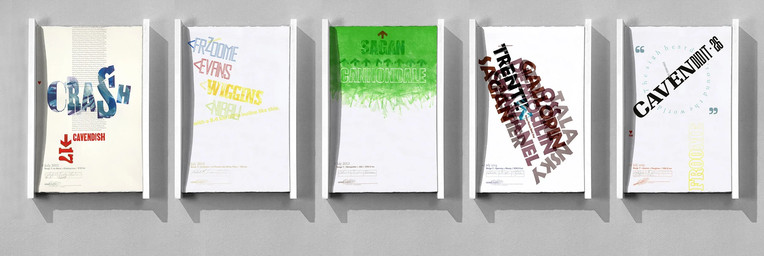
In the 2011 crash, it was an opportunity to use our large broken “S”, an early piece of wood type in our collection. Broken. Finding a reason to use it was always fun. Also, I believe this might have been the only broadside for which we used our Intertype.
The green Cannondale was just playfulness, illustrating the team’s complete domination of the stage. We debossed the team name and then handrolled the greet. It was strangely hard to get that green to be that green and that solid on the heavily textured Somerset stock, requiring several minutes of rolling per print.
Day 8 - 2011 thru 2015 Tour de Lead Graffiti
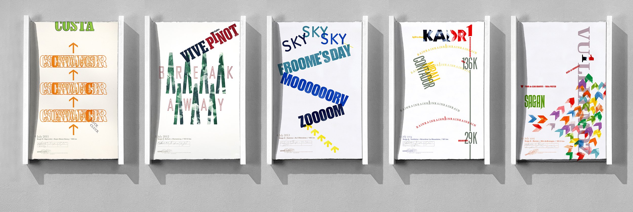
For every stage, there are dozens of pieces of information that MIGHT be significant and usable. Seven fairly serious mountain climbs, a major effort that worked from a breakaway. Sometimes you just need to count the letters.
And there are always a number of rain days over three weeks, which most spectators just ignore. Finding a way to say that the only significant element was rain, in a way different from any you’ve done before, is sometimes hard. But it is kind of easy to take a bit of extra time to create a nice umbrella curve and then print it four times in different colors to add some visual excitement; it ends up being quite nice and different.
Day 9 - 2011 thru 2015 Tour de Lead Graffiti
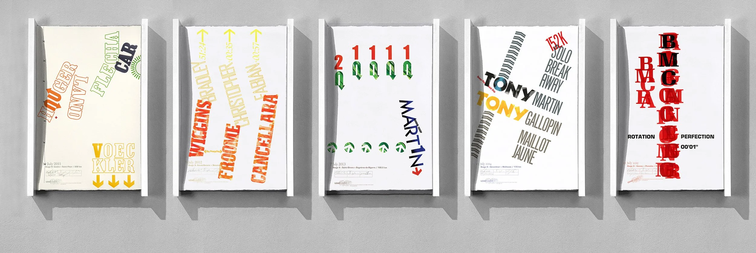
The first image (2011) was from a strange event. Four riders in a breakaway are riding essentially side by side. One of the cars tries to pass them on a somewhat narrow, flat road, but a tree near the side of the road causes him to veer into the road, bumping one of the riders and triggering a chain reaction. Johnny Hoogerland, the 4th in line, crashes with him going end-over-end and landing, probably 10 feet off the road, upside down, with his legs over a barbed-wire fence. Blood is everywhere.
Now back to letterpress.
There is an upcoming stage that goes up Alpe d’Huez, known for its 21 hairpin turns. We know it is coming, and we’ve made special pieces of wood type to represent hairpin curves specifically for that stage’s broadside. You have to wait about 2 weeks to see it, but it will come. Hoogerland has 2 “O”s, so the wood type is perfect. The two people who are collaborating with us, only one we know a little, are architects. As architects, they know how to represent barbed wire (dashed line with an X every so often), so that is included. Now, how strangely does that all fit together?
Now back to Hoogerland.
Hoogerland, who, unbelievably, gets bandaged up out on the side of the road (he is going to need 39 stitches to close the wounds), is about 40 minutes late to the finish line. Blood is draining out of his shoes. He is awarded “Most Combatative,” which requires him to walk up the stairs to the podium. ALL of the spectators who want to see the Yellow Jersey awarded are STILL at the podium. The pain on Hoogerland’s face trying to get up the stairs made me cry watching TV.
Hoogerland raced the next day, stitches and all, and he didn’t do well. But he raced, and he finished the stage. He also finished the tour that year. I have tears writing this.
The driver is banned from the Tour de France for life.
Day 10- 2011 thru 2015 Tour de Lead Graffiti
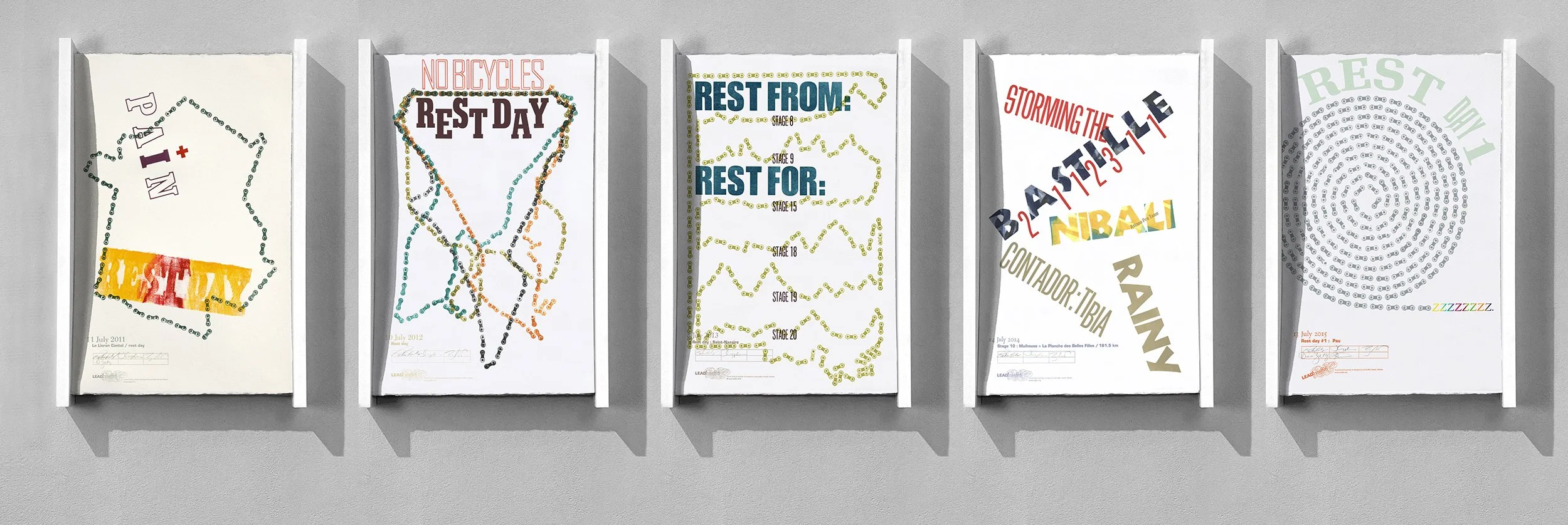
The day lines up four of the years as the first rest day, except for 2014, as they won’t schedule a rest day on Bastille Day, which is pretty cool.
The first year we created bloody gauze for Johnny Hoogerland’s crash the day before, while using a bike chain to outline France. We liked using the bike chain and kept using it on rest days.
One of our two favorites here is 2012, where we locked the chain down across the top and would then just flick it into four different positions, each in a different color. The second is the snail for 2015. It took EXACTLY four bike chains to make the complete snail. That looked a bit too easy, so we added the rainbow Zs at the end.
Day 11 - 2011 thru 2015 Tour de Lead Graffiti
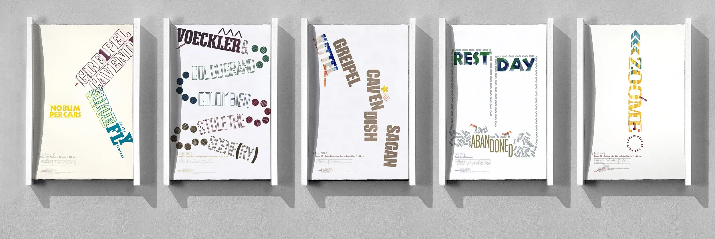
There are some amazing HC mountains (“Out of Category,” or better known as “Hors catégorie”) crossed during the Tour de France, which refers to the most difficult and punishing climbs in the race. Originally meaning "beyond classification," these mountains are extremely long and steep. We always highlight the athleticism that goes along with the climb and the just plain guts that come with descending a lot of them at 60+ mph.
Col du Grand Colombier (2012) is one of those amazing climbs in that from the bottom to the top is pretty much just a zigzag of hairpin turns that run “straight up a corner” of the mountain. Our typographic fun was locking the slight curves with the type to balance the oak dowel hairpins.
We also love the 2015 broadside for Chris Froome and a quote from sports broadcaster Bob Roll about Froome, who won the stage, riding “deep in the pain cave.” Typographically, it was fun to zoom his name a bit. We think the handrolling on his name is one of our favorites ever. Sometimes it just seems to clicks, and this is one of those times.