
A dozen Lead Graffiti DNA-defining projects :
Seeking unanticipated pathways
QUESTION WE ASKED: “PRINTING SLOWLY & PATIENTLY VIA LETTERPRESS,” what does Lead Graffiti do to take the road less traveled?
LEAD GRAFFITI SEEKS TO PROVOKE CREATIVITY by experimenting with letterpress printing techniques, observing the essential nature of projects, and tweaking the normal pathways while probing new ones, combining, and morphing. We learn new visual vocabulary from those we associate and collaborate with and endeavor to pass our craft on to others. The following examples witness Lead Graffiti’s commitment to printing slowly and patiently via letterpress while striving for creative experimentation, spontaneity, and collaborative experiences.
#1: BOOK: Electric Fire from the Clouds

QUESTION WE ASKED : Does making each book in an edition different from its sibling copies offer any creative advantages?
ELECTRIC FIRE FROM THE CLOUDS uses “ink pulls,” a by-product of our press clean-up process. The liquid effects are as beautiful as they are unusual, especially when executed on a substantial paper stock instead of inconsequential newsprint. And with the text reacting to the variations on each page, the book collector becomes an added collaborator as they choose from the actual ink pulls to be used in the final assembly of their particular volume.

The head of a critical special collections department said he had never seen anything like it and immediately bought one. Shop for yourself.
#2: BOOK: The Multifaceted Mr. Morris

QUESTION WE ASKED : How can we connect a reader to the ownership or humanity behind an object?
THE MULTIFACETED MR. MORRIS is a book made up of labels from an exhibition of Victorian books, photographs, drawings, and letters from the Mark Samuels Lasner Collection at the University of Delaware Library. Lead Graffiti wanted to humanize the selections with a sense of the “collector experience.” Highlighting each piece with a “visual nugget” accompanying the item’s description helps connect the reader with a “memory” from the work when they examine it firsthand.
The nugget idea feels worthy enough to consider seeking it at almost every turn on future book projects—Pan for your own set of nuggets.


QUESTION WE ASKED : How can we print more border material than anyone else and at the same time have a good deal of text that has been messed with?
Along with 35 other letterpress shops across the country associated with APA, we were provided with wood border material. The stipulations were that you had to use the border material and bounce off an alliteration (the occurrence of the same letter or sound at the beginning of adjacent or closely connected words).
The supplied wood border material was in 1, 2, 3, and 4-star groupings, along with inside & outside corners (which make an excellent comma and question mark). The main problem was that there were only a couple of singles. So, the print took 11 runs to complete, given our idea.
Can you read it? Limited to about 30 - 40 seconds only 25% have been getting it.

#3: BROADSIDES: Tour de Lead Graffiti, 2011 - 2015

QUESTION WE ASKED : What happens if we link our love for the endurance feat that is the Tour de France to our passion for spontaneous printing via letterpress?
FROM 2011 TO 2015, LEAD GRAFFITI AND A SMALL ARMY OF COLLABORATORS watched each stage of the Tour de France, translating the happenings and cycling personalities into a daily journal of 115 broadsides. After watching the scene live on TV, we adjourned to our letterpress lab to work entirely with handset wood & metal type and a variety of objects on hand, such as bicycle chains, rubber bands, gauze, checkers, and more. The 5 clamshell sets are a comprehensive treasure trove of typographic imagery, hand-setting, and inking techniques.
See all of the Tour broadside series jewels here : Shop 2011 | 2012 | 2013 | 2014 | 2015

#4: BROADSIDE: Alphabetachaos No.1

QUESTION WE ASKED : How can Lead Graffiti make a mundane type specimen sheet feel joyous?
ALPHABETACHAOS No.1 is a hand-rolled specimen sheet of an antique 40-line alphabet of gothic wood type. It’s printed slowly and patiently via letterpress in 3 runs, inking with two different colors for each impression. Maintaining a delicate balance between readability and abstraction has always been a compelling tightrope to walk that you can’t take your mind’s eye off. The visual energy and excitement generated in setting and inking the type are evident in the finished print.
Make yourself smile each time you gaze at it. Collect your reminder of how much you love type.

#5: CERTIFICATE: ADC Grandmasters

QUESTION WE ASKED : If Lead Graffiti is to impress the unimpressible, should we choose “smart” or “hard”?
THE ART DIRECTORS CLUB OF NEW YORK SELECTED RAY as one of their initial 5 Grandmasters educators. One of his students, Liz, designed the certificate. The studio of another graduate, Craig, took the photo. A London calligrapher friend, Satwinder, did the calligraphy. The ADC knew Ray was a letterpress printer, so they asked if he would be interested in printing it. If you understand the character of letterpress and what that image is for the certificate, you would typically avoid the letterpress process. But for the Art Directors Club of New York, Lead Graffiti printed a full-color photo as posterized line art (no halftone dots here) in 6 runs.
Turned out grand all the way around.

#6: CERTIFICATE: Waldorf School of Philadelphia

QUESTION WE ASKED : What happens when Lead Graffiti gets kids to be the architects of the milestones in their lives?
USING THE WORLD RENOWNED NOBEL PRIZE CERTIFICATES AS A POINT OF DEPARTURE, Lead Graffiti enables the eighth-grade students of the Waldorf School of Philadelphia to create a special collective memory, as well as one of our most personally satisfying and enjoyable annual letterpress projects.
By contributing to the certificate that celebrates the start of their high school years, each student forms an indelible reminder of the classmates they had as they step between these stages of their lives. The students eagerly join in hand setting their name, printing a portion of their certificates, submitting a piece of personal calligraphy, creating a unique collaborative drawing that accompanies each diploma, and producing hand-painted cover art for each folio. The smiles on the new faces each year bear witness to this Aha! moment experienced by the students and Lead Graffiti.
We’d love to be a fly on the wall in 40 years when the box holding this keepsake gets stumbled upon.

#7: EPHEMERA: Boxcards

QUESTION WE ASKED : How can Lead Graffiti get a lot of colorful fun on note cards without printing many colors?
INSPIRATION CAME FROM LOOKING AT THE BRIGHTLY HUED and usable packaging in our recycling bin. With today’s interest in repurposing items and using recycled paper, we have a win-win situation. What makes this Boxcard™ idea click is printing the “background” of the card’s text image in opaque silver ink, so what stands out is a rainbow of already-there, peek-a-boo color.
Fair warning, there’s some work trimming each package into a “note card blank” ready for printing. As much as possible, we also try to use an existing fold from the box, which saves scoring and folding efforts later. Some of the fun comes from enlisting friends to save their boxes for us (instead of the recycling center) and pondering some of their buying and eating habits. Shop.

#8: EPHEMERA: Sprout calendar

QUESTION WE ASKED : How would Lead Graffiti handle a job designed for another printing process when the client insists they want letterpress?
WE COULDN’T REFUSE. Red Tettemer, a killer creative advertising agency in Philadelphia, came to us to print and bind 500 copies of an 11” x 17” calendar for the Sprout TV Network and offered a bigger budget than our typical client. But we had to renegotiate specific printing parameters to ensure successful results for all of us. Reducing the number of colors from about 30 to 10 was a significant concession on their part.
Even so, we still had to reorder some colors part way through the job due to the inordinate, excessive amount of ink required to maintain the solid coverage of the more extensive backgrounds. Logistics were extra tricky—everything from the amount of floor space the paper took up to cycling through the sheets in a way that required the fewest press wash-ups to allowing for extra drying time. The client liked it so much that they ordered an additional 100 copies after the first 500 were delivered. We had learned a lot from the first order, so we geared back up, pressed on, and earned a bonus of an extra $2,000. Sprouts never tasted so sweet!

#9: EPHEMERA: Political postcards

QUESTION WE ASKED : How loud can Lead Graffiti print small?
LEAD GRAFFITI HAS FALLEN IN LOVE WITH POSTCARDS. After the 2016 election, we wanted to put our love of letterpress to work as part of the resistance. A Rachel Maddow interview with EZRA LEVIN, one of the founders of INDIVISIBLE, inspired us to print loud. We decided to mail a constructive (sometimes outraged) reminder in the form of a letterpress postcard to all 100 U.S. Senators—Democrats, Republicans, and Independents—about every 3 weeks for 15 months. We sent 21 postcards, all handset in metal type and printer ornaments, and printed slowly and patiently via letterpress for the senators’ collective enlightenment. A bunch of them heard us in 2018. We are currently in Phase 2 with an additional 24 postcards through the 2020 election going to the U.S. House and Senate. Shop and join in for Phase 2.

#10: EPHEMERA: APHA rainbow calendar page

QUESTION WE ASKED : How little work can Lead Graffiti to do but make it look like it was 10 times the work?
NOTHING EVER HAPPENS IN AUGUST. There are no holidays for inspiration, and it usually gets picked last. So let’s make it fun anyway. Start with a sheet that is 14” square. To make the rainbow run diagonally, cut one corner off at 30° and place that edge in the grippers (follow the colors diagonally, and you’ll see it). Turn your plate on a 60° angle to the rollers. Set your press to print a rainbow roll and ink it in 12 colors. Print your 1st run. Cut the adjacent corner off at 60° and place that edge in the grippers. Turn your plate on a 30° angle to the rollers and shift about 1/4” over and down. Print your 2nd run. Trim your paper to the finished 7” x 11” size.
Fun and done. It is seriously colorful, with two runs that look like 15 and strangely diagonal.
We like calendars. Here is one Jill did to avoid the above mechanical look completely.


#11: WORKSHOP: Meander book
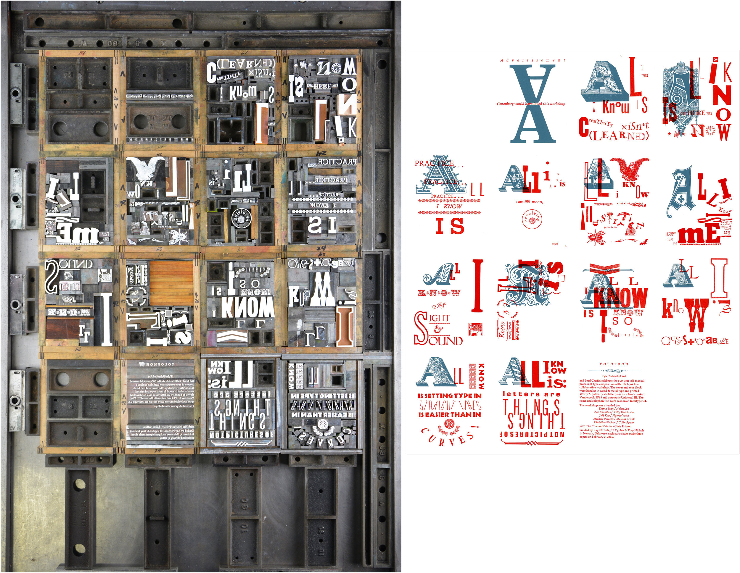
QUESTION WE ASKED : How much letterpress experience can Lead Graffiti cram into 14 people in one day?
WE WOULD ARGUE THAT THIS IS THE BEST CREATIVE LETTERPRESS WORKSHOP IN EXISTENCE. It includes a little history, some creative thinking & writing, old-school style typesetting by hand, printing with and without electricity, casting a little hot metal, and walking out with a book by the end of the day. Whether you’re a student or a professional, there’s a lot of hands-on doing that reroutes the way you think and refuels your creative engine. You get a portfolio piece in one day and a few new innovative tools to tweak your horizons. And Lead Graffiti gets to spread the word about how much fun letterpress is.
Seriously killer one-day letterpress portfolio piece with a no-sew, no-glue bookmaking workshop thrown in for free. Workshop description.
We are now offering the workshop ONLINE, with Baylor University being the first in September 2021.

#12: WORKSHOP: H.N. Werkman druksels

QUESTION WE ASKED : What happens when someone forgets that type is for words and starts to think of letters as shapes?
CAN YOU DO THAT? IS IT LEGAL? All you need is your two hands and the courage to think in pictures instead of words. Be brave with color. Dare to print from the hip and on the fly with reckless abandon. Don’t worry about where you’re going because it’s serious fun. It’s a mystery, but thanks to the upside-down process of little-known Dutch printer H.N. Werkman, this works for kids AND professionals.
Yeah, how do you do that? Put your apron on and start inking here. Workshop description.