We’ve been doing INK PULLS for a while without taking the time to explain how and why we make them.
It is often nice to print on paper stock that is not just a solid color, white or otherwise. This can add an amount of complexity to an image, emphasize the presence of a foreground/background dimension, impact readability (which we love to do), and, when you are selling them, offer the buyer more options or variations in making their decision.
Below is a carousel of images from early November 2024, when we printed a series of about 40 broadsides using our recently designed “Shahn Torn” typeface. Using our laser cutter, we’ve cut the Edgar Allan Poe quote out of a sheet of clear acrylic for the piece. We removed the typographic elements; the background was inked and printed on ink pulls. So, essentially, there is some difference in how we inked the acrylic, but honestly, we tend to do it the same way, and the ink pulls make up the background.
Remember that the part we are talking about here is the “background” of the print. The text and the black around the text are essentially the same, except that it is hand-rolled. which results in some variation.


Typically, when printing from a letterpress cylinder press like a Vandercook, the first step in cleaning the rollers between runs is to remove as much of the ink left over as quickly as possible. Once you’ve gotten rid of 80% of it, you can get around to “really cleaning” the rollers. On Vanderrcooks, there is a doctor blade you can engage, which will scrape much of the ink off, but doing so ruined the ink drum on our Vandercook SP15, and it cost us $150 (and that was 15 years ago) to get the gouges milled out of the surface. So, we don’t like engaging that doctor blade.
To start the cleaning process, we would often squirt some solvent on the rollers and then run some scrap paper “through the rollers” to quickly remove the bulk of the ink.
The image below shows a 2024 holiday card we printed as a 2-color rainbow roll and the first ink pulled through the press after we added solvent to the rollers. In this instance, you can see the purple on the left of the press and the yellow on the right for simultaneously printing the rainbow roll.

As we were doing ink pulls after almost every color we printed, we discovered that we could often get a more interesting “transfer” of ink depending on “how” we squirted the solvent, how much we squirted, squirting directly on top of the roller and letting it “stream” over the rollers (gives you those fingers), squirting a pool of solvent directly on the paper next to the rollers, sometimes the speed we pulled the paper through changed things along with stopping and starting the pull-through.
On the first pull, you’ll have a relatively heavy amount of ink on BOTH sides of the sheet. If you want to use the sheet as a background for a print, you’ll have to decide which side to use and essentially give up the other side. So we started sandwiching two sheets together, running them through, and that kept the backside FAIRLY clean while providing us with two sheets each time. And as it turned out, those two sheets would almost always look different. The ink pull is the “top” sheet in the image above. The bottom sheet typically has a more linear feel as it doesn’t get the solvent directly squirted. We would generally run four to five per thorough cleaning. You have 8-10 sheets total. Typically, we would get 4 to 6, which we were interested in keeping.
You also have to keep in mind that if you want a background for future broadsides generally you need to run thicker paper through. That doest start to add up in paper costs over time.
Here are two books produced by Lead Graffiti that have been made with sheets of ink pulls.

Early on, we purchased an eBay auction of 48-point Onyx. When we received it, the package had come apart inside, and metal type was everywhere. Ray carefully pulled it out, placing it into a large galley. Afterward, he printed it as a broadside entitled “How Type Writes Poetry.” Continuing with the idea that letterpress stuff has its own kind of poetry, we used ink pulls to illustrate “How Ink Writes Poetry.”
For “Fire from the Clouds,” we were trying to illustrate the stormy weather from Ben Franklin's story of flying the kit in a rain storm. We would use fairly uncontrollable ink pulls, using white ink on the press and black paper.

Go back up and look at the top image of the Henri Matisse quote. On one of their First Friday openings, we did a letterpress demonstration at The Contemporary Museum in Wilmington, Delaware. We had three lockups of quotes by artists the museum-goer could pick from, and a pre-trimmed stack of a couple of hundred ink pulls they could choose as the background for their print. We were printing black ink to automatically get some contrast to the ink pull using a Nolan table-top proofing press to do a print every 45-90 seconds or so when we were swamped. Getting everyone in line who wanted to print Matisse significantly sped things up.
Most of the ink pulls you see from our run up and down, typically because of the scale of the “overprint,” In the instance of the Matisse quote, we were cutting two pulls out of each sheet to keep from eating up our inventory. So you’ll notice on that one that the ink seems to be running left to right,
. . .
A blog update / September 15, 2026
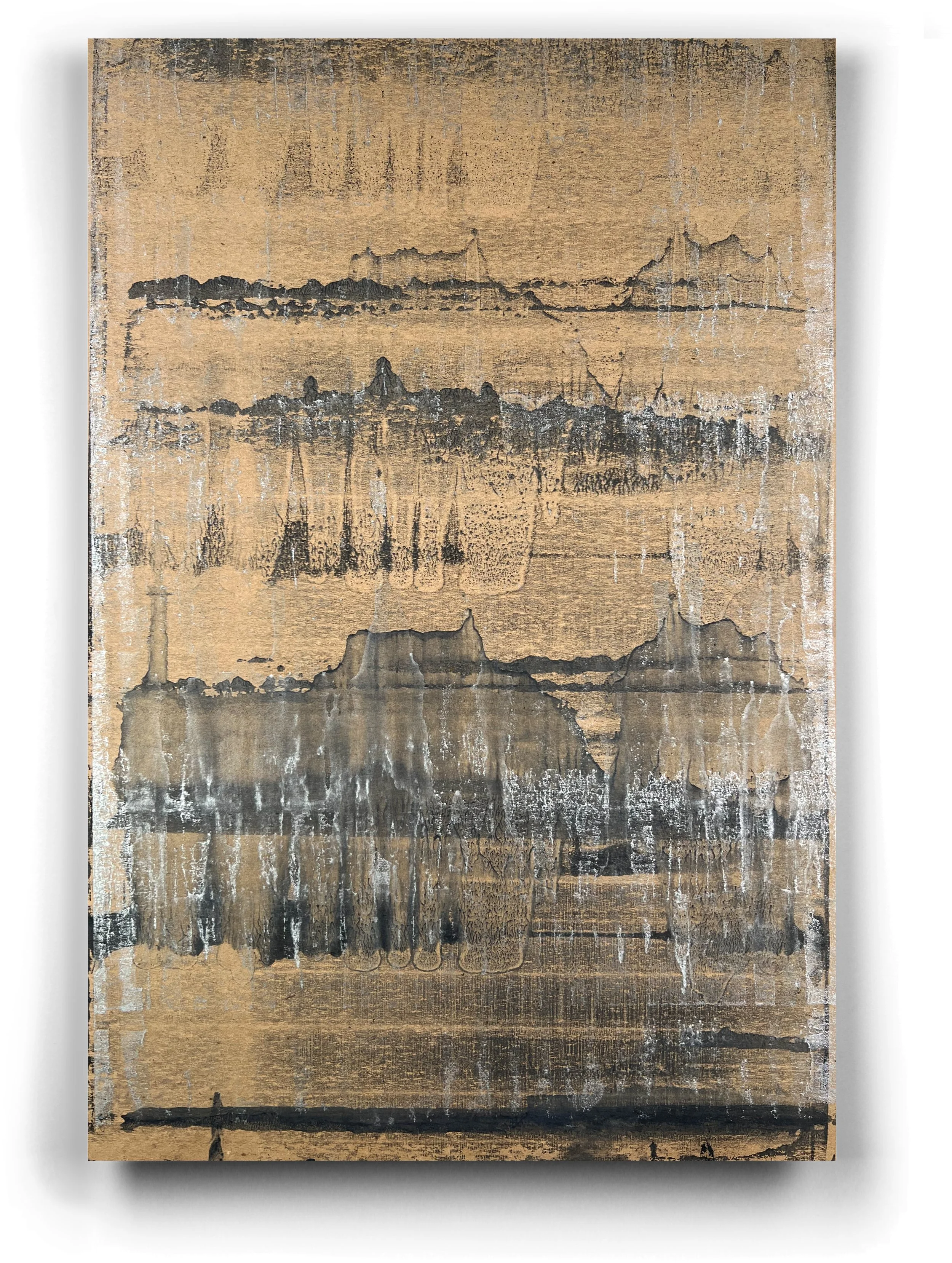
We are getting a “little” better at ink pulls. We are also seeing more options for them being the paper stock for future posters. Here is a new one run on chipboard in black and silver.