• intro
    • bios
    • 12 DNA projects
    • callouts
    • our lab
    • contact
  • calendar
    • subscriptions
    • workshops
    • fine press books
    • broadsides & posters
    • cards
    • Cinderella stamps
    • Blank books by Lead Graffiti
    • Blank books by Anne Hessel
    • Tour de Lead Graffiti 2011-15
    • letterpress things for sale
    • New Products
    • STUDIO SUBSCRIPTIONS
    • TECHNICAL LETTERPRESS
    • . . basic type composition
    • . . vandercook
    • . . iron hand press
    • . . floor-model platens
    • . . week-long letterpress
    • CREATIVE LETTERPRESS explained
    • . . meander book online
    • . . werkman druksels
    • . . quotable broadside
    • . . holiday card
    • press rental
    • BOOKMAKING explained
    • . . bookmaking basics
    • . . 6-pocket accordion
    • . . one day one book
    • . . coptic stitch
    • . . clamshell
    • . . paste paper
    • . . bookmaking bonanza
  • blog
  • search
Menu

Lead Graffiti

120 A Sandy Drive, Sandy Brae Industrial Park
Newark DE 19711
Phone Number
a letterpress lab of sorts

Your Custom Text Here

Lead Graffiti

  • about
    • intro
    • bios
    • 12 DNA projects
    • callouts
    • our lab
    • contact
  • calendar
  • store
    • subscriptions
    • workshops
    • fine press books
    • broadsides & posters
    • cards
    • Cinderella stamps
    • Blank books by Lead Graffiti
    • Blank books by Anne Hessel
    • Tour de Lead Graffiti 2011-15
    • letterpress things for sale
    • New Products
  • workshops
    • STUDIO SUBSCRIPTIONS
    • TECHNICAL LETTERPRESS
    • . . basic type composition
    • . . vandercook
    • . . iron hand press
    • . . floor-model platens
    • . . week-long letterpress
    • CREATIVE LETTERPRESS explained
    • . . meander book online
    • . . werkman druksels
    • . . quotable broadside
    • . . holiday card
    • press rental
    • BOOKMAKING explained
    • . . bookmaking basics
    • . . 6-pocket accordion
    • . . one day one book
    • . . coptic stitch
    • . . clamshell
    • . . paste paper
    • . . bookmaking bonanza
  • blog
  • search

The Lead Graffiti logo

February 22, 2008 Ray Nichols

We like telling the story of how our logo came into existence.

Back in 2008 when we rented our Sandy Drive studio space, we were investigating names for our letterpress studio. The three top ones were

  • Lead Zeppelin

  • Press of Sighs

  • Lead Graffiti

Lead Zeppelin wasn't going to work as it was going to bump up against Jimmy Page far too often. It did give us a reason to listen to "Stairway to Heaven" blasting through the studio most days. But then we do that anyway. Oh, well.

Press of Sighs (idea taken from the "Bridge of Sighs" in Venice, Italy) has a nice feel to it. Would give us a marker to work for to make people “sigh’ when they saw something we printed. In our graphic design work when designing logos, we always like to put into the conversation that we liked the design (and the same for a logo) to both to talk to your target customer and also to your company's people. Focusing on creating work that made people "sigh" sounds like a good thing to remember every time you are designing or printing via letterpress.

Lead Graffiti ended up being the "chosen one" because it worked on a variety of levels.

  • Once you heard it, remembering it seems pretty easy

  • It reacted to the hand-rolling we liked doing on wood type to give a painterly quality

  • It had the more complicated "ffi" ligature and also the opportunity to design the second “i” a second way

  • Printing those delicate lines would require a delicate touch which would then be automatic on many projects

The original problem

The main problem with Lead Graffiti seemed that the word Graffiti, while interesting because of the hand-rolling, is a negative word. We imagined it floating around a conversation with a mother and daughter talking about wanting a wedding invitation. That felt a bit grating. But it was still the one we liked. Now we needed a way to turn that negative into a positive. That is always something we try to achieve. Now to find a way to do it to our logo.

The stepping stone connections

  • We went on study-abroad trips to London with Ray's students from 2001 - 2005.

  • On those trips, we discovered CoinCraft, our favorite London store, right across the street from the British Museum, which sold a lot of coins and other antiquities. If you've seen our piece of cuneiform, that is where we bought it.

  • In 2007 We designed the 300-page, hardback book, Histories of Newark: 1758 - 2008. The Newark, Delaware charter was signed by King George II, King of England. After discovering that a silver half-sterling coin minted in 1758 had King George II's portrait on it, we designed a cover for a dozen deluxe copies, which included an inlaid coin where you could see both sides. Seriously, how cool is that? We ordered 12 of the coins at $75 each. It took them 3 months, but they found them.

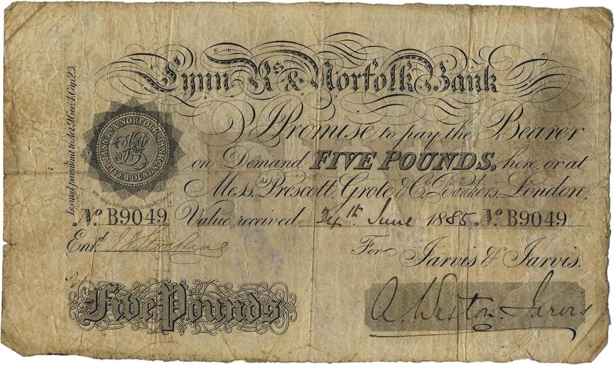
  • In early 2008 as we were starting to get our new 2,200-square-foot studio space organized, we got a catalog in the mail from CoinCraft. While going through the catalog, we came across an item that was an 1885 British banknote with a terrific Spencerian script for the bank's name (see the banknote image above). Hmmm. We emailed CoinCraft, and they still had the banknote, so we bought it. The banknote is shown at the top of this blog entry.

LG-logo-black-grey-for-new-website.jpg

The banknote for the "Bank of Norfolk" gave us the r, a, and f. The rest had to be invented. The logo has an "ffi" ligature which is an excellent element for people who like type. It also offered the chance to design the ligature with a second f and a second i.

Tray Nichols, Ray's son, did a killer job on the computer work. As we write this 10 years later, we still love it.

We would love to do an animation of the logo being drawn, but we need to figure out how to accomplish it. Does anyone out there want to trade for free time on our presses or something letterpressed with a severe discount (or maybe free) for that animation?

LEAD was in Gill Sans Bold. The plan was always to do it in 2 colors that would change with every use. If you look at our portfolio cards, almost every one includes different colors.

When we use the logo, we usually rotate it 20° and bleed off an edge. Go back and look at the landing page for our website.

Tags students, projects
← Grandmasters Exhibition / Art Directors Club of NY2008 →

Our Lead Graffiti blog is a mass of varied information that is hard to understand. The search option in the top navigation works quite well if you can hit the right keyword (s). In this sidebar, we’ve highlighted some personally meaningful entries that might help if you want to try a couple of entries. To DEEP DIVE, click somewhere in the right column and then scroll down the left column. Also, if you know us, you can try searching for an appropriate word & the word “blog.”

2025

Resist
Liar, Liar.
Just do it!
Bernie Herman

2024

"Ink Pulls:" the hows and whys
Family holiday card workshop
“Liar, Liar.”+3 broadsides @ NAA exhibit
Waldorf diplomas / 2024
More on X-ing the Paragrab
”Concertina spine” book workshop
Lead Graffiti labyrinth
Jill, Ray, & Brodovitch @ the Barnes

2023

Forward for “X-ing a Paragrab”
UCBA member IMHO Meander Mook project
Black History is White History broadside
AIGA / Philadelphia Feedback broadside
Dunya Mikhail “Pronouns” broadside
etaoin shrdlu
Seven Fun Facts about the Linotype

2022

DCAD First-year talks
Cy Twombley. It’s just my opinion anyway.
”No more war. No more Putin.” broadside
Buying our Albion : that story
January 6th assault broadside

2021

Waldorf School of Philadelphia diplomas
Teleport broadside
ONLINE MEANDER BOOK letterpress workshop

2020

A design example of subtle racism
Looking back : Histories of Newark : 1758-2008
Retrospective exhibition at DCAD
Broadside : Black Lives Matter. A lot.

2019

A wonderful film about Ben Joosten
People Were Close (2004 book project)
WHYY-TV / Waldorf School of Philadelphia
What would a good student do?

2018
Alone in Berlin : postcard power
Doves’ type : metal & digital
“Blue Wave” broadside
John Bolton / Lead Graffiti connection
Alan Kitching’s VCUK workshops
U.S. Senators postcard mailing (coming)

2017
Four things you might want to know about Ray
Introducing Stephen Frykholm at AIGA

2016

Saul Bass. A no-show.
Burning Man & Lead Graffiti’s journal
Chris Fritton, The Itinerant Printer
Porter Garnets’s 10 commandments

2015
Best Intertype project #2 : round calendar
The Nash Equilibrium

2014
WHYY-TV’s Best of 2014
London Bombing’s 7th Anniversary

2013
Tour de Lead Graffiti. Sports Illustrated.
Grant Hart. Letterpress printer?
July 4th revolution coasters

2012
Thank You, Craig Cutler

2011
APHA National annual meeting program

2008
Designing Lead Graffiti’s logo
Art Directors Club of NY Grandmasters Award

2004
VCUK’s Alan Kitching letterpress workshops
VC family album pages

2003
Alan Fletcher : Raven Press logo origin
Bukva:raz! - Our first serious piece

2001
Visiting Eric Gill’s Gravesite