
Continuing with an ongoing obsession with letterpress & typography and investigating minor & probably worthless details in the history of printing, this book focuses on the hand composition of “X-ing a Paragrab” by Edgar Allan Poe, published in The Flag of our Union during the week ending May 12, 1849.
Several elements piqued his interest.
Poe’s story unfolds in the realm of position, a world once shaped by handset metal type. This unique perspective offers rare insights into a bygone era of printing newspaper compo.
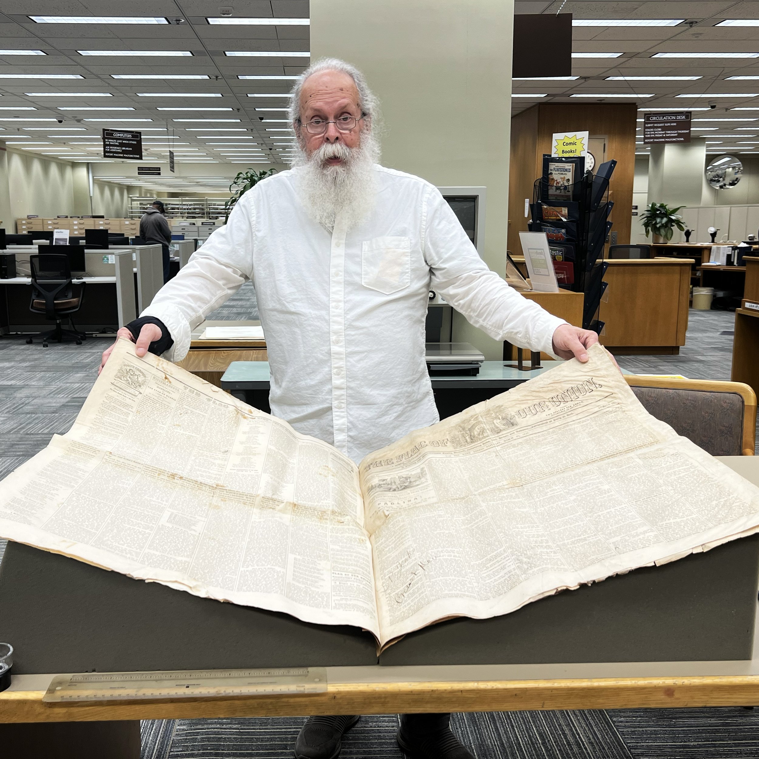
The enormous size of this literary publication. A single page is roughly 24” wide x 36” high (these measurements must be checked). The image below shows Ray at the Library of Congress with the issue before the one containing Poe’s story.
Poe’s story unfolds in the realm of position, a world once shaped by handset metal type. This unique perspective offers rare insights into a bygone era of printing newspaper compo.
The enormous size of this literary publication. A single page is 24” wide x 36” high (these measurements need to be checked)
One intriguing question is why compositors would set such a short, justified column without switching (and at this point essentially unused) the possibility of flush-left, ragged right. From the author’s standpoint, fl/or would be noticeably easier and faster to set; the lack of adjusting word spacing would make eye flow along the lines of the type more even and end up with the same characters on every line.
This is just one of the many thought-provoking queries that Ray Nichols’ book delves into to such a great extent without making the text flush-left rag.
I wanted to investigate exactly how the composition was set. However, many details were probably made with little or no serious thought or consideration and without any knowledge of the composer’s skillset.
And to make the type large enough to feel like I was standing amongst the sorts.
Initially, we tried investigating the actual typography to identify the typeface by searching type specimen books from just before the 1849 printing. Often, one would be close on most letters but only on some of them. The two primary sorts we looked for were the “Q” and the “?.”
When I initiated this blog post, my plan was to produce a digital typeface by photographing near-date examples of the publication in at least the regular size in both a medium and italic medium version. The only example of the original printing I had was a high-resolution scan of “The Flag of Our Union” page with the Poe story.
When I first started this project, there were two known copies listed: one at the Library of Congress in Washington, D.C., and the other at———in Boston. (Text: Edgar Allan Poe, “X-ing a Paragrab” (Text-02b), Flag of Our Union (Boston: MA), vol. IV, no. 19, May 12, 1849, p. 2, cols. 1-3)
The image below,
