Stage 1: TdLG 2011 thru 2015

Starting to get pretty jazzed about the upcoming Tour de France 2026, which we always watch. Speaking as Ray, I’ve followed the Tour religiously since the late 1980s, when American Greg Lemond won 3 times. The 2026 Tour de France is dominated by the rivalry between Tadej Pogačar and Jonas Vingegaard. Pogačar is looking for a record-tying fifth yellow jersey.

I was trying to think of something I could do to talk about the new stages while also including what we consider the major project of our 24-year career as letterpress printers.

Download the image 2500 pixels wide.

So, this is the plan. At each stage, we’ll post the five broadsides from the same stage each year from 2011 to 2015. The image above is for each of those opening stages. Not sure this works very well on a phone, but that is your problem and not mine

We’ll likely just show the same 5 images above and perhaps write a paragraph about each one, including some interesting details we remember about the design or the printing, with maybe a bit about what happened that day on the 2026 Tour. It will be fun reliving THE Lead Graffiti project.

During that time, always finishing the broadside on the same day as the stage, often with a sometimes strange and sometimes familiar collaborators, The broadsides are 14.25” x 22.5” (essentially a sheet of Somerset 300gsm textured white (we used soft white the first year as you can see above, but ended up thinking it had too much impact on our colors and switched to white the next four years.

Each day, I hope we can find the time to highlight some elements from the various broadsides. Originally, we did a broadside for each of the racing stages (21) and the rest days (2), and a composite of all of the broadsides overprinted on a single sheet.

Jill and I were in Belgium for the opening day prologue in 2004.

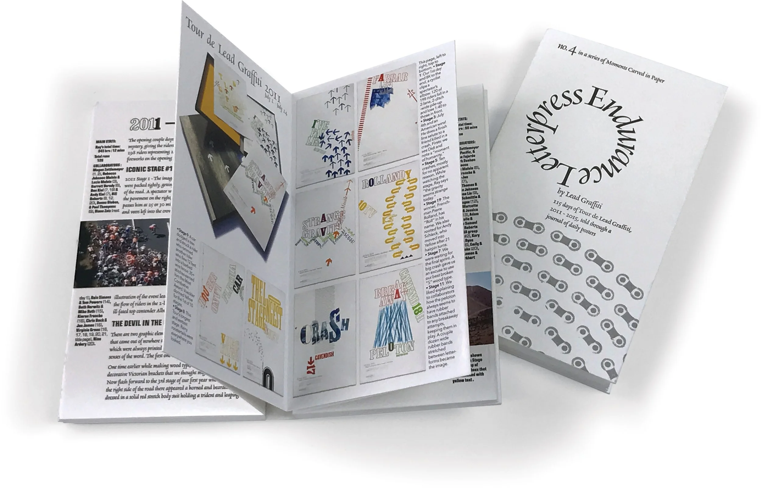
We ended up printing a letterpress book called “Moments Carved in Paper 4: Endurance Letterpress” about our Tour de Lead Graffiti experience. Two highlights from the project, among many others, include the sale of all 5 years in accompanying clamshells to the Library of Congress and the Special Collections at the University, and an exhibition of the first 3 years at The British Library in London.

This is the “Moments 4” book.

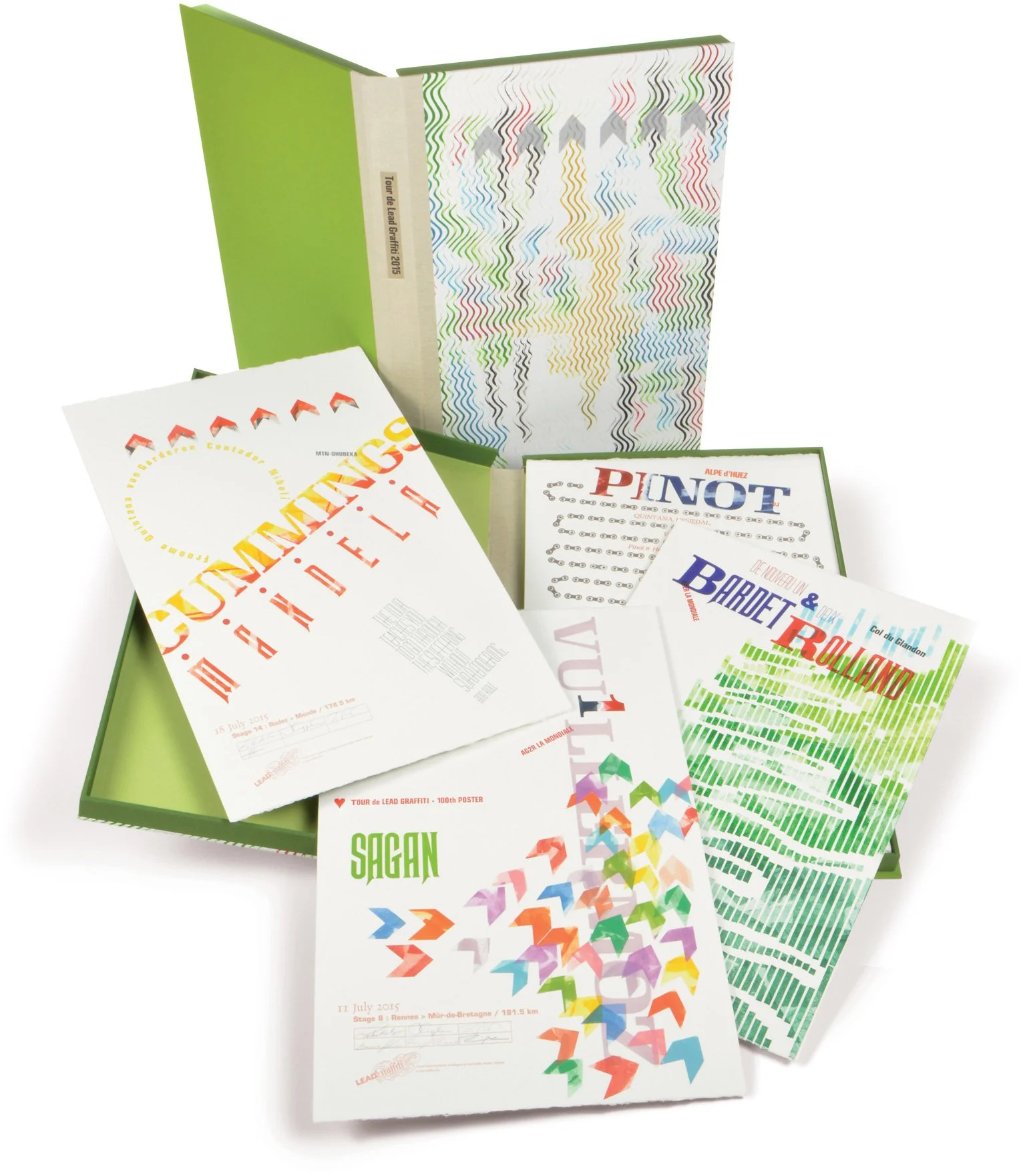
This is the look of one of the clamshell and four of our favorites from that year with the 2015 Tour.

Thank yous

Explain why you need them. Main issue is to include something that says you heard something that was said.

Amount of work should reflect the value of what you received.

  • 6" x 4" postcards (not sure what these are)

  • My thank you to Craig Cutler for lighting equipment

  • Thank you for the Garamond, Roland Hoover

  • Happy birthday Roland Hoover

Thank yous from others

  • Jim Culley's books for Werkman experience for his grandchildren

  • Ann Lemon's "100 things Ray taught me"

Link to a good artlcle in MentalFloss about 7 Smart Tips for Writing a Proper—and Professional—Thank You Note.

Picking a typeface versus picking a concept

A question Ray don't like to get is, "What is your favorite typeface?"

He tends to think that the typeface is a flexible element. You can pick any font you want to use and then build a concept around it or get a concept and pick a typeface for it.

An example.

Once at a talk the designer / speaker, describing how typefaces worked said, "For instance, you wouldn't use /Franklin Gothic for a lingerie ad and you wouldn't use Nuptial Script for an ad for nails."

Hmmm.

Helmut Krone : You need to know the answer before you hear the question


You (thinking about students at the moment) need experiences which provide you with a savings account of opportunities you can draw from.

Helmut Krone, one of my favorite couple of historically important art directors, once said to me, “You need to know the answer before you hear the question. Then all you have to do is reword the question to fit your answer.” 

I use to talk to my students about having ideas “on the shelf.” You constantly look for ideas you can store until you need them. What could you do with this? How might this be applied? You get a picture in your head and then you put it on the shelf, to call down later when you need a solution. Doing the pieces that have little obvious value, because you can do so many of them and because they don’t carry much pressure, can offer important leaps in creativity in some future project.

From Wikipedia : Helmut Krone (July 16, 1925 – April 12, 1996) was an art director and is considered to be a pioneer of modern advertising.[1] Krone spent over 30 years at the advertising agency Doyle Dane Bernbach. He was the art director for the popular 1960s campaign for the Volkswagen Beetle, which featured a large unadorned photo of the car with the tiny word "Lemon" underneath it; the series of "When you're only No. 2, you try harder" advertisements for Avis, and the creation of Juan Valdez, who personified Colombian coffee. During his career, Krone won a number of awards and was inducted in both the One Club's Creative Hall of Fame and the Art Directors Hall of Fame. His work has been collected by the Museum of Modern Art and the Smithsonian.

Volkswagen


Half-justified text block

I have a design book somewhere I believed mentioned a technique for justifying type that was called something like half justification. This is from at least 20 years ago and I’ve never been able to find the reference again. As I remember the piece was from England. The idea was that if the length of the text was within some predetermined distance of the maximum possible width the line would be justified. If it fell short of that it would remain ragged right.

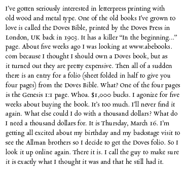
The first example below is 12 point Rialto on a 20 pica measure set flush left / ragged right.

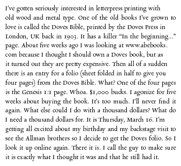
The second example is the same text, but if the text length was 19 picas or more the line was force justified.

I like the way that looks and was thinking about trying it on an upcoming project.

Especially from British readers of this post, "does anyone know what this is called or if it is even something compositors actually did? Do you have an example?"

Flush left, ragged right

Flush left, ragged right

Half justified

Half justified

Sandcasting at the Type Museum / London

While on a study abroad program in 2004 with 2 dozen students from the Visual Communications Group at the University of Delaware, Ray visited the Type Museum. The museum had been interested in getting someone in to demonstrate sandcasting large metal type, a process that hadn't been used for 150 years.

Ray said he would pay for it if the group got to watch. We had an early model Nikon camera with digital video capabilities allowing us to shoot in 3 minute segments, after which it would store the video, allowing you to shoot another segment.

Ray finally got around to editing the pieces togethe,r and as it turns out works quite well, documenting the process that probably hasn't been seen since.

8' Year-End Show invitation from 1982

Back in 1982 Visual Communications was starting to ramp up for its annual year-end show. Back then we referred to it as "The Breakfast," a holdover from when we had invited a Wilmington-area chef who came down and cooked omelets for a morning.

I give credit to Michael Dodson (VC'82) for the idea that the "whole world is talking." The idea evolved from a cityscape with voice bubbles coming out of windows to this idea.

It is a complicated story, but it will be nice to lay it all out and provide some credit to people I haven't thought about for a while.


Read more

Extending the provenance of our 1868 R. Hoe iron hand press

THE PHOTO ABOVE SHOWS US during the renovation of our 1868 Robert Hoe Washington #5 iron hand press in 2007. After stripping the press and priming it, we took a break for the photo above. It's a handsome classic satin black now with polished brass accents and leather straps on the rounce. We had picked it up in Portland, Maine, we were new to letterpress, and we didn't get any details on its history.

Then about 2 years later, Ray thought it would be interesting to get into hot type metal casting. After some research, it was time for another road trip back to the source in Portland.

We now also possess a 2nd iron hand press, an Albion that originated in Pittsburgh, PA. Spying a chance photo of that press and putting 2 and 2 together, Ray has been able to confirm its provenance back to its original purchase date in 1928 by Porter Garnet at the Carnegie Institute of Technology.

This set us to wondering about the Hoe and its history.

The letterpress gods smiled again

OUR RECENT INVOLVEMENT with the Fine Press Book Association and the Manhattan Book Fair caused us to stumble onto some new information about the provenance of our Hoe iron hand press. A perfect stranger, Steve Vile, walked up to our MBF table and casually mentioned he was a printer from Portland, Maine. That rang a loud bell with us.

Portland is the city where we bought two of our most important pieces of equipment (Intertype C4 linecaster and an R.Hoe Washington #5 iron hand press). We mentioned buying the iron hand press and Steve asked who we bought it from.

"Scott Wilson." Scott Wilson is the printer and book seller in Portland, Maine, that we connected with when we purchased the Hoe in 2007. We also bought our Intertype C4 linecaster from him about 2 years later.

Steve replied, "I owned that press before Scott Wilson. I sold it to him."

That lead us to the next question.

"Where did you get it?"

It turns out that Vile had worked at a Portland print shop and bindery named The Anthoensen Press for a number of years, eventually coming to own the Hoe no. 5 that now resides at Lead Graffiti.

So our newest research project is to find out all we can about The Anthoensen Press.

Information about our page in the Bamberg Bible

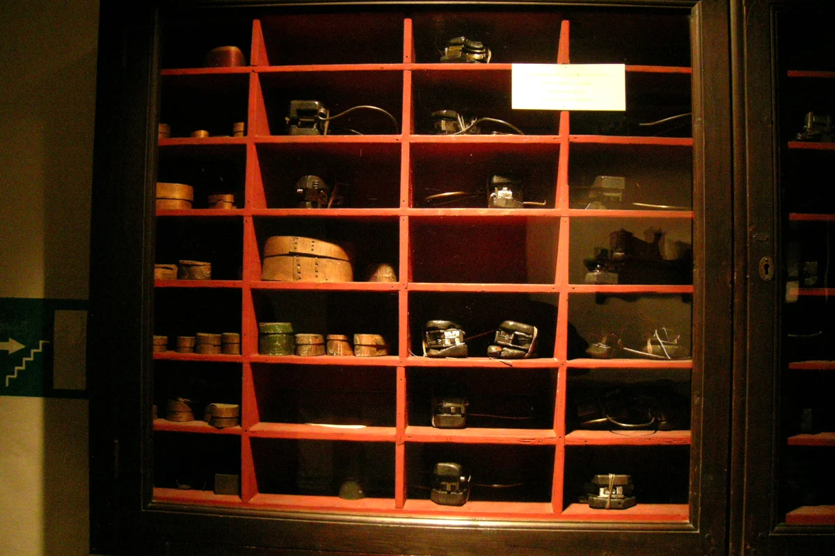
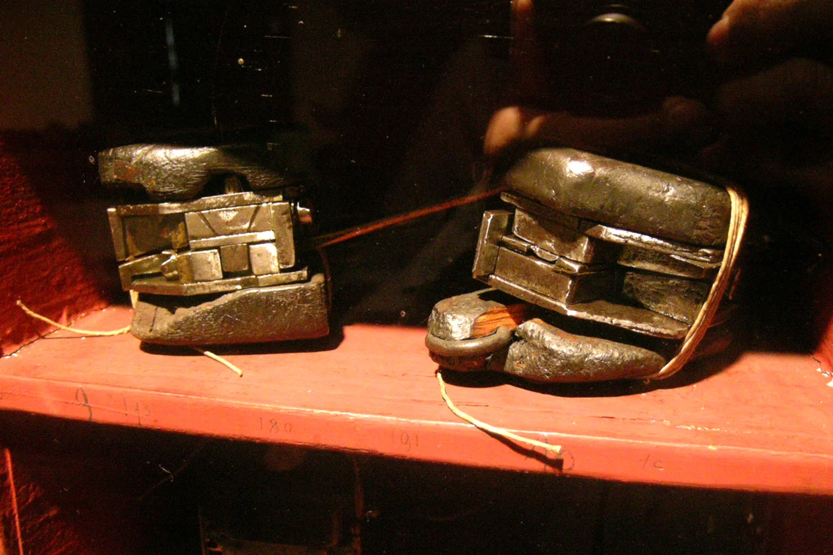
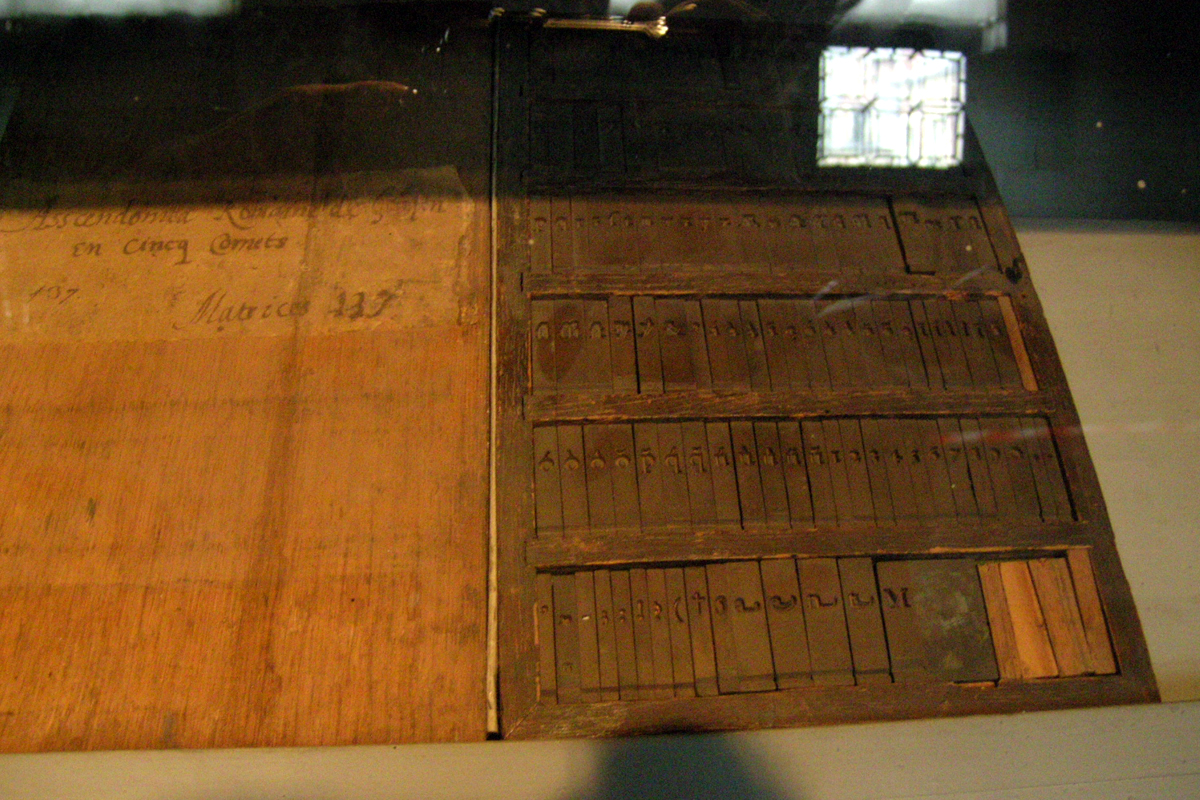
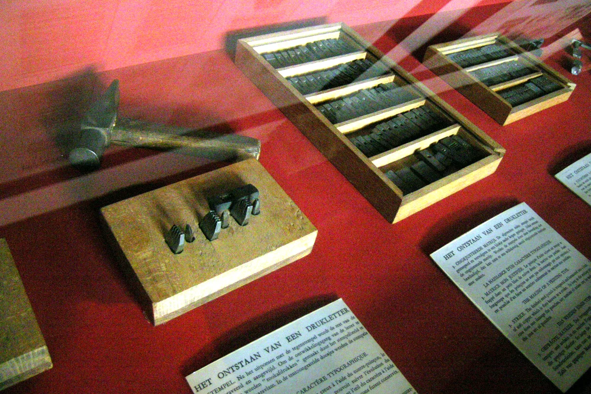
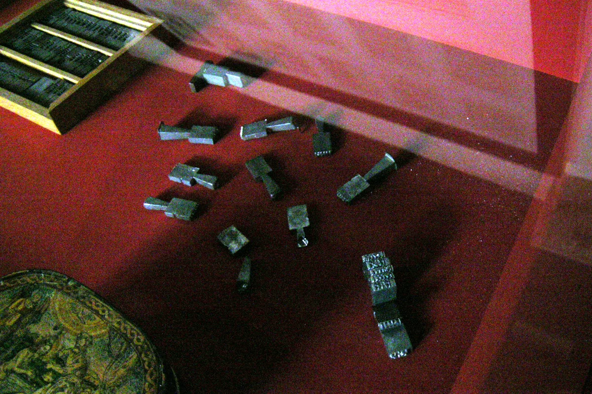
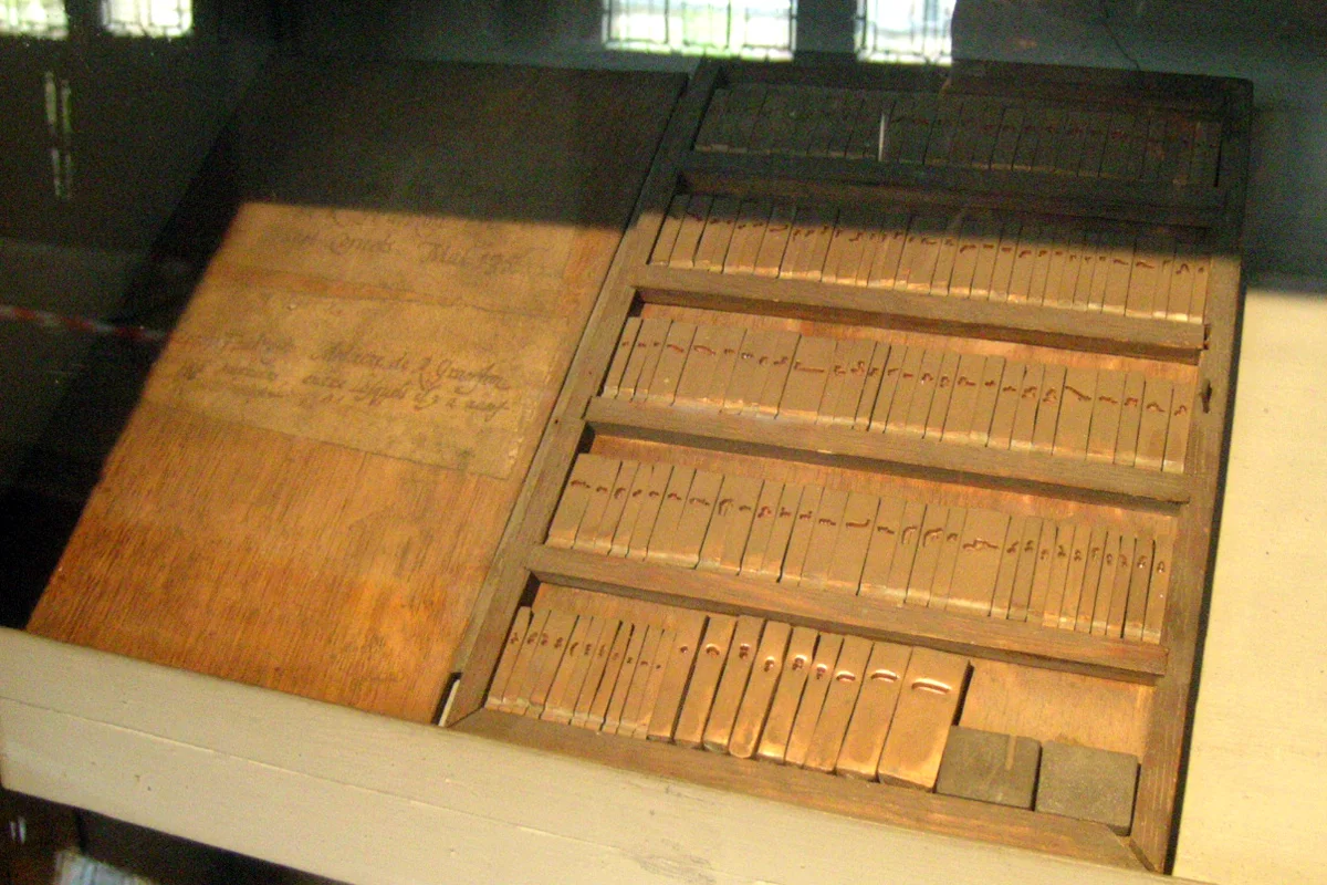
Mike Anderson, a friend who was a letterpress printer and type caster, produced the type that Lead Graffiti currently has on extended loan from Chris Manson. We have the hand composed page from Luke along with 2 packed job cases of additional type. All told we believe there are 192 different characters represented.

The design of the type was taken from a Christie's auction catalog shown below.

This is the page from the catalog showing the type that was used to set the form we have.

The following description of the 36-line Bible is taken from Wikipedia.

36-line Bible

From following information is taken from Wikipedia.


Pages from 36-line Bible at the Bavarian State Library

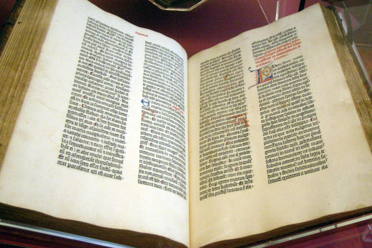
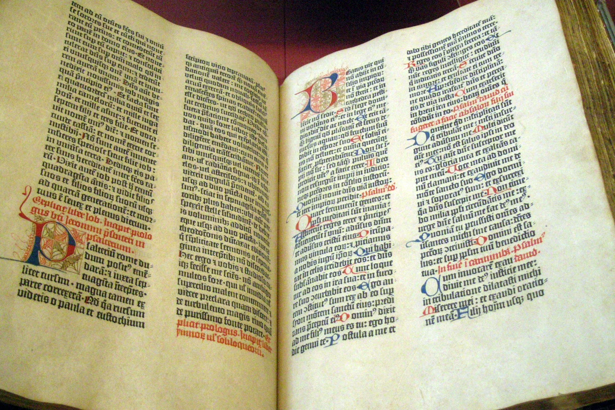
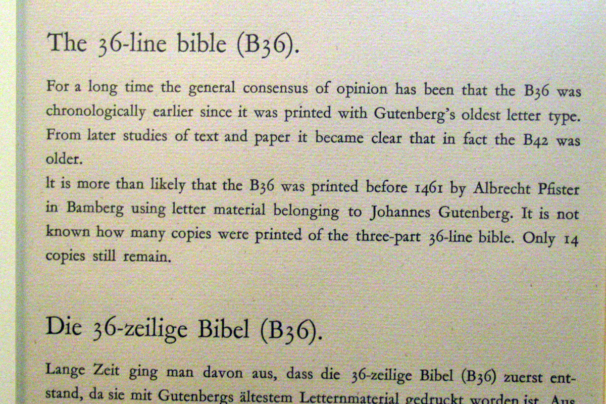
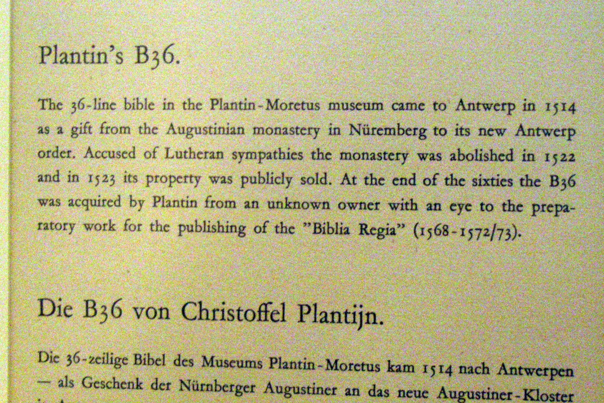
The 36-line Bible, also known as the "Bamberg Bible",[1] (and sometimes called a "Gutenberg Bible") was the second moveable-type-printed edition of the Bible. It is believed to have been printed in Bamberg, Germany, circa 1458–1460. No printer's name appears in the book, but it is possible that Johannes Gutenberg was the printer.

The primary, or particular meaning of the term Gutenberg Bible, is the first moveable-type-printed edition of the Bible, circa 1450–1455. The Gutenberg has 42 lines of text on each page in comparison to the Bamberg's 36 lines, and the Bibles are thus sometimes therefore referred to by this criterion. However, because the 36-line Bible could have been printed by Gutenberg and was printed at a similar time, it is sometimes referred to by, and included in, the term "Gutenberg Bible".

Date

In the past, some scholars have argued that the 36-line Bible was an early, and primitive, version of Gutenberg's 42-line Bible, which would have meant that it was printed prior to 1455.[2] Careful comparisons of the texts, however, have since shown that (with the exception of the first few pages) the 36-line Bible was set from the Gutenberg's 42-line Bible, thus proving the 42-line was the first.

The date "1461" was marked by a rubricator (a scribe who hand-wrote initials and other items in red text, for decoration or emphasis) written in one copy of the 36-line Bible, indicating that it would not have been printed any later than this.[5] Most scholars now agree that the 36-line Bible can be dated to c. 1458–60, making it the second printed edition of the Bible.[1]

An existing fragment of a 40-line Bible was probably printed around 1458 or earlier, and printed with the same type. However it is believed that the fragment is only a trial piece, and that this Bible was never fully printed. It has been suggested that the first few pages of the 36-line Bible (the pages that were not made from Gutenberg's 42-line Bible) were set from the same manuscript used for the 40-line Bible fragment.[3]

Place of printing

Several pieces of evidence suggest that the 36-line Bible was printed in Bamberg, Germany. First, the paper used is known to be from Bamberg, and was not found in Mainz, the location of Gutenberg's press. Second, the existing originals have typical Bamberg style bindings. Third, when books were printed at the time, fragments of scrap paper (misprints, etc.,) were used to add padding to bindings. Fragments of the 36-line Bible were found in the padding of other books printed in Bamberg. Finally, almost all known copies have ownership records that can be traced back to Bamberg or its vicinity.[6]

Identity of printer

The printer's identity is unknown. It may have been Gutenberg, someone who had worked for him, or someone who had bought type and other equipment from him.[7] Several pieces of evidence show that Gutenberg was linked in some way with the 36-line Bible. In the 1980s cyclotron analysis performed by Richard Schwab and Thomas Cahill established that the ink used was similar to that used for the 42-line Bible.[2]

The type is a version of the so-called D-K type, also known as the 36-line Bible type.[8] This type is crude and older than that used for the 42-line Bible. It had been used for some very early works, probably predating the 42-line Bible and almost certainly printed by Gutenberg, such as an Ars minor by Donatus (various printings c. 1452-53) and several leaves of a pamphlet called the Turkish Calendar for 1455 (likely printed in late 1454), hence the name D-K for "Donatus-Kalendar".[8][9] Gutenberg lost much of his original equipment to his banker Johann Fust in a lawsuit in 1455, and it is possible this type was the only one left available to him.[10] A number of works seem to have been printed with the D-K type in Mainz between 1455 and 1459, perhaps by Gutenberg.

Albrecht Pfister, who is known to have used the D-K type in Bamberg from at least 1461, has also been suggested as the printer. Many authorities believe that Pfister is unlikely because later works known to be by him have poorer-quality printing.

Surviving copies

Fourteen complete or nearly complete copies are known, all on paper, plus many fragments and single leaves from vellum copies, which have survived because they were used in the bindings of later books.[15] The small number of surviving copies suggests that far fewer were printed than of the 42-line Bible. A higher proportion may have been printed on vellum.

Eight of these copies are in Germany. This Bible has been much less sought after than the 42-line Bible, with a higher proportion remaining in Germany and only one having been acquired by an American library, an incomplete copy at Princeton University Library. A copy is on permanent display in the Sir John Ritblat Gallery in the British Library.