Setting up our Harrild & Sons Albion


Setting up our Harrild & Sons Albion: Part 1

We are hoping to connect with some others with a similar Albion press to help us make subtle adjustments between the spring, handle, platen, & bed.

We bought the press, a Harrild & Sons / London Albion iron handpress from the Museum of Printing in North Andover, MA, in May 2008. The platen size is 21" x 29". 

The Albion was our 2nd iron handpress. The first one was a R. Hoe & Co. Washington #5. We've spent most of our rebuilding time working the Washington as it was missing the tympan / frisket and one of the corner irons. We finally got all of that completed except for a modification to the inner tympan.

We brought Steve Heaver from The Hill Press in Baltimore up to run an Albion workshop for a select group of friends and to help us get the press set up correctly. That turned out to be a lot easier said than done. In the photos down through this page I'll show the parts that impact the lowering of the platen onto the paper. 

There seem to be 2 main problems at the moment 

  • When you pull the handle it just doesn't seem to move as far as it should indicating that the platen is too close to the type. Right now the tympan / frisket doesn't drag on the platen at all, but it is really close to it. There is almost no room to have to lean into it. It only moves about a foot.

  • The chill is precariously close to falling out. It won't fall, but if we adjust the bar and pulls on the chill or move the spring, it comes apart. Just seems that there is no way it should be this close to falling out. 

There are 5 components that seem to impact the pull of the press

  • the spring at the top,

  • the adjustment at the far side of the bar that moves the chill,

  • the four bolts that hold the platen against the cup,

  • the wedge, and

  • the stop that keeps the handle from over impressing the type.

Above #1: the press generally ready to go.

Above #2: the "spring"

What does tightening versus loosening it do? Make it easier to move the handle back to its standing position? Does anything else change?

What happens at the bottom of it? Does it hook somehow to the peg with the 1" cap you can see right below "& Sons" in the photos a few down.

Does anyone have what originally covered the spring and could you supply us with several good photographs taken all the way around it?

Related to part 2: Several people thought this press would not have had something covering those bolts. After considering the options, and why there are just two screws, I wonder if it wasn't something that might hold the tympan in the "up" position. Worth considering anyway.

Above #3: adjusts the wedge. Generally, should it be pulled farther toward the front or pushed toward the back?

The bolt part on ours is slightly bent. Something obviously heavy hit is sometime in its life. Because of the bend we cannot get the bolt in the last 0.75".

Related to part 2: It appears that we have to get that bolt straightened. Options to do some kind of workaround seem awkward at best and it complicates things if you to continue to adjust things.

Above #4: the bar that controls the "toggle lever" that moves the chill toward the vertical position. Any logical general position? How much of the threaded bolt should be exposed?

Related to part 2: After finishing Part 2 of this process it appeared that this interesting set of bolts had to be screwed on a "lot" more (maybe 6 threads showing instead of the .5 we see here).

Above #5: With everything set as it is now, this is how far I have to go to reach the handle. It can only be about 1.25" closer to me or the tympan would hit it while being lowered.

Should the handle be as close to me as possible without hitting the tympan? Seems like things would be a lot better if the handle was bent toward the printer. I'm not a small guy and I'm right against the rails (and all of that oil) when I reach for the handle and then I'm holding it right on the left end of the wooden section.

Related to part 2: We did get the handle about 0.5" closer to the puller. Not much, but it helps.

Above #6: This is at the end of the pull, which to me seems to not be far enough. The movement of the end of the handle from the beginning to the end of the pull is 15". I'm still quite vertical. Seems like I should be almost forced to lean in to the pull more.

Related to part 2: The pull is at least another 12" now, so things feel more in line with what we think should be happening.

Above #7: We finally found the serial number. By this point in time it appears they weren't going to much trouble to show it. So, 8112. In a photo we took the day we moved this press we took another photo of the other press that was exactly the same. It was numbered 8113. The museum said they got the pair from Pittsburgh. There is a photo in Rummonds' "Printing on the Iron Handpress" that shows two presses at Carnegie Mellon that at least appear generally to be the same kind of press. The sequential serial numbers are a pretty good indicator.

Related to part 2: Those photos we mentioned are at the top of Part 2.

Above #8: Sweet.

An added question: Can anyone share any form of base / stage for your press that perhaps shows it lifted off the floor and showing the brace you would put your foot against?

I may adjust this some if I hear from some people with useful information I can try. 

Setting up our Harrild & Sons Albion: Part 2

This is the second step in trying to set up our Albion. We made a number of changes and figure out how a few things worked that we didn't understand before. We still have one big issue we think an that relates to trying to get the platen higher. 

First, thanks to the dozen or so people that offered advice and photos. Really great to have you all as a resource. 

Most of the adjustments came from reacting to suggestions we received. Often we would get things to where they felt about right and the chill would drop out. That happened maybe 6 or 7 times. Each time we got a bit better at getting things organized and in place.

We believe that two photos in Richard-Gabriel Rummonds' book Printing on the Iron Handpress may be the exact press we have or its brother. We bought one of two identical presses from the Museum of Printing in North Andover, MA back in 2008. Ours has the serial number 8112 and one at the museum is 8113. Consecutive serial numbers would seem to indicate they were bought new together. Currently trying to find out if Carnegie Mellon has any information related to this.

Paul Ritscher of Devil's Tail Press, through the iron handpress listserv where we've been getting the advice for our Albion setup, offered this bit of information about the presses. "In a glance at "Porter Garnett: Philosophical Writings on the Ideal Book", Book Club of California 1994 (a book that should be in every hand-press library), Porter Garnett describes the purchase of the two presses specifically for the purpose of printing the Catalogue of the Frick Collection for the Museum of Modern Art, a project begun in 1928, and not completed until after he left Carnegie in 1935 by Bruce Rogers."

After bit of online searching we found that the University of Delaware (just down the street) has a copy of the catalog of the Frick Collection. The colophon from volume 1, "The printing ... was begun in 1929 by Porter Garnett who designed the basic format of the text, and who printed the sheets through page 168 ... The work was laid aside in 1932. Printing was begun again in the spring of 1949 under the direction of Bruce Rogers, who designed the two volumes of illustrations, and the title page, section headings, and accessory pages for the volume of text. The sheets of text were completed on the hand-presses of the University of Pittsburgh ... One hundred and seventy-five sets have been made"--Colophon of v. 1.The story just keeps getting better."

I'm not sure what the connection was between Carnegie Institute of Technology and the University of Pittsburgh, but that will get a some looking into. More on that at the bottom of the page.

Here are the two photos from Rummonds' book.

Above: This one shows the press feet/legs to the cheeks so we have a much better idea that the photo matches our press. The caption in Rummonds' book reads...

Photo 13: Pressmen printing The Catalogue of the Frick Collection on two Albion presses back to back. Laboratory Press, Carnegie Institute of Technology, Pittsburgh, PA, 1949. (Photo courtesy of Cary Graphic Arts Collection, RIT.)

The caption in Rummonds' book reads...

Above: Photo 14: Pressmen printing The Catalogue of the Frick Collection on a Harrild Albion Press. Laboratory Press, Carnegie Institute of Technology, Pittsburgh, PA, 1949. (Reprinted, by permission, from American Printer, March 1950.)

THINGS THAT HAVE BEEN CHECKED, ADJUSTED or CORRECTED:

Bolts holding the platen on have been slightly loosened. They had been VERY tight before.

Spring was removed and cleaned. It isn't broken and seems as it should be.

The swing of the "handle" seems right (or at least a lot more right).

TO BE DONE:

Need to get the bolt that moves the wedge straightened.

What is the strap attached to the bolt at the top of the "rib stay supposed to do.

Is there a way to raise the platen (does being able to move the wedge do this?). The problem is that the tympan / frisket rests on the chase so the gap between it and the platen is really, really close.

Understand better how that round bolt on the far side of the rod that connects to the "J" object works and what it accomplishes.

Above #1: On our first page description we forgot to include a photo of the "cheek stop."

Additionally, we loosened the nuts holding the platen (one showing in the lower left of the photo above) to give it a bit of flexing room. It is definitely NOT loose, but when we started this it was TIGHT as we were trying to lift it as much as possible.

Above #2: the "spring"

In the first photo at the top of the page you'll see a strap attached to the top of the "rib stay."

Question: Is this meant to stop the bed from moving too far and likely would there have been one on the other end of the bed?

Above #3: We thought you might like to see the spring removed. Next to it is a kind of washer that centers in the top of the spring. Strangely the hole in that washer is a bit off center. We don't see any reason for that. 

We were worried that removing the 2nd nut might send the nut through the ceiling. Also we worried that if the spring was under pressure when it came loose we would never be able to get it back in, but the designers of the Albion apparently thought ahead on that issue. We removed the lock nut and then keep undoing the other bolt. About 1/2" before you would start worrying that it was going to explode, it came loose and you could just remove it by hand. Then the spring just lifted out. I wondered if you could compress the spring by hand. Nope. Not even a little bit which gives you a good idea of how well the leverage works on the press. Ended up being a great demonstration of how well the handle, chill, etc. leverage each other for efficiency. I would really like to see a session on "How It's Made" on making those springs.

Above #4: The print ready to be replaced. The bolt seems to be an eye bolt. The next time I take this apart this far, we are going all the way and clean the paint off of a few additional parts which will make the press look a lot better and perhaps a bit less industrial. We think that will be nice.

Above #5: Shows the bend in the bolt that positions the "wedge."

It is starting to look like that bend might be creating part of our problems getting the press set up absolutely correctly. It is also interesting that the bolt DOES NOT come out of the wedge. There must be a pin that has been driven through the wedge to hold it in, but visually you cannot see any evicence of it. The bolt can easily be rotated by hand when it would likely be close to coming out, but eventually just rotates without coming out.

Next on the list of things to fix on the Albion is to get that bolt straightened. It is worth saying that I don't think that is going to be easy for whomever does it.

The wedge is flat along its bottom and the top slants which is what changes the tension on the chill. As it turns out the wedge is not exactly centered in that indented part of what holds it to the press. Once you get the wedge loose enough to rotate it you have to be sure to get it back in the right way.

Above #6: The "wedge" at the top with the "chill" at the bottom. Not sure what you call that "rocker plate" for the bottom of the chill.

Today, we are going to try putting something on top of the wedge and under that rocker plate to see if that will raise the toggle joint mechanism.

We tried that, but that was harder than it seemed it would be. We've decided to just go for the straightening of the bolt so now that we are past Thanksgiving we'll start making some phone calls. Anyone out there willing to do it for us for a fee? Email Ray.

Above #7: Shows the wedge being replaced.

We've figured out that part of our problem is that the "frisket / tympan" was setting on the chase we had in the press. The chase has "Harrild & Sons" cast into the piece so it looks original.

So, it looks like the wedge might need to be pushed in about the thickness (a bit more than 1") of the part of the frame it is bolted to

Once we took the chase out things the bed fit much better under the platen. The problem is that even if we use furniture to position a smaller chase that fits inside the metal edge of the tympan / frisket will still be in contact with the furniture. This is the reason it appears that no matter what we need to get the whole adjusting mechanism for the platen up at least 0.125".

When we are standing at the press looking at the wedge we still aren't quite sure this is the problem, but we don't see anything else that can accomplish that raising of the platen. 

So, things are a lot better. We get a more logical pull to the handle and we also have a much better idea of how the mechanism work. We seem to be getting closer and I suspect once we solve straightening that bolt things are going to fit nicely into place.

More on the Carnegie Institute of Technology and University of Pittsburgh issue, piecing together the story from Wikipedia. 

The Carnegie Technical Schools were founded in 1900 in Pittsburgh. In 1912 the institution changed its name to Carnegie Institute of Technology.The Mellon Institute of Industrial Research was founded in 1913 and was initially established as a department within the University of Pittsburgh. In 1927, the Mellon Institute incorporated as an independent nonprofit. In 1967 Carnegie Tech merged with the Mellon Institute of Industrial Research to become Carnegie Mellon University.

So, it seems the caption for the 1949 photos at the Laboratory Press at Carnegie Institute of Technology and that the overall credit for the book as being University of Pittsburgh seem OK.

Setting up our Harrild & Sons Albion: Part 3

Trying to have a conversation with others about our problems with our Albion has been difficult for a couple of reasons. 

  • We are new to iron handpresses. Since the formal beginning of Lead Graffiti in 2008 we've wanted to print at least some quality work on an iron handpress.

  • Trying to talk from the same page is difficult. Everyone we talk to is a lot more experienced and trying to define the part you are talking about and what is happening with and around that part is difficult on the phone. Through email it is worse, except you have a record of what was said that you can go over it multiple times.

So, the purpose at the moment of this page was "stop and start over." Take the entire press apart from the platen up, pull out all of the parts, clean the parts well, and photograph related parts in group portraits. We've supplied names to the parts trying to make sense of the relationship between this 1928 Albion and the Washington-style iron handpress which is thoroughly illustrated in Richard-Gabriel Rummonds' "Printing on the Iron Handpress." As it turns out the way the two presses work is quite similar and many of the parts operate in the same general manner.

Above: Albion stripped down with the piston separated from the "head." 

While we were doing all of this we even got rid of that scuff, which seemed like dried caulk, on the upper left.

Above: Piston in place with the "piston support pin" in place.

Above: Spring, spring washer, eye bolt, nuts for eye bolt, piston support pin, and cotter pin.

After some online advice we thought it might be best to add a couple washers at the bottom of the sprint to lift it to help us get the gain in height we THINK we need. Home Depot had exactly the right washer. The photo above shows 3 washers added. After putting it together it seems like it might need 5 or 6.

Above: The handle is attached. You can just see the top of the handle pivot pin showing on the back side. The connecting rod is in position (it has to be inserted through the handle and piston before the handle is locked into place. The caps on both ends are not in place and the round connecting rod nut is not in place.

Above: Handle, tapered handle pivot pin, connecting rod, and brass connecting rod enclosures.

Above: the back of the pivot point for the "bar." The vertical tapered pin is the "bar pivot pin." You can also see the "handle stop" in the lower right. 

Above: a closeup of the near end of the "coupling rod ".


Above: The far end of the "coupling rod" shown from the back of the press. There is a circular lock bolt that has not been added to the threads.

Above: round connecting rod nut, conneting rod locking nut, and connecting rod brass enclosure piecs for the far end of the connecting rod.

That round nut and the encasing mechanism is quite amazing the way it sits on both ends inside a socket. The ball at the other end of the "coupling rod" is welded to the rod and is not threaded on.

Above: Wedge area. You can see the coupling rod passing from the bar through the piston to the toggle lever.

The toggle lever is in position, but does not have the chill supporting its left side.

The red arrow points to a flange that runs up the backside of the cheeks. At the 2015 APHA conference on "Printing on the Iron Handpress" we had the chance to print on the Kelmscott-Goudy press in the Carey Collection at RIT. The Kelmscott printers had wrapped a heavy iron strap vertically along both sides of the cheeks to provide support when they were printing the "Kelmscott Chaucer." We don't know if perhaps the flange shown here is a reaction to that or is built into earlier Albions. You typically don't see photos of the backs of iron handpresses. Below is a photo showing that flange. It is possible that there might be some adjustments to this press as it was ordered from Harrild & Sons with a specific printing project in mind. That was "The Frick Collection: An Illustrated Catalog" which is a large format book. Adding the flange would have been a fairly easy process when making the sand casting moulds.

Above: toggle lever (J-shaped piece), toggle lever pivot, chill, wedge-shaped chill support, and wedge.

There has been some questions raised about the chill (3rd piece down from the top) and if it is symmetrical. As best we can tell it is. You can tell that the fulcrum that fits into the chill is not perfectly circular and that might be contributing to some of our problems.

We've been taking some of the major threaded pieces to Doug at A-F Machine, located just to the right and across the street from us in the Sandy Brae Industrial Park. He has the complete set of taps and dies to clean up the threads. The first piece we took to him was the "connecting rod." He pulls out a cardboard chart out of his shirt pocket which I think he has been using since the 60s, measures the threads and announces "7 8 9". I look at him with a blank stare and he says "7/8th inch with 9 threads per inch." He walks over to a 5-foot-high cabinet, opens the bottom drawer, pulls out out a die (the part that does the rod). Three minutes later it is as clean as it was the day in 1928 when they made the press. Sweet.

Anyway, we gave him the wedge with the bent bolt. That took him an hour as he had to be really careful with that cast iron support which kept us from getting the bolt out. Tray did a great job figuring out where the pin was and then drove it out with a punch. All better now.

Above is a photo of the wedge and associated parts before the bolt was straightened.

We are really liking being across the street from Doug and all of his machining equipment.

Above: Albion with most everything in place. At this point the connecting rod lock nut is not on it and it has not been adjusted for printing.

Above: Closer view from the side.

Above: Main toggle area from the back.

Above: This is the final reconstructed press. We still have the problem at this point that the platen seems to be too low. If you'll notice there is a curve along the top of the piston. We think that should be hidden in this photo and that the platen needs to be raised at least 1/4".

The platen being too low causes the pull of the bar to bottom out after only a very short pull when the bar should essentally come close to being parallel to the near side of the platen. It is only getting maybe 25% of that distance at the moment.

Since we wrote the information above we've made two additional changes. We've gotten the bolt that pulls / pushes the wedge straigtened and it works completely through the cycle.

We added 3 washers over the eyebolt at the bottom of the spring and that lifted the platen to at least where it was when we stared all of this. We are going to try adding a couple more and see if the pull of the handle gets closer to going parallel to the side of the bed. 

Below you can see a Youtube video of the pull being executed. The end of the handle is moving about 8" or 9". we think it should be more like 24"

          Video of the handle being pulled (actually pushed).


Yuengling Boxcard™ facebook competition

We wanted to find a way to connect to the people who were following us on Facebook. We proposed a competition to write the text on the cards with the top 3 getting their cards printed along with receiving 24 of the cards.

Project stepping stones

A greeting card project we've loved doing for a decade we call "Boxcards."

  • We were trying to figure out a way to more directly connect with people who followed us on Facebook.

  • A friend who likes Yuengling gave us FIFTY case cartons from Yuengling beer

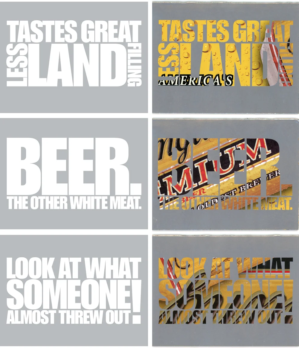
We began using packaging goods boxes for notecards by using large type text and printing the background in opaque silver ink. This allows the original printing on the boxes to show through as the type. Quite startling surface when you consider it is just one ink run.

It is the ultimate in recycling. Often we use the existing folds for the cards.

The winners and a sample. We always use Impact as the typeface. You need something bold to let some of the color from the carton show through well enough to read them. The positioning of the image in relation to the type is "whatever happens happens."

yuengling-cards-(3)-1000w.jpg

Here is a photo of us trimming out the board for the blank cards.

The drying rack. We were printing a number of other Boxcards at the same time so you see some non-Yuengling packinging mixed in.

Rainbow printing

PRINTING MULTIPLE COLORS at a time on a press designed to print only one color at a time can be tricky, but the results are often quite fun and visually exciting. What follows are photos and descriptions of a few projects we've tackled at Lead Graffiti to experiment with the letterpress version of rainbow printing.

By trying something a little different each time, we've been able to substantially increase the number of colors we can print simultaneously, as well as maintain clarity of individual colors over longer print runs.

  • Essential to all of these rainbow runs is removing the yoke from the vibrating roller of our Vandercook Universal III.

  • Another important tweak is allowing about 1/8" or so of manually pushing that same roller side-to-side in order to keep the stripes of the multiple inks smooth, given the various amounts of printing surface engaged by each color. How often you actually manipulate the vibrating roller is a personal call based on the actual image and results you are seeking.

  • The form rollers are engaged with the inking drum only just long enough to refresh the ink between prints in order to further reduce the amount of blending during the entire run.

APHA 2016 Calendar / July

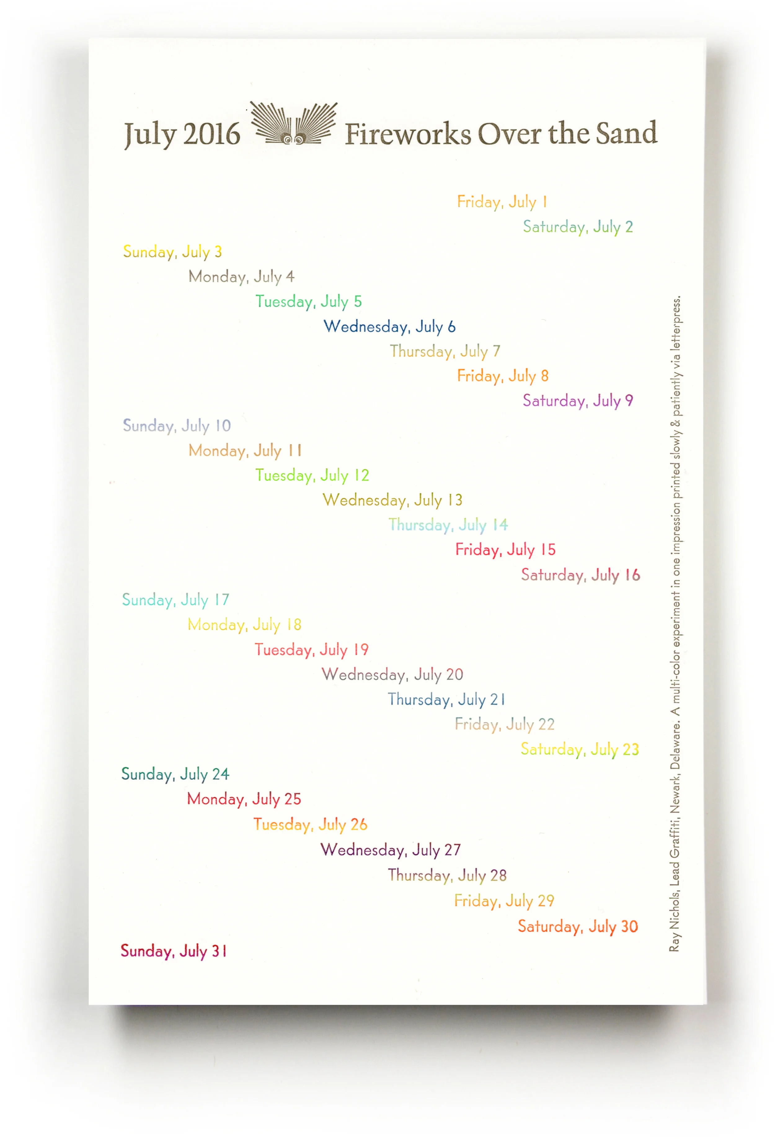
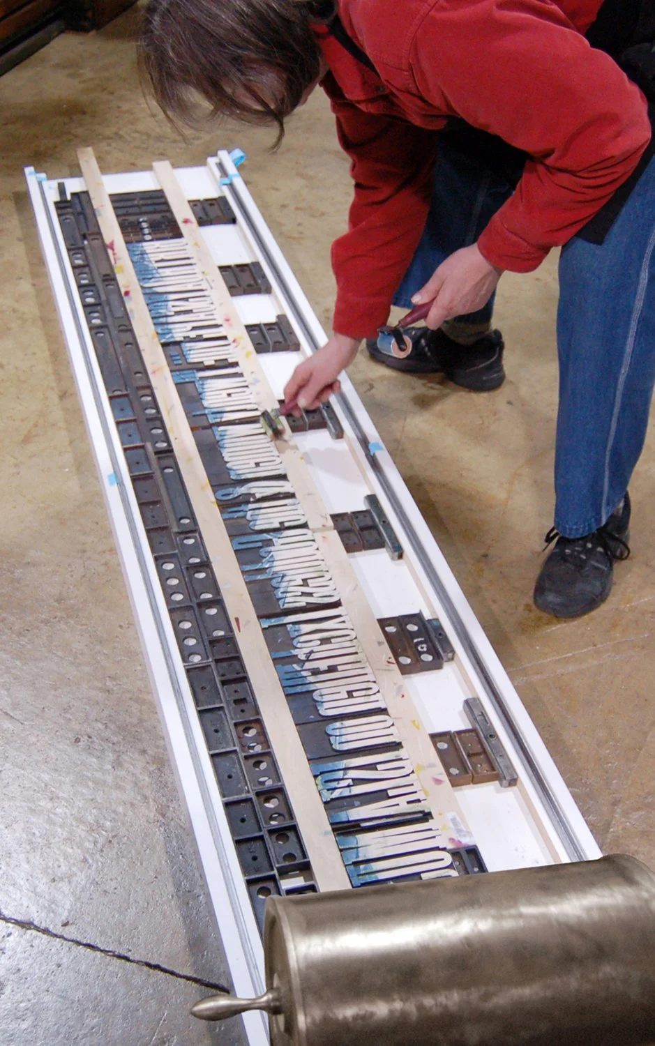
SO THIS IS RAY'S IDEA for the month of July in the 2016 calendar for the Chesapeake Chapter of the American Printing History Association: 31 days in 31 colors, all in one run. The photo at the top of this blog post shows the 31 colors and the type form which was cast as slugs on our Intertype linecaster. The size of the trimmed calendar page is 7" x 11".

Seems simple enough. A major time-consuming part was mixing up 31 distinctly different colors of ink. Since the lines of type were so close together, the corresponding stripes of ink had to be placed tightly side by side and with only the tiniest amount of ink applied to the rollers.

2016-july-rainbow.jpg
perforation-dots-w-shadow.jpg

APHA 2018 Calendar / August

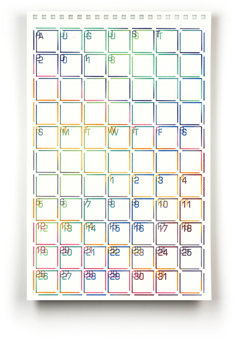
WANTING TO GIVE A DIFFERENT TWIST to rainbow printing for 2018, Ray decided to do a 2-run calendar page using about 6 - 8 colors each. The twist here was to print on a larger sheet of paper (about 14" x 18") and rotate the paper for each run.

The gripper edge was recut so that the exact same polymer plate could be printed the first time (as I remember it) rotated 30° and the second time rotated 60° in the other direction. It is a bit easier to follow the color change in the date numbers. The trimmed size of this calendar page is 7" x 11".

Using fewer bands of color allowed for each band to be wider. An issue we had to combat was individual bands of ink occasionally showed up as ragged zigzag edges on the calendar's date boxes. This was most likely due to applying a bit too much ink on those bands, and since the movement of the vibrating roller was severely restricted, excess ink tended to pile up in multiple tiny raised parallel ridges. Manually pushing the roller a tiny fraction from side to side between every other print (versus every 5 prints) helped smooth the ridges until the ink leveled out.

apha-2018-ray-august.jpg

Porter Garnett collection

Things in the Lead Graffiti collection that connect directly with Porter Garnett and may have important significance to Lead Graffiti.

Booklet : Sixty Five Years of Fine Printing at Carnegie : Exhibit at Carnegie Mellon University Libraries' Fine and Rare Book Room Pittsburgh, Pennsylvania

  • page 2 : This tilling of new ground prepared the way for a course in "Fine Printing" for September 1922.

  • page 3 : Within a few years after Carnegie Tech established a fine printing acytiviyy, facilities or courses were initated at New York University, Massachusetts Institute of Technology, Chicago Art Institute, and the Art Students League in New York.

  • page 4 : Formal dedication of the Laboratory Press took place April 17, 1923.

  • page 4 : the motto of the press : Nil vulgare, nil pertriti, nil inepti—nothing commonplace, nothing hackneyed, nothing inept.

  • page 4 : " . . . the Laboratory Press is, in the purest since of the term, a private press; and its purpose, being solely educational, it may be said to be the first private press to be dedicated exclusively to educational ends."

  • page 4 : "There is no word in English (or any other language I know) that means indestructability by means of beauty…" My word for this quality is beaumenance, from beau (bellus) and maneo. But call it what you will, it seems to me to be a think worth striving for."

  • page 18 : books / projets to look for 1) A documentary account of the beginnings of the Labortory press, CTI 1927; #21 the outlook for typography; #53 the Oop Unit; Selections from Poe's Marginalia, Decalogue, Jack the Ripper They Never Found Him.

Book : Philosophical Writings on the Ideal Book by Porter Garnett, compiled by Jack Stauffacher. A few notable callouts :

  • page 59 : "You may remember that I was not a believer in layouts for printing, preferring to work things out in my head." [Lead Graffiti has followed this philosophy of "think then do" since day 1]

  • page 68 : "Mr. Eric Gill, in his Typography, is also pertinent. 'There are then,' he says, 'two typographies, as there are two worlds, and apart from god or profits, the test of one is mechanical perfection, and the other sanctity–the commercial article at its best is simply physically serviceable and, per accidens, beautiful in its efficiency; the work of art at its best is beautiful in its very substance and, per accidens, as serviceable as any article of commerce.'"

  • page 70 : Figure 10

  • page 116 : "While I was in London I placed with Harrild & Company an order for two super-royal Albion hand-presses and conferred with Mr. (later Sir) Emery Walker regarding the making at a future date..."

  • page 126 : from a letter from P.G. 2 January 1930 - "What I have told you of the happenings of December 21st was sufficient for that day, don't you think? But what happened the day before? Well, my two hand presses were erected in Room 426 Frick Building. There I am established for the next three years, at least."

  • page 224 : "Probably the most ambitious publication of the Laboratory Press was The Fine book a symposium of essays and articles by various critics, artists, and craftsmen—Henri Focillion, Lewes Mumford and Valéry, Eric Gill, William Morris, T.J. Cobden-Sanderson....Of this book Ruth Shepard Granniss has Written, 'This is not a plea for machine process versus handiwork. A careful reading os the 'symposium' on the Fine Book, so beautifully and lovingly printed on the iron hand-press by Porter Garnett and his students of the Laboratory Press, teaches the futility of such a thing."

  • page 249 : photo caption of our Albion or its brother : The Laboratory's Albion unceremoniously abandoned in the Fine Arts Building, at Carnegie Tech (Carnegie Mellon Univerity), 1958.

2 copies of a booklet : A description of the catalogue of the Frick Collection, reprinting its introduction by Sir Osbert Sitwell .

by Standard, Paul and published by Frick Art Reference Library, Pittsburgh (1949)

About this Item: Frick Art Reference Library, Pittsburgh, 1949. Wraps. Condition: Very Good. 27 p. With a sheet from the Catalogue, and explanatory note by Paul A. Bennett laid in. Designed by Bruce Rogers & printed by Robert Haas at the Ram Press. Size: 31 Cm.

50 for Edna

Sheets for the Typophiles which contain an origional sheet from The Frick Collection Catalogue.

Three student projects from the 1920s.


CC52 : a year-long endurance photography project

with a little Lead Graffiti in the mix

Craig Cutler is a former student of Ray's and a renowned photographer based in New York City. In addition to his award-winning work for commercial clients, Craig regularly takes on personal exploratory photo/video projects to stay sharp. His latest effort, CC52, is a monumental personal challenge to shoot a new assignment each week for a year. And it is one of our favorites because Lead Graffiti got to contribute to Craig's project for 2 of those weeks.

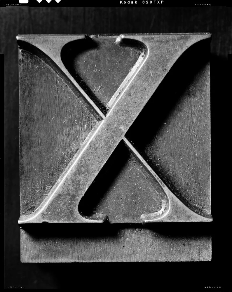
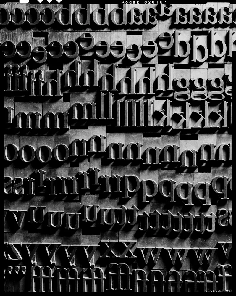
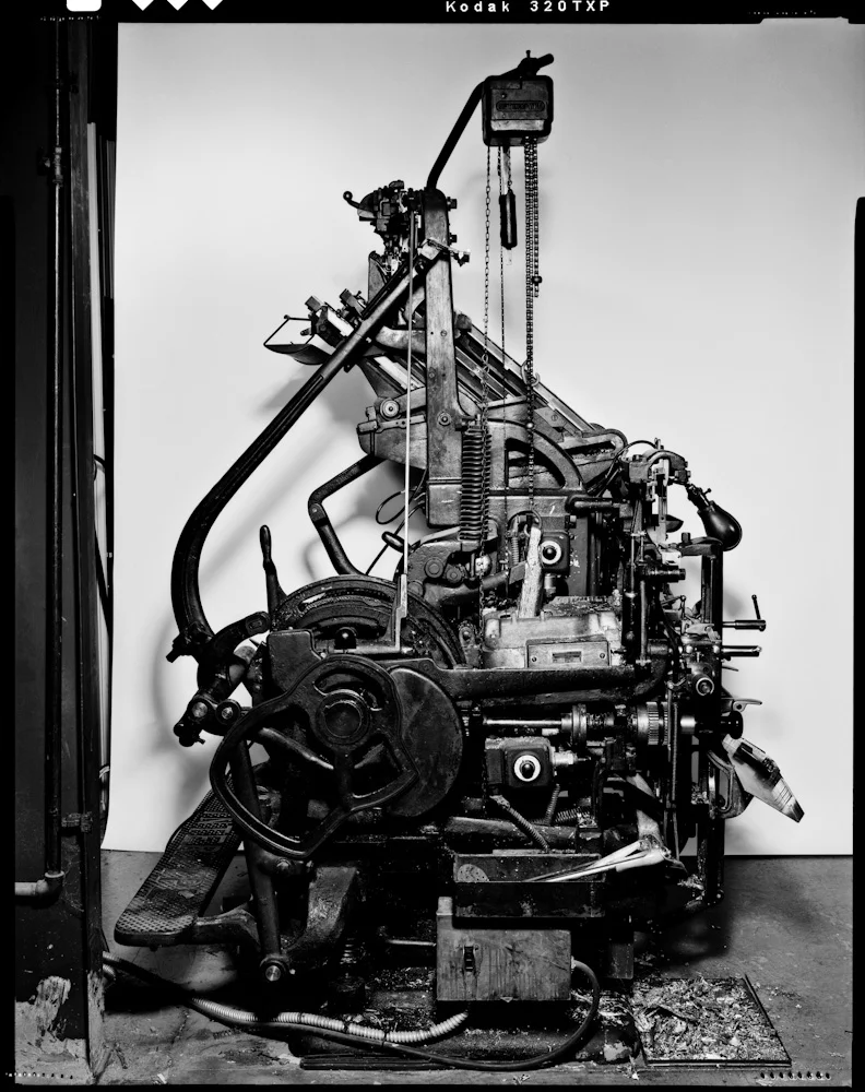
In his 49th week, Craig came to shoot wood, metal, grit, and grime in Lead Graffiti for 2 days. He poked around in every dark and dusty corner of our studio, documenting all sorts of letterpress goodies: a case of antique hand-carved letters, our uncommon 96-point Caslon metal, and an incredibly lit beauty shot of our Intertype C4 hot metal linecaster.

For the grand finale celebrating week 52, Lead Graffiti contributed several parts to his film, "Words." One of those parts was a flip book using hand-inked wood type printed slowly & patiently via letterpress. Another fun part was building a word out of matches and setting it on fire.

Below are 3 of Craig's photos from his Lead Graffiti studio shoot in Newark.

craig-cutler-cc52-caslon-x.jpg

Photo by Craig Cutler : 96-point Caslon X. At 20" x 24," this photo takes the term "super sized" to a whole new dimension.

craig-cutler-cc52-galley-of-garamond.jpg

Photo by Craig Cutler : Galley of lowercase Caslon. Too large for a California job case, this 96 point Caslon rests in several galleys. As you can see, it includes lots of classic ligatures.

craig-cutler-cc52-intertype.jpg

Photo by Craig Cutler : Intertype C4 .inecaster. This is beauty and the beast in one incredible shot.

Craig was having an exhibition of the work in Manhattan and asked if there was a way we could produce a piece that would function as a keepsake. One of the remarkable things about letterpress is the ability to create projects with many pieces in small runs. Craig ran out a series of 100 prints of each of 8 images from his year's effort. We produced a folder to hold each photo in each series which were given out at the exhibition.

We printed Craig's name and project name (CC52) onto the folders which held one loose image. We could easily print just the name of the particular image and the appropriate week's number.

Turned out to be a lovely way to contribute to the work of an important person in our lives and to connect with some seriously creative imagery.

CC52 : the big ending

Craig Cutler pulled out all of the stops on the final week of his year-long personal series. Lead Graffiti’s contributions run from 1:34 - 1:46, 2:02 - 2:11, and 2:17 - 2:25 in the 3.48 film. Check it out.


An Essay on Typography by Eric Gill

QUESTION FOR STUDENTS : How long would you work on your computer before you looked for a way to do something different to something fundamental, instead of using the default option that is automatically engaged?

perforation-dots-w-shadow.jpg

TYPOGRAPHY PROJECT IDEA FOR TEACHERS : Ask students to devise 5 different ways to place a period at the end of a sentence (vertically centered dot, space before the period, new shape, etc.). What context might cause you to do something specific? Try doing this for anything that is generally considered a rule and isolate the best options for consideration.

Another personal observation is the weight of a footnote's number or other symbol within the text; I seldom notice the superscript number while reading the book. Then when I see a footnote which interests me, I have to scan the entire page to find the bit of text it refers to. Shouldn't this be easier?

perforation-dots-w-shadow.jpg

THE GENERAL BASIS FOR THIS BLOG ENTRY should offer exciting viewpoints for students and teachers. Ray speaking here: I suspect that most designers today, working with computers, don't experiment with certain types of detail, given that the processor applies rules to typography so evenly. But when you are composing with metal type, you run into physical obstacles that cause you to consider options that might not typically come to mind in the digital world.

A particular letterpress-printed book got us to start thinking more seriously about taking back control of the way we set type. Eric Gill's An Essay on Typography offers a fascinating look at the thought processes of someone with masterful control over his typography. Gill set the type in this small book in a flush left / ragged right style. This was one of the first times text in a book was set unjustified, which in itself seems like a late development in the history of books.

Before movable type was common, scribes often invented contractions to help create justified type. I know that in my writing I tend to try to avoid contractions.

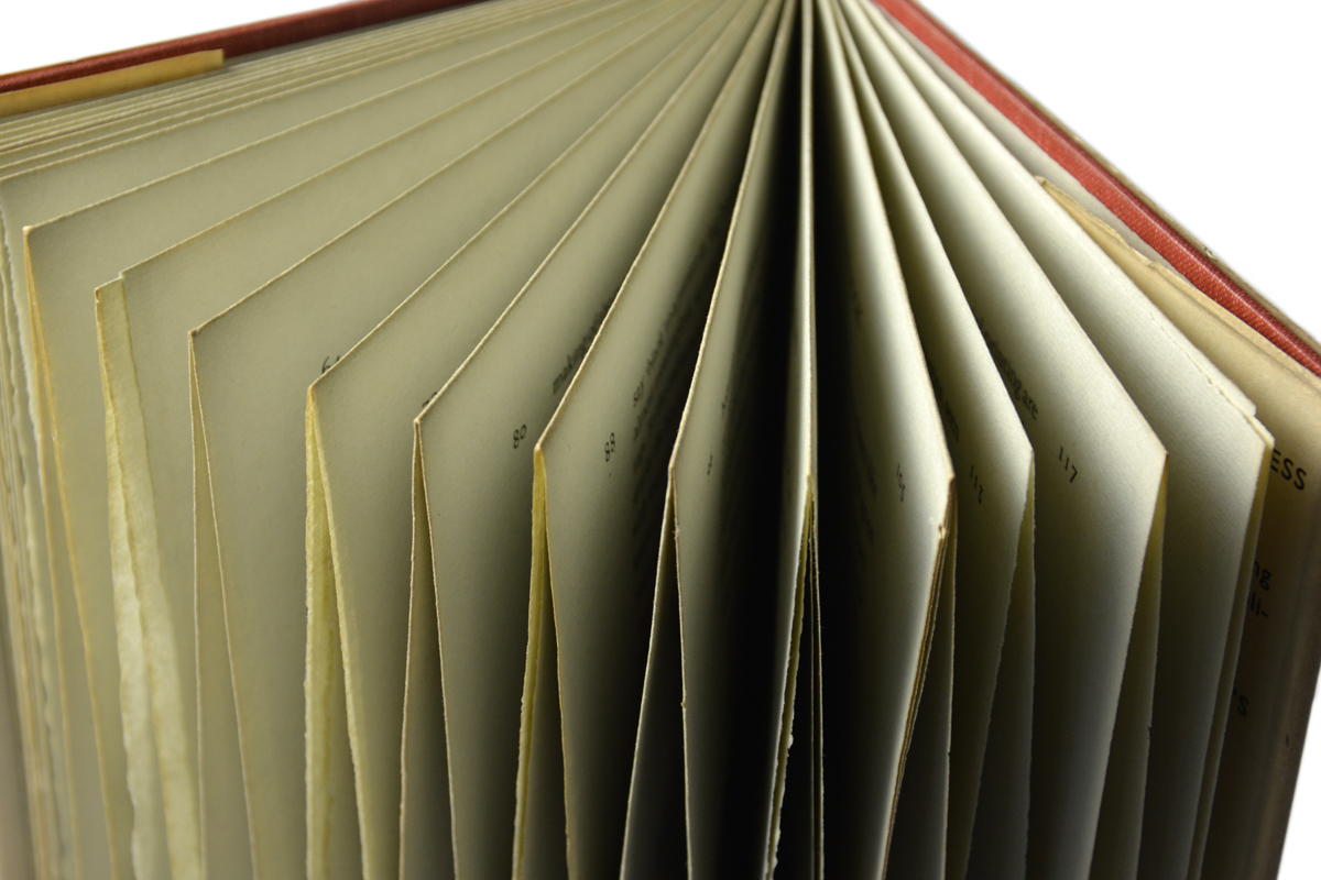
Our particular copy of Eric Gill's classic essay is a first-edition that is "uncut." The printed sheets of the book were gathered in pairs, then folded twice to make signatures of 16 pages each, and never slit open or trimmed across the tops of the pages before being sewn and cased into a hardcover. Consequently, you can only fully open the first and last pages and the center spread of each signature.

This image shows the uncut (untrimmed) pages.

This image shows the uncut (untrimmed) pages.

Gill's Condensed Words  

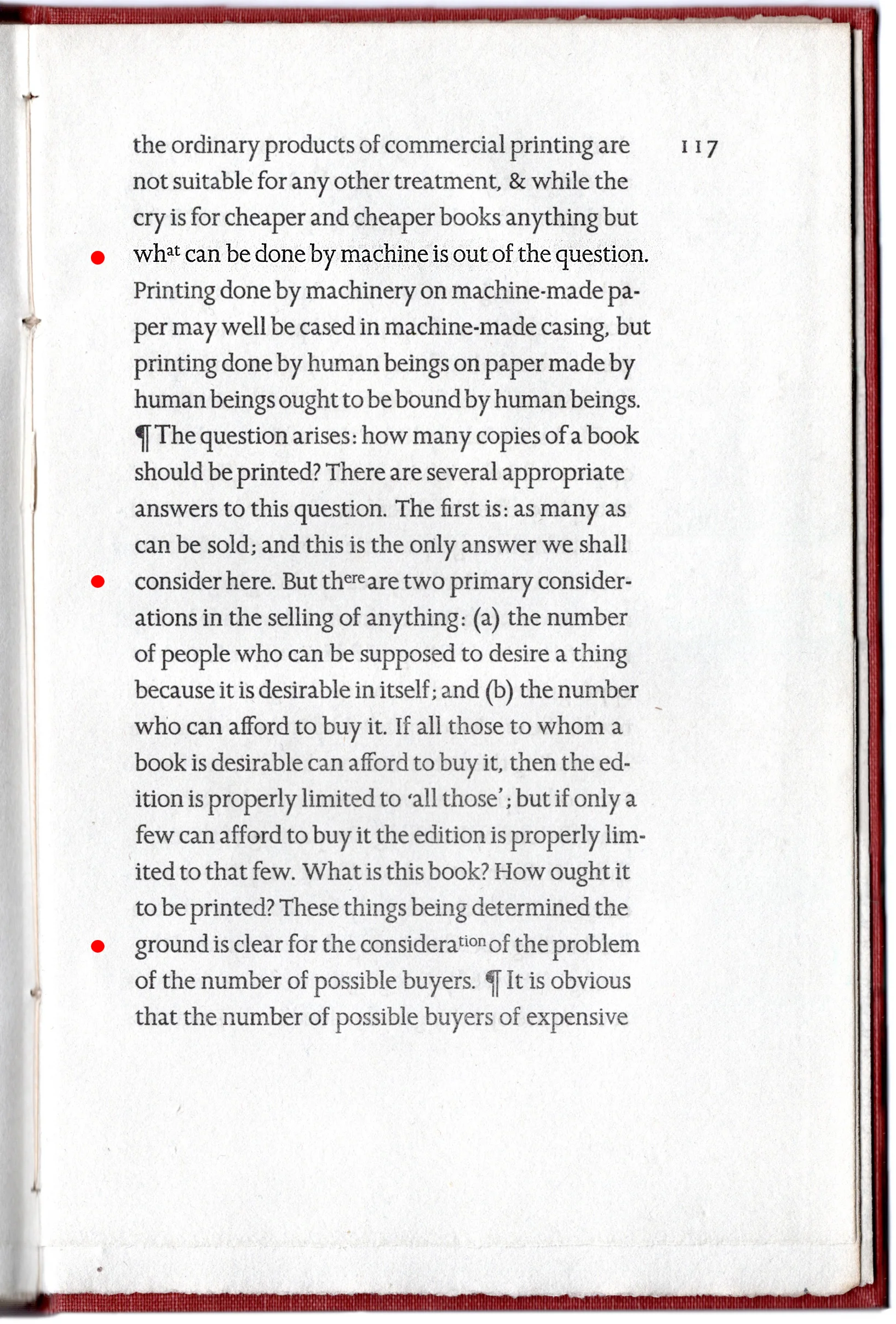
GILL MADE AN UNUSUAL DECISION in order to maintain a smoother ragged right edge in his page composition. He used smaller, yet not quite superscript-sized, letters to help crowd words onto a line to get as close to justified as he could, without artificially altering the word spacing.

The lines below are taken randomly from the text of Gill's book. They do not connect, so view them individually.

contraction-tion-2.jpg
contraction-tion.jpg

These first two examples condense the letters "tion", one in the middle of the line and one at the end. The smaller type, raised above the main baseline, almost appears to be a superscript.

contraction-at.jpg
contraction-ere.jpg
contraction-om.jpg

The 3 examples above are located more in the middle of the line and involve fewer letters. The main idea seems to be to keep the beginning of a word in the larger type to help with readability, while using the smaller sized type for the ends of words to aid spacing.

contraction-ny.jpg

Above, another example with the condensed letters at the end of the line.

contraction-y.jpg

The last example above shows the strangest contraction (to our eyes) where the word "very" is abbreviated "vy." Also note there is no apostrophe, which typically is used to indicate missing letters. The single superscript letter being a Y has the added visual quality of almost reaching the baseline, giving it a graceful balance.

Out of our book's 120 pages, we can actually only easily read about 20 of them because it's pages are uncut. We're looking for another 1st edition to examine it more thoroughly. We happen to have a 4th edition copy, which has an added chapter at the end and does not include any of these unusual typographic features. It also includes quotation marks, which we  discuss below. 

The full page shown here provides a good idea of how well Gill's condensed words work for establishing visual balance with a gently ragged right edge versus the awkward word spacing usually encountered with justified edges. The red dots indicate lines that have a contraction in them.

essay-full-page.jpg

We often remind students to avoid deferring to the default settings that are supplied continuously by the computer. We suspect it takes a great deal of focus on a substantial amount of typography before students feel comfortable experimenting to this degree, offering another example of the typographic genius of Eric Gill.

Gill's Quotation Marks

AS WE'VE GOTTEN DEEPER INTO LETTERPRESS, our research has shown us many things that we like and find curious. One of those things is the different ways punctuation can be used. Yet another example from An Essay on Typography is Gill's use of quotation marks. When using single quotes, Gill positions the first one lower than the second. We like the touch of typographic detail this displays.

We'll need to look for any variations, such as

  • Does anything change if the word is capitalized?

apostrophe-mass.jpg

It would be nice to ask Gill precisely what he is seekng, or is he just experimenting or playing with the single quotes by positioning them at two different levels.

apostrophe-hand.jpg

We were wondering what might happen if a word was capitalized, but this example which has an initial letter with an ascender probably answers that question.

apostrophe-right-wrong.jpg

This was just an interesting example of two words in such proximity.

An Essay on Typography was the first historically important and expensive book we bought for our collection.


There is stuff out there

I want to write this entry for our blog for a couple of reasons.

There is real stuff in the real world, not just images on a website or photos in a book. I'm a firm believer in the need for people to collect a vocabulary of experiences to form a kind of dictionary-like format that you can pull from when a problem in search of a solution rears its ugly head.

Most notably for students there are ways to experience
Books, movies, are not things. Fact.
These aren't right, so think them out a bunch more.

Avant Garde : Part 1 / Bernie Herman

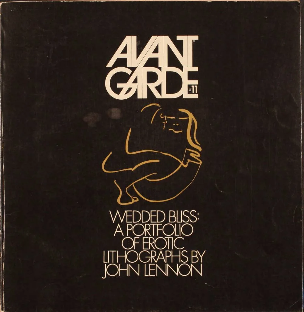
I was sitting quietly at home, and I got a phone call from my friend Bernie. He was up in Chadds Ford at an antique store and had come across a copy of the 1960s magazine, Avant Garde. Avant Garde was a highly controversial, sexually-oriented magazine, published by Ralph Ginsburg and designed by Herb Lubalin, one of the most highly regarded designers of the 1960s. The magazine was a norm breaker. No advertising. Provocative. Visually groundbreaking. The issue Bernie had found was the Wedded Bliss : A Portfolio of Erotic Lithographs by John Lennon issue.

avantgarde11-cover-1000x1024.jpg

I hopped in the car and drove the 25 miles to the antique store, and as planned there was the issue. $20. I bought and returned home with a slightly stunned sense of surprise that things like this that, at the time I would only see in a design history book are sitting out there, for real, somewhere. 

Back in the 60s my university friend Tim's mother had a subscription to Avant Garde, so I had seen several of the issues. Also, to say the least Tim's mom was the coolest mom on the planet. Once, soon after moving to Delaware, I heard that you could call up books and magazines in the Library of Congress. You couldn't check them out, but they would bring them to you.

I drove the 100 miles to Washington for an afternoon to gaze firsthand on magazines designed by Lubalin. Avant Garde. Fact. Eros. It was a fabulous way to spend an afternoon. 

The fact that they might sit on a "for sale" shelf took me by surprise.

A few years later I found out that they had a complete set of Avant Garde right in Special Collections at the University of Delaware Library.

Avant Garde part 2 : Portland, Maine

Jill and I were in Portland, Maine, to connect with Amelia, a friend from Houston, Texas. The 450-mile drive from Newark, Delaware, had taken less time than we expected. With the extra time, we were walking around town and came across a bookstore. After 25 minutes without finding anything we couldn't live without, we were just walking out the door. The owner / clerk wished us a good day in an incredibly sincere way that immediately made me feel bad that I hadn't bought anything.

Chadds Ford came to mind.

"You don't, by any chance, have any copies of Avant Garde, do you?

"I should have 5 or 6 in a box in the back of the room." He had 7 @ $7.50 each. I bought them.

Avant Garde part 3 : still in Portland, Maine

Starting to walk out of the store for the second time, I asked, "You don't know of another store around here that might have more of the magazines, do you?"

"I know a guy that used to have some." He dug through his Rolodex and gave me his phone number.

In the meantime, Amelia and her friend had caught a taxi over to where we were.  We tried our new lead, calling from the store's phone. Nothing. We grabbed a quick bite to kill a bit of time, and as we were driving out of Portland, we stopped at a 7-Eleven that had a pay phone on the side of the building. Jill and I had a conversation about how much I could pay to complete the set. We settled on $400.

A man answered. We told him the story about how we had come to call him. "Do you have any issues of Avant Garde for sale." "Yes."

“Can I tell you which issues I  have and see if you have any that I don't have."

He agreed, and I read out the numbers of my copies. After I finished, he said he had all of the ones I didn't have. It turns out that he had the whole set, but didn't want to break them up. Then he started talking about how rare they were, and I could feel the price going up.

I studdered a bit and asked how much he wanted for them.

"They are pretty rare, so I would need seven fifty," he said. My quick in-my-head math told me that was $300 more than Jill's and my agreed upon high.

I asked, "For the set." He says, "No. Each."

Hmmm. $7.50 and not $750.00.

Hmmm. $105.

"Can we drive to where you are?" "No, I'll come to the 7-Eleven."

We looked through the box in the back of his Jeep, and sure enough, the whole set was there. I got bold and asked if he would be willing to take a check, hoping I could save our cash for the rest of our trip. He said, "Sure." I pulled out my idea for identification. He said, "Do you think I thinksomeone is going to cheat me in a parking lot over a magazine deal for a set of Avant Gardes?"

After I got back home I gave the 7 doubles to my friend, Martha, and I still have my complete set.

The original John Lennon issue strangely had a second version of the cover. So I  have the full 15 issues.

A couple of years later I had the chance acquire a copy of the prototype for Avant Garde, so now our collection has the "complete" complete set.

Nowadays it is easy to just look on AbeBooks.com, but the search that day was fabulous.

perforation-dots-w-variable-shadow.jpg


Life magazines in the mall

Jill and I were walking through Christiana Mall one afternoon. In the hallways of the mall they had a lot of pop-up shops selling antiquest. One was a guy who was selling Life Magazines,. His sign said “Buy your birthdate.

I looked, but they didn’t have my date. Life Magazine was a weekly back in those days so your odds immediately dropped to 1:7 that your birthday would come up. I passed on just getting the right week, which he had, and moved on down the mall.

A couple hundred feet farther along there was another booth selling old ads. He had thousands of them, divided into hundreds of categories. I taught advertising design and looked through “Automobiles : Volkswagen” to see if there were any early VW ads, especially looking for “Think Small” and “Lemon”, two of the most highly creative ads of the 1960s. No luck and we started moving on through the mall.

A bit farther along the math hit me relating to the lucky happenstance of those 2 stores being there that day. If I knew what ads were in which Life Magazines (the VW ads always ran in Life and Time magazines) then I could buy the exact ads I wanted by just buying the magazine.

I asked Jill if she would be willing to go with me to the University of Delaware Library and look through microfilm of Life Magazines to find “Think Small” and “Lemon.”

“No problem” and off we went.

I knew that the VW year that marked the start of the campaign was the 1960 model year. So we started looking at Life Magazines starting in July of 1959 to be sure we caught the beginning of the model year which typically was in September. We found the first VW ad in an August issue. We found “Think Small” in a February issue and “Lemon” in April. Back to the mall.

I told the guy what I was looking for and asked if I could look through the issues I thought they might be in. All of the magazines were in plastic sleeves that were taped shut. He had both issues and both ads were in there as expected. We spent most of the next week looking through microfilm.

Each Life Magazine probably averaged something like 120 pages. We looked through magazines from July 1959 through 1972. That is about 81,250 pages of Life Magazine. We would put a reel of microfilm in the machine and just crank through it about half the speed you could do if you were flying. It was surprisingly easy to see a VW ad. Always black and white. Very distinct layout. You could easily see other advertisers who were trying to copy them.

I ended up buying about 250 copies of Life Magazines from the guy. All with different VW ads in them. Still have them. He sold them for a price that was dependent on the cover. I would pay from $10 to $75 for each magazine. Boatload of cash in total.

perforation-dots-w-variable-shadow.jpg

Doves Press Bible Genesis 1 : 1

It was my 60th birthday. I was thinking about buying something cool for my own birthday present. Something printing by the Doves Press came to mind. I went on ABEbooks.com to see if there was a copy of the Doves Bible. I set the website to show most expensive items first (to make sure you are looking at the good ones) from most expensive was a copy for $23,000. Hmmm. MaybeF a bit more than I was ready to spend. But in looking through all the listings there was another that caught my attention.

For $1,000 there was a folio (folded sheet providing 4 pages), 1 of which was Genesis 1 : 1, widely considered to be one of the dozen most beautiful pages ever printed. It was being offered by a NYC bookseller. Well it was my birthday, but that was a lot for a single sheet of paper. I heed and hawed about it for a week or so.

In the meantime my daughter, Terre, invited Jill and I to New York, where she lived, so she could give me my birthday present in person. We set that up to get together on Friday, March 17, St. Patrick’s Day. My birthday was on March 6. We reserved a room at the Chelsea Hotel (our favorite place to stay in the city) for the weekend.

Every day I would check on Genesis 1 : 1. About a week ahead of going to NYC it was gone.

Related to the present she was going to give me she said, “Don’t try to Google it!” So first thing I did was Google it. You should know is that Terre and I liked to go to rock concerts together, and my favorite place to go was Madison Square Garden. Stevie Ray Vaughn, U2 (twice), Radiohead, Coldplay, Paul McCartney, Jeff Beck. Nothing scheduled for the 17th. Hmmm. Finally, pay dirt. The Allmann Brothers were playing at the Beacon Theater. Must be it.

Terre said meet her up near 57th Street and we would go get the present. We slowly made our way from 22nd Street, making several phone calls along the way while wadung through St. Patrick’s Day crowds, Terre was getting slowly more and more insistent that we hurry. Finally, getting there, Terre met us on the street and ask us to fome up while she finished up doing whatever it was that she was doing.

She had said she was helping some friends that ran a redoreing studio help set up for a party they were throwing. We walked into the slighty open door. Whoa, I knew someone that was there. Then someone else. Then another. The room was full of about 200 former students. Honestly, my eyes sfanned the room for the Allmann Brothers. Bummer, they didn’t seem to be there. Maybe that was going to be for later.

perforation-dots-w-variable-shadow.jpg

Mueller-Brockmann

perforation-dots-w-variable-shadow.jpg

Gill Sans original tissues / St. Bride Printing Library