Thank yous

Explain why you need them. Main issue is to include something that says you heard something that was said.

Amount of work should reflect the value of what you received.

  • 6" x 4" postcards (not sure what these are)

  • My thank you to Craig Cutler for lighting equipment

  • Thank you for the Garamond, Roland Hoover

  • Happy birthday Roland Hoover

Thank yous from others

  • Jim Culley's books for Werkman experience for his grandchildren

  • Ann Lemon's "100 things Ray taught me"

Link to a good artlcle in MentalFloss about 7 Smart Tips for Writing a Proper—and Professional—Thank You Note.

Sandcasting at the Type Museum / London

While on a study abroad program in 2004 with 2 dozen students from the Visual Communications Group at the University of Delaware, Ray visited the Type Museum. The museum had been interested in getting someone in to demonstrate sandcasting large metal type, a process that hadn't been used for 150 years.

Ray said he would pay for it if the group got to watch. We had an early model Nikon camera with digital video capabilities allowing us to shoot in 3 minute segments, after which it would store the video, allowing you to shoot another segment.

Ray finally got around to editing the pieces togethe,r and as it turns out works quite well, documenting the process that probably hasn't been seen since.

Yuengling Boxcard™ facebook competition

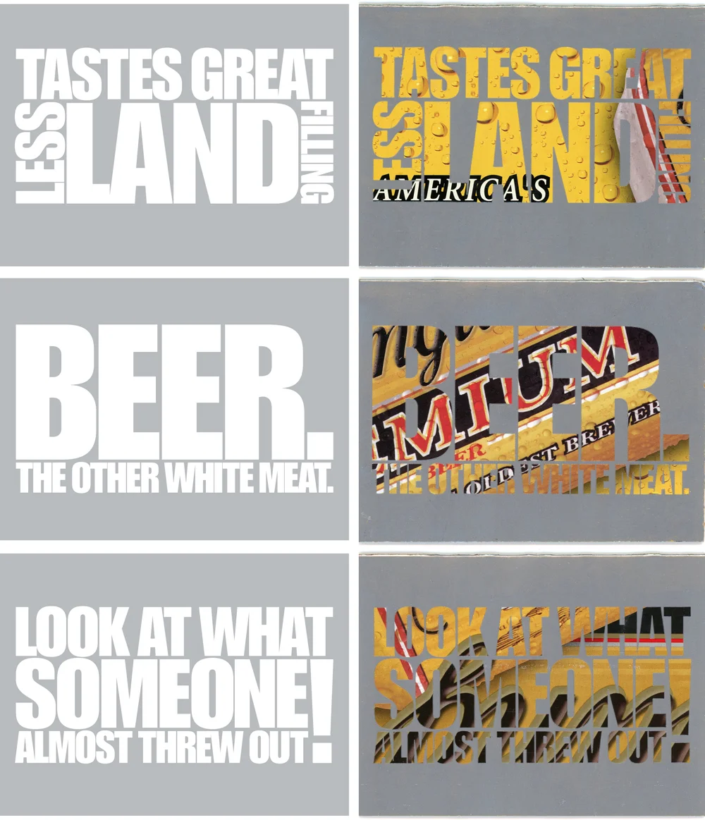
We wanted to find a way to connect to the people who were following us on Facebook. We proposed a competition to write the text on the cards with the top 3 getting their cards printed along with receiving 24 of the cards.

Project stepping stones

A greeting card project we've loved doing for a decade we call "Boxcards."

  • We were trying to figure out a way to more directly connect with people who followed us on Facebook.

  • A friend who likes Yuengling gave us FIFTY case cartons from Yuengling beer

We began using packaging goods boxes for notecards by using large type text and printing the background in opaque silver ink. This allows the original printing on the boxes to show through as the type. Quite startling surface when you consider it is just one ink run.

It is the ultimate in recycling. Often we use the existing folds for the cards.

The winners and a sample. We always use Impact as the typeface. You need something bold to let some of the color from the carton show through well enough to read them. The positioning of the image in relation to the type is "whatever happens happens."

yuengling-cards-(3)-1000w.jpg

Here is a photo of us trimming out the board for the blank cards.

The drying rack. We were printing a number of other Boxcards at the same time so you see some non-Yuengling packinging mixed in.

Rainbow printing

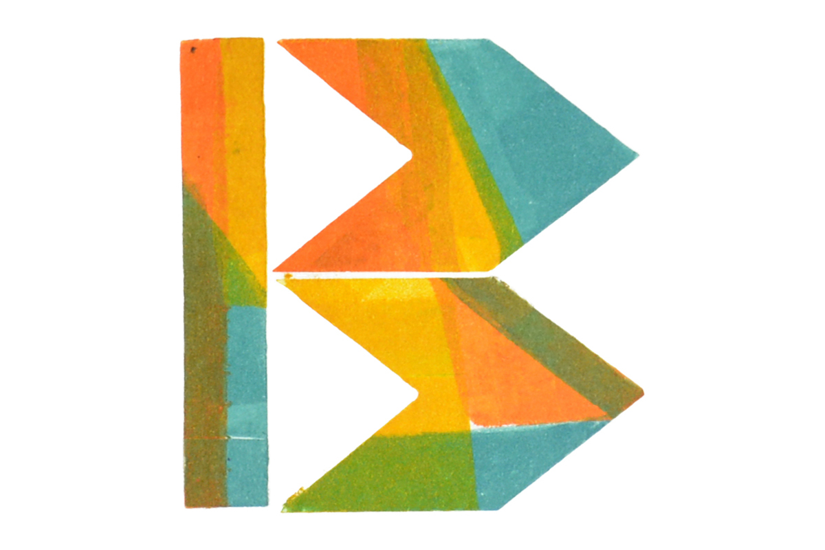
PRINTING MULTIPLE COLORS at a time on a press designed to print only one color at a time can be tricky, but the results are often quite fun and visually exciting. What follows are photos and descriptions of a few projects we've tackled at Lead Graffiti to experiment with the letterpress version of rainbow printing.

By trying something a little different each time, we've been able to substantially increase the number of colors we can print simultaneously, as well as maintain clarity of individual colors over longer print runs.

  • Essential to all of these rainbow runs is removing the yoke from the vibrating roller of our Vandercook Universal III.

  • Another important tweak is allowing about 1/8" or so of manually pushing that same roller side-to-side in order to keep the stripes of the multiple inks smooth, given the various amounts of printing surface engaged by each color. How often you actually manipulate the vibrating roller is a personal call based on the actual image and results you are seeking.

  • The form rollers are engaged with the inking drum only just long enough to refresh the ink between prints in order to further reduce the amount of blending during the entire run.

APHA 2016 Calendar / July

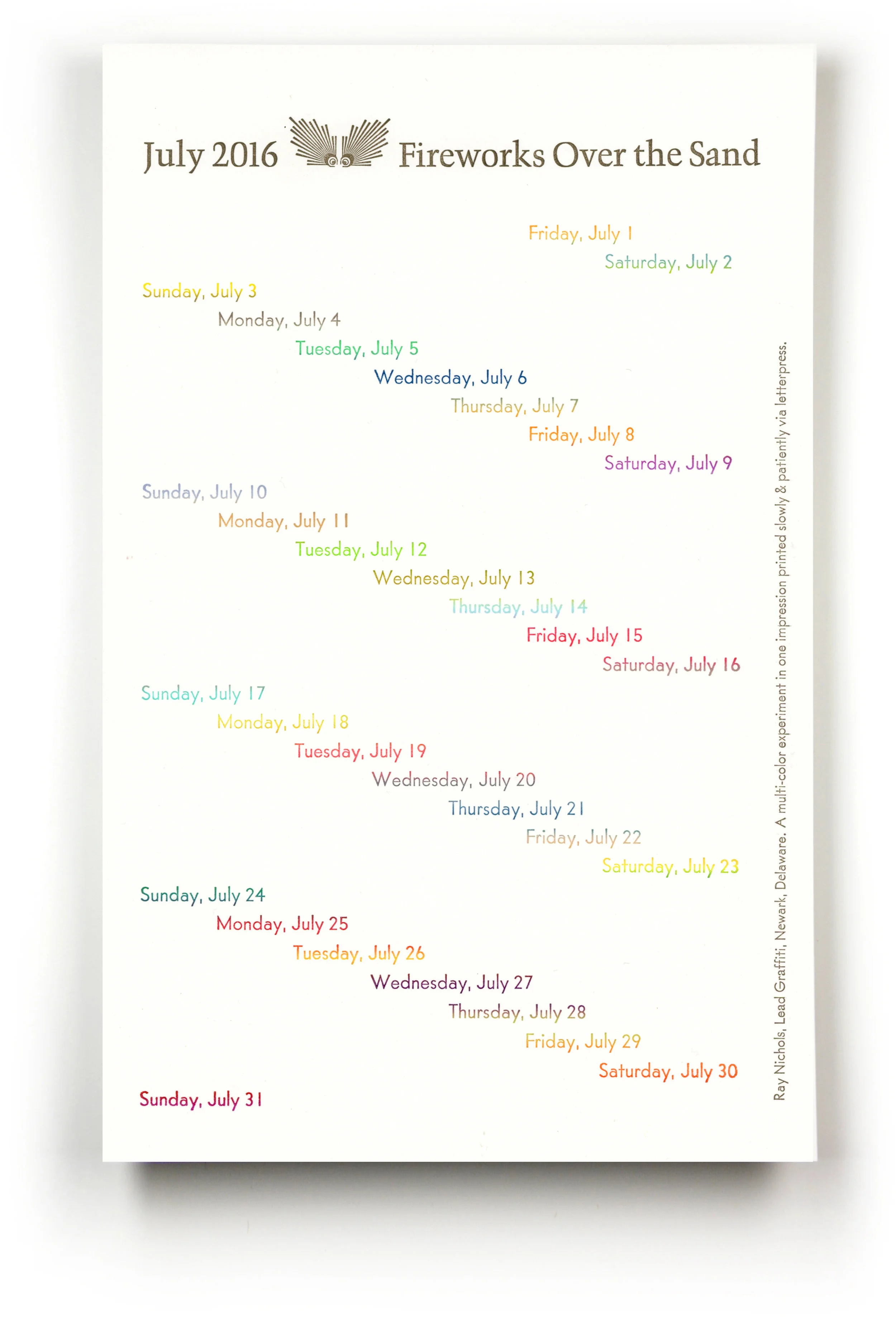
SO THIS IS RAY'S IDEA for the month of July in the 2016 calendar for the Chesapeake Chapter of the American Printing History Association: 31 days in 31 colors, all in one run. The photo at the top of this blog post shows the 31 colors and the type form which was cast as slugs on our Intertype linecaster. The size of the trimmed calendar page is 7" x 11".

Seems simple enough. A major time-consuming part was mixing up 31 distinctly different colors of ink. Since the lines of type were so close together, the corresponding stripes of ink had to be placed tightly side by side and with only the tiniest amount of ink applied to the rollers.

2016-july-rainbow.jpg
perforation-dots-w-shadow.jpg

APHA 2018 Calendar / August

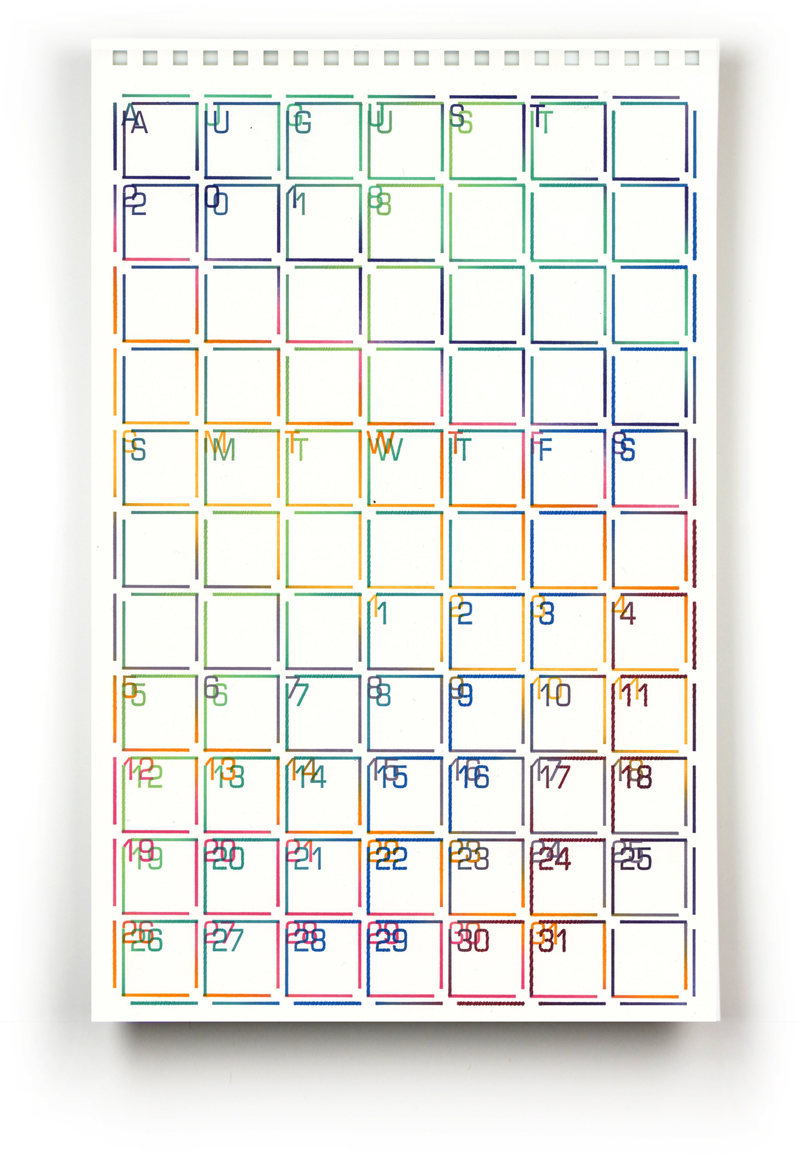
WANTING TO GIVE A DIFFERENT TWIST to rainbow printing for 2018, Ray decided to do a 2-run calendar page using about 6 - 8 colors each. The twist here was to print on a larger sheet of paper (about 14" x 18") and rotate the paper for each run.

The gripper edge was recut so that the exact same polymer plate could be printed the first time (as I remember it) rotated 30° and the second time rotated 60° in the other direction. It is a bit easier to follow the color change in the date numbers. The trimmed size of this calendar page is 7" x 11".

Using fewer bands of color allowed for each band to be wider. An issue we had to combat was individual bands of ink occasionally showed up as ragged zigzag edges on the calendar's date boxes. This was most likely due to applying a bit too much ink on those bands, and since the movement of the vibrating roller was severely restricted, excess ink tended to pile up in multiple tiny raised parallel ridges. Manually pushing the roller a tiny fraction from side to side between every other print (versus every 5 prints) helped smooth the ridges until the ink leveled out.

apha-2018-ray-august.jpg

CC52 : a year-long endurance photography project

with a little Lead Graffiti in the mix

Craig Cutler is a former student of Ray's and a renowned photographer based in New York City. In addition to his award-winning work for commercial clients, Craig regularly takes on personal exploratory photo/video projects to stay sharp. His latest effort, CC52, is a monumental personal challenge to shoot a new assignment each week for a year. And it is one of our favorites because Lead Graffiti got to contribute to Craig's project for 2 of those weeks.

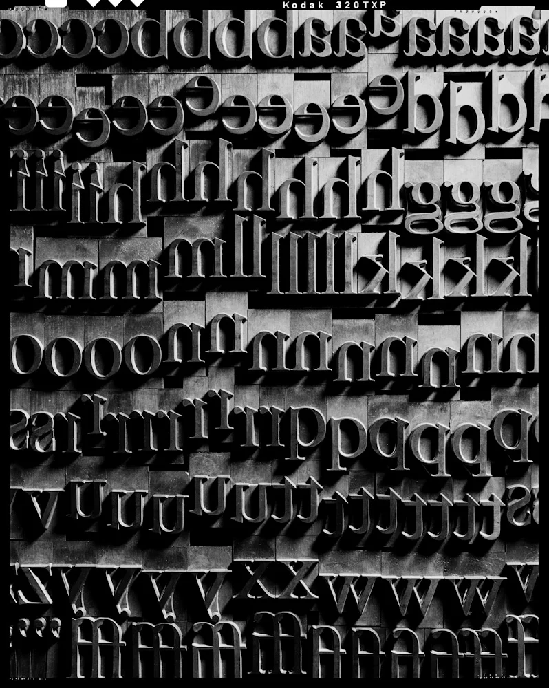
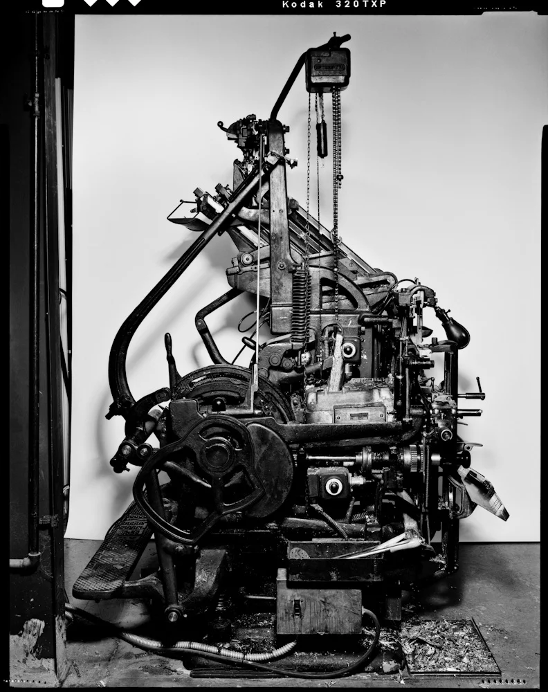
In his 49th week, Craig came to shoot wood, metal, grit, and grime in Lead Graffiti for 2 days. He poked around in every dark and dusty corner of our studio, documenting all sorts of letterpress goodies: a case of antique hand-carved letters, our uncommon 96-point Caslon metal, and an incredibly lit beauty shot of our Intertype C4 hot metal linecaster.

For the grand finale celebrating week 52, Lead Graffiti contributed several parts to his film, "Words." One of those parts was a flip book using hand-inked wood type printed slowly & patiently via letterpress. Another fun part was building a word out of matches and setting it on fire.

Below are 3 of Craig's photos from his Lead Graffiti studio shoot in Newark.

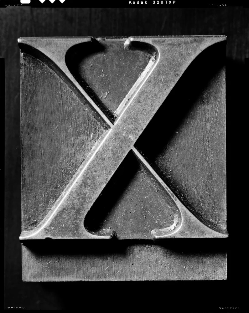
craig-cutler-cc52-caslon-x.jpg

Photo by Craig Cutler : 96-point Caslon X. At 20" x 24," this photo takes the term "super sized" to a whole new dimension.

craig-cutler-cc52-galley-of-garamond.jpg

Photo by Craig Cutler : Galley of lowercase Caslon. Too large for a California job case, this 96 point Caslon rests in several galleys. As you can see, it includes lots of classic ligatures.

craig-cutler-cc52-intertype.jpg

Photo by Craig Cutler : Intertype C4 .inecaster. This is beauty and the beast in one incredible shot.

Craig was having an exhibition of the work in Manhattan and asked if there was a way we could produce a piece that would function as a keepsake. One of the remarkable things about letterpress is the ability to create projects with many pieces in small runs. Craig ran out a series of 100 prints of each of 8 images from his year's effort. We produced a folder to hold each photo in each series which were given out at the exhibition.

We printed Craig's name and project name (CC52) onto the folders which held one loose image. We could easily print just the name of the particular image and the appropriate week's number.

Turned out to be a lovely way to contribute to the work of an important person in our lives and to connect with some seriously creative imagery.

CC52 : the big ending

Craig Cutler pulled out all of the stops on the final week of his year-long personal series. Lead Graffiti’s contributions run from 1:34 - 1:46, 2:02 - 2:11, and 2:17 - 2:25 in the 3.48 film. Check it out.