• intro
    • bios
    • 12 DNA projects
    • callouts
    • our lab
    • contact
  • calendar
    • subscriptions
    • workshops
    • fine press books
    • broadsides & posters
    • cards
    • Cinderella stamps
    • Blank books by Lead Graffiti
    • Blank books by Anne Hessel
    • Tour de Lead Graffiti 2011-15
    • letterpress things for sale
    • New Products
    • STUDIO SUBSCRIPTIONS
    • TECHNICAL LETTERPRESS
    • . . basic type composition
    • . . vandercook
    • . . iron hand press
    • . . floor-model platens
    • . . week-long letterpress
    • CREATIVE LETTERPRESS explained
    • . . meander book online
    • . . werkman druksels
    • . . quotable broadside
    • . . holiday card
    • press rental
    • BOOKMAKING explained
    • . . bookmaking basics
    • . . 6-pocket accordion
    • . . one day one book
    • . . coptic stitch
    • . . clamshell
    • . . paste paper
    • . . bookmaking bonanza
  • blog
  • search
Menu

Lead Graffiti

120 A Sandy Drive, Sandy Brae Industrial Park
Newark DE 19711
Phone Number
a letterpress lab of sorts

Your Custom Text Here

Lead Graffiti

  • about
    • intro
    • bios
    • 12 DNA projects
    • callouts
    • our lab
    • contact
  • calendar
  • store
    • subscriptions
    • workshops
    • fine press books
    • broadsides & posters
    • cards
    • Cinderella stamps
    • Blank books by Lead Graffiti
    • Blank books by Anne Hessel
    • Tour de Lead Graffiti 2011-15
    • letterpress things for sale
    • New Products
  • workshops
    • STUDIO SUBSCRIPTIONS
    • TECHNICAL LETTERPRESS
    • . . basic type composition
    • . . vandercook
    • . . iron hand press
    • . . floor-model platens
    • . . week-long letterpress
    • CREATIVE LETTERPRESS explained
    • . . meander book online
    • . . werkman druksels
    • . . quotable broadside
    • . . holiday card
    • press rental
    • BOOKMAKING explained
    • . . bookmaking basics
    • . . 6-pocket accordion
    • . . one day one book
    • . . coptic stitch
    • . . clamshell
    • . . paste paper
    • . . bookmaking bonanza
  • blog
  • search

"It's a Small World" : Lead Graffiti’s contributions

January 21, 2019 Ray Nichols
il-pluet-stillife.jpg

⬆ IT’S A SMALL WORLD is a 5” x 7”, collaborative book that has been produced annually since 1952. Lead Graffiti has produced pages off and on since 2012. The image above is our favorite page which is project #2 below.

Project #1 : Just our type of rain

IASW-rain-poem-1-front-back-1200x848.jpg

THE IMAGE ABOVE SHOWS LEAD GRAFFITI’S FIRST DIVE into the project. We had recently discovered that our Intertype C4 had a lever we could switch to cast multiple copies of the same line of hot-metal type. We’re always looking for a way to use type that isn’t just casting lines of prose. It didn’t take long to realize that if we set a line using the word “Rain” using upper and lowercase letters with a few interspersed periods as raindrops, we could create repeating lines of typographic weather. Repeating a few at the bottom to mimic splashing gave us a solution we didn’t mind spreading across the world.

It’s a Small World is a publication produced mainly by hobbyist printers with some serious printers mixed in. Given our creative interests, the publication offered us a chance to do some high-end experimentation.

perforation-dots-w-variable-shadow.jpg

Project #2 : Graphic poetry. Period.

IASW-rain-poem-2-front-back-1200x848.jpg
130403-casting-It-rains-01-800x800.jpg
il-pluet-original.jpg

Ray has long been haunted by an image of a graphic poem, entitled “Il Pleut” (It Rains), by Guillaume Apollinaire (1880–1918), a French poet, playwright, short story writer, novelist, and art critic of Polish-Belarusian descent. The simplicity of the poem, the use of a typewriter as a production tool, and the clear avoidance of trying to not look handmade, presses all of the right buttons.

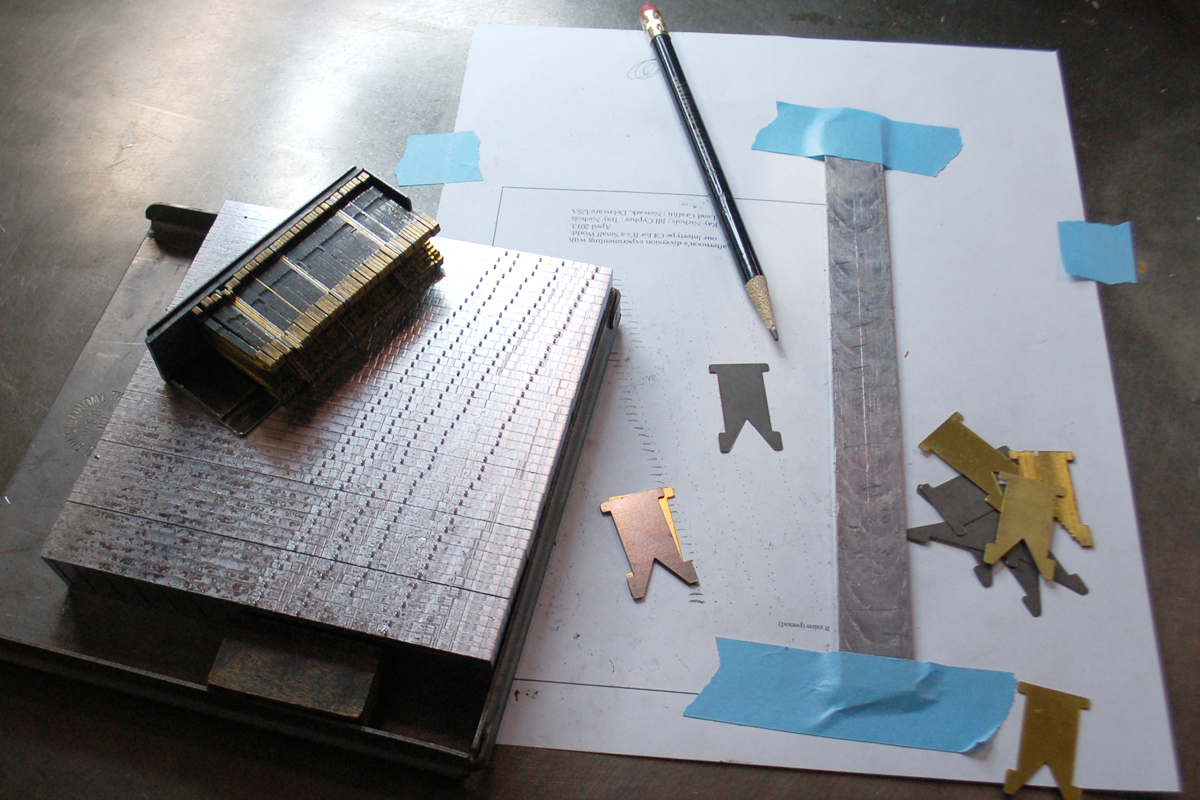
We had just gone through boxes of miscellaneous Intertype parts, many of which totally escaped some sense of use. A box of spacing material came to light. On the keyboard of the Intertype, there is only room for 3 different widths of spacing—thick, middle, thin. This new box of spacing gave us a dozen different widths, including very, very thin. This gave us the opportunity to space characters fairly carefully. Not as finely as a computer, but it offered more options at least.

Ray scanned the text of “Il Pleut” (shown below) and replaced each letter with a map of carefully positioned periods to replicate the feel of the original poem.

The image above shows the 5 brass matrices for the periods on each line spread apart by various options of spacing. Each line was painstakingly accurate to the printout of the poem. Overall it took about 5.5 hours to completely set our “period” version of the poem, carefully adding increments of 1/2 point (144th of an inch) until everything aligned. The image below shows the cast lines, each with 5 periods, and a variety of the spacing matrices we had to work with.

This project is probably the most complicated and Ray’s favorite using the Intertype.

130403-casting-It-rains-06-1200x800.jpg
perforation-dots-w-variable-shadow.jpg

Project #3 : Rain’s forecast again?

IASW-rain-poem-3-front-back-1200x848.jpg

Rain Poem No. 3 allowed us to experiment with our Intertype as a tool for creating 1 point rules and merging them with periods to interpret rain visually in yet one more way. We’ll see what 2019 brings into play, though we may start down a different path with this year’s submission.

perforation-dots-w-variable-shadow.jpg

We’ve been trying to collect a full set of the now 65 issues of It’s a Small World and are down to 4 that we lack. The problem is that issue number 1 is scarce, rarely available and one of the missing copies we’re seeking. We are hoping to find someone who would give us a set of scans of the pages so we could at least fill the hole with a facsimile.

You can click here to read about the history of It’s a Small World by Alan Brignull.

← What would a good student do? Right here. Right now.An Updated History of a “It’s a Small World” →

Our Lead Graffiti blog is a mass of varied information that is hard to understand. The search option in the top navigation works quite well if you can hit the right keyword (s). In this sidebar, we’ve highlighted some personally meaningful entries that might help if you want to try a couple of entries. To DEEP DIVE, click somewhere in the right column and then scroll down the left column. Also, if you know us, you can try searching for an appropriate word & the word “blog.”

2025

Resist
Liar, Liar.
Just do it!
Bernie Herman

2024

"Ink Pulls:" the hows and whys
Family holiday card workshop
“Liar, Liar.”+3 broadsides @ NAA exhibit
Waldorf diplomas / 2024
More on X-ing the Paragrab
”Concertina spine” book workshop
Lead Graffiti labyrinth
Jill, Ray, & Brodovitch @ the Barnes

2023

Forward for “X-ing a Paragrab”
UCBA member IMHO Meander Mook project
Black History is White History broadside
AIGA / Philadelphia Feedback broadside
Dunya Mikhail “Pronouns” broadside
etaoin shrdlu
Seven Fun Facts about the Linotype

2022

DCAD First-year talks
Cy Twombley. It’s just my opinion anyway.
”No more war. No more Putin.” broadside
Buying our Albion : that story
January 6th assault broadside

2021

Waldorf School of Philadelphia diplomas
Teleport broadside
ONLINE MEANDER BOOK letterpress workshop

2020

A design example of subtle racism
Looking back : Histories of Newark : 1758-2008
Retrospective exhibition at DCAD
Broadside : Black Lives Matter. A lot.

2019

A wonderful film about Ben Joosten
People Were Close (2004 book project)
WHYY-TV / Waldorf School of Philadelphia
What would a good student do?

2018
Alone in Berlin : postcard power
Doves’ type : metal & digital
“Blue Wave” broadside
John Bolton / Lead Graffiti connection
Alan Kitching’s VCUK workshops
U.S. Senators postcard mailing (coming)

2017
Four things you might want to know about Ray
Introducing Stephen Frykholm at AIGA

2016

Saul Bass. A no-show.
Burning Man & Lead Graffiti’s journal
Chris Fritton, The Itinerant Printer
Porter Garnets’s 10 commandments

2015
Best Intertype project #2 : round calendar
The Nash Equilibrium

2014
WHYY-TV’s Best of 2014
London Bombing’s 7th Anniversary

2013
Tour de Lead Graffiti. Sports Illustrated.
Grant Hart. Letterpress printer?
July 4th revolution coasters

2012
Thank You, Craig Cutler

2011
APHA National annual meeting program

2008
Designing Lead Graffiti’s logo
Art Directors Club of NY Grandmasters Award

2004
VCUK’s Alan Kitching letterpress workshops
VC family album pages

2003
Alan Fletcher : Raven Press logo origin
Bukva:raz! - Our first serious piece

2001
Visiting Eric Gill’s Gravesite