
• recent fun
    • THE dna project
    • another 12 DNA projects
    • bios
    • callouts
    • our lab
    • contact
  • calendar
    • TECHNICAL LETTERPRESS
    • . . basic type composition
    • . . vandercook
    • . . iron hand press
    • . . floor-model platens
    • . . week-long letterpress
    • CREATIVE LETTERPRESS explained
    • . . haiku meander
    • . . werkman druksels
    • . . quotable broadside
    • . . holiday card
    • STUDIO SUBSCRIPTIONS
    • PRESS RENTAL
    • BOOKMAKING explained
    • . . bookmaking basics
    • . . 6-pocket accordion
    • . . one day one book
    • . . coptic stitch
    • . . clamshell
    • . . paste paper
    • . . bookmaking bonanza
    • . . meander book online
    • subscriptions
    • workshops
    • fine press books
    • broadsides & posters
    • Bernie Books
    • Letterpress puzzles
  • blog
  • search
  • cards
Menu

Lead Graffiti

120 A Sandy Drive, Sandy Brae Industrial Park
Newark DE 19711
Phone Number
a letterpress lab of sorts

Your Custom Text Here

Lead Graffiti

  • about
    • recent fun
    • THE dna project
    • another 12 DNA projects
    • bios
    • callouts
    • our lab
    • contact
  • calendar
  • workshops
    • TECHNICAL LETTERPRESS
    • . . basic type composition
    • . . vandercook
    • . . iron hand press
    • . . floor-model platens
    • . . week-long letterpress
    • CREATIVE LETTERPRESS explained
    • . . haiku meander
    • . . werkman druksels
    • . . quotable broadside
    • . . holiday card
    • STUDIO SUBSCRIPTIONS
    • PRESS RENTAL
    • BOOKMAKING explained
    • . . bookmaking basics
    • . . 6-pocket accordion
    • . . one day one book
    • . . coptic stitch
    • . . clamshell
    • . . paste paper
    • . . bookmaking bonanza
    • . . meander book online
  • To buy
    • subscriptions
    • workshops
    • fine press books
    • broadsides & posters
    • Bernie Books
    • Letterpress puzzles
  • blog
  • search
  • cards

Birthdayscape / the long one

June 26, 2026 Ray Nichols

Birthdayscape 8

Three times we’ve produced an accordion-fold book as a keepsake for Ellen Steinberg’s Birthdayscape. Up to twenty women friends gather in some far off place for a week of relaxation. This year they are ‘camping out’ on the appropriately named “Isle of Women,” just off the coast of Cancún.

This is the 2009 edition.
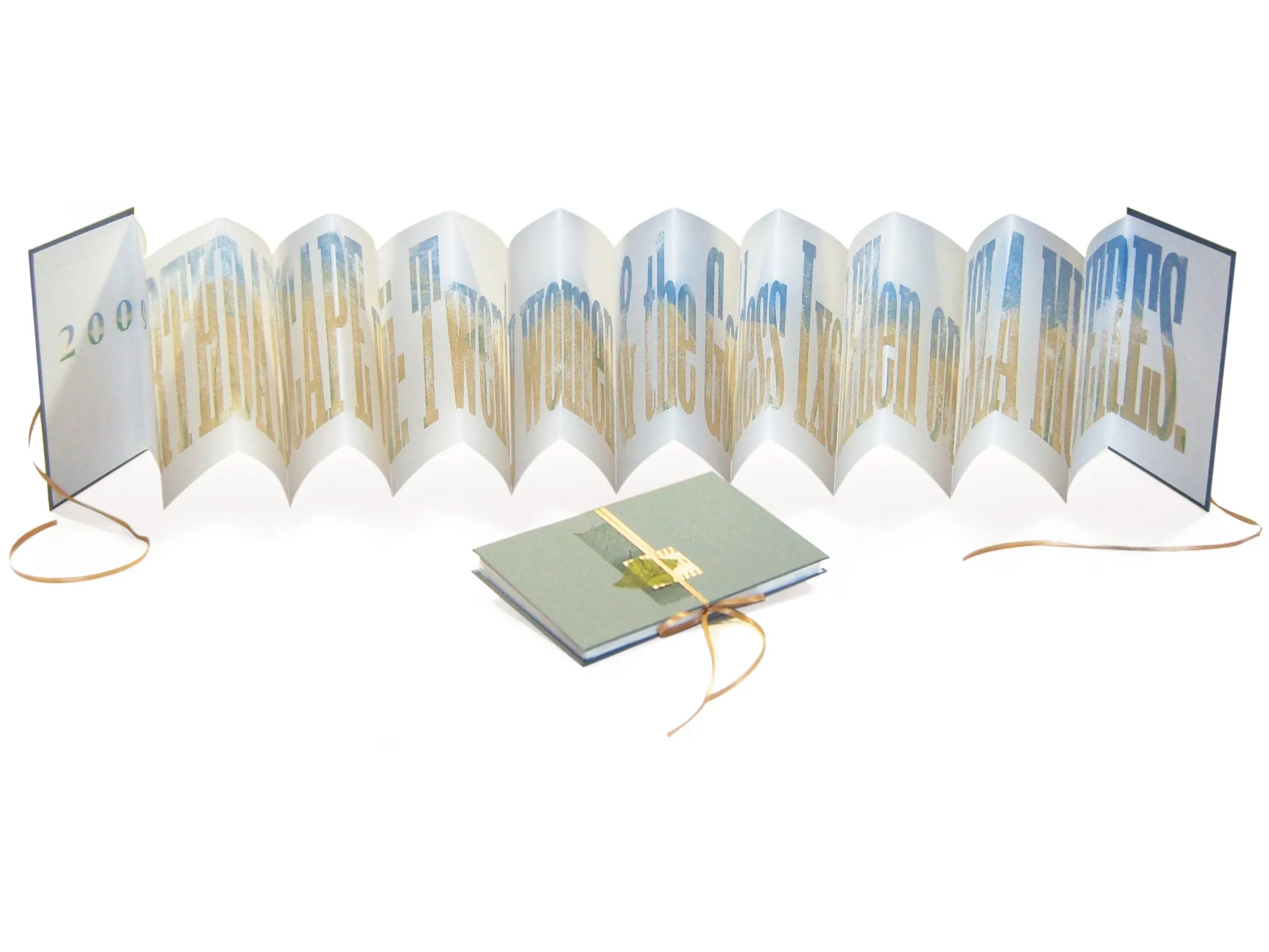
Each time we’ve done the keepsake, we’ve tried to push the envelope a bit more. This time we were working on a method for printing pieces longer than the presses we have. Our Vandercook Universal III will print a maximum length of 24”. We wanted to go a lot longer, so we built the Lead Graffiti “Long Bed,” which allows us to print about 7 feet. The book above is 80” on a single sheet of paper printed in one pass.

Below are images from the production of the 2009 edition. You can see the other Birthdayscape book keepsakes we’ve done at these links.

2004 dogsledding in Montana

Cannot find the image.

2007 home building in New Orleans.

Cannot find the image.

To see our blog entry where we show our first attempt at using the press.

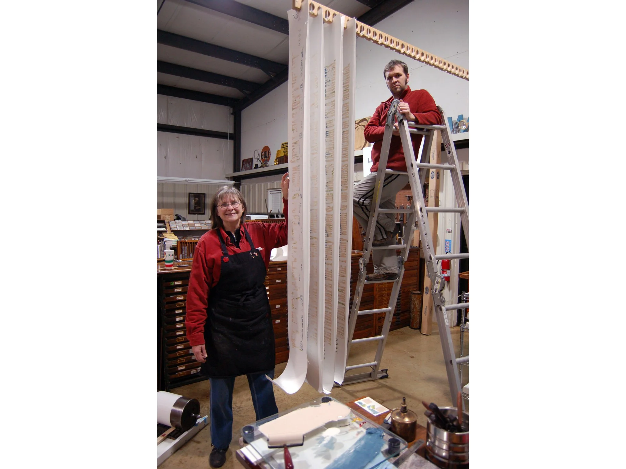
The image above shows the paper almost ready for printing. We used a Super White seamless, customarily used for backgrounds in photography. One of the ways it comes is 9 feet wide by 36 feet long. [We had three half rolls (18 feet long) left over from our ‘citizen’ photography for the Histories of Newark: 1758-2009 we designed this past year.] The rolls were cut using a radial arm saw to trim the paper to 9” wide. We could get two books out of each.

We did our copywriting to get the text to the right length, which was just about 77” wide. It says “2009 Birthdayscape viii: Twenty women and the Goddess IxchEllen on Isla Mujeres.” The twenty panels (one for each participant) of the book were 4” (80” total).

The type we used, Antique XXX Condensed, was made by William Page & Company, sometime between 1859 when it first appeared in a specimen book and 1891 when the company was bought out by the Hamilton Wood Type Company. Taking the mean would put the type at 131 years old.
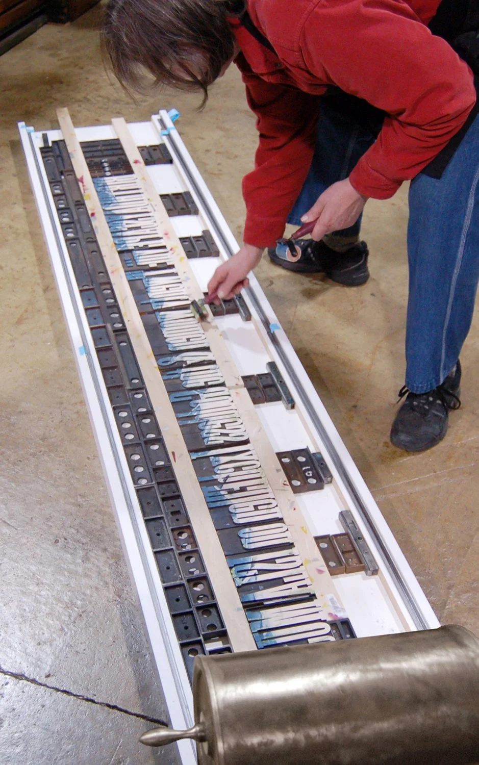
This image shows us inking the wood type the first time. After you’ve done a couple much of it fills in. One of the subtle textures you get as you print is the hint from previous runs where you’ve not reinked.

This shows a closeup of the hand inking. The group was traveling in Mexico. We wanted the text to have an aged look and a beach sand texture. As it turned out that texture was almost impossible to avoid because of 120-year old variations in the thickness of the letters.

This image shows Jill with two rollers (blue for the sky and green for a bit of vegetation) moving her way down the type. Ray had already inked the ‘sand’ areas.

As it turned out, we had problems with the color being a bit too dark to write over along with keeping the paper straight. So, after an edition of eight we decided to give up for the day and return to it refreshed the next morning.

Below starts the second try.

The next day’s printing went a lot better. We think the floor is flatter in this area versus over the seam you can see in the last photo from the previous day. This shows Jill and Ray the next morning with the C&P proofing roller in place.

In the instance of this project the printing is a three-person job. Jill would get the starting end of the paper under the roller, Ray would hold the paper to be printed and Tray would do the actual printing. Once we got rolling we could keep the paper pretty straight. If you drew a straight line from one end of the baseline to the other we would be within 3/8” over the 77” of type. We think it would help to use wider paper, but we were being a bit stingy as this eats up a lot of paper in a hurry.

We figured out that you cannot pull the paper almost at all as you print. The paper will absolutely be pulled the other way. The best way to do it was to have the roller start on the type and immediately try to take as much tension off the paper as you could while not letting the paper touch the type in front of the roller (which will definitely give you a double image). You want the roller to push the paper onto the type.

.

We have a nice hanging rack system that attaches to our 22’ ceilings. We ended up printing about 30 to get a good 22. Walking up and down the ladder was exausting after you’ve done it 60 times. It looked great hanging in our studio.

Below is the type stacked so you can see it in less than a 24” wide image.

Folding was no small task. We trimmed off the top and bottom of the paper with a long straight-edge. We marked every 8” along the bottom. We would then fold to those marks first starting with one end of the paper and then with the other. We were starting to push our deadline and the ink was still tacky. It is hard to do the handrolling we typically do and keep the ink thin. When you double layer ink in different colors it makes drying take longer so we had to put slip sheets between each of the folded panels.

Jill came up with a nice way to tie the books shut. We cut a small notch in both the front and back boards and ran a ribbon through them. It did a good job of holding the back of the book nice and tight.

Jill designed and printed the covers using handset metal type and silver ink. The contrast is subtle, but you can see it at the top of the right book below.

Then we glued the covers to the backs of the first and last panels, added a bit of paper to give it some texture and voila they were off the next morning to Mexico.

We mentioned at the top that we already have plans for improving the design. Here is that schematic.

You need those blocks that run the length of the press to support and push back against the vertical piece. The force of quoins is just too great to simply screw it to the bottom as we did the first time around, especially using particle board. We will definitely use oak in the next version of the Lead Graffiti “Long Bed.”

← There is stuff out thereWhy I like the Tour de France and watching the World Chess championship live online. →

Our Lead Graffiti blog is a wealth of varied information that can be difficult to understand. The search option in the top navigation works quite well if you can hit the right keyword (s). In this sidebar, we’ve highlighted some personally meaningful entries that might help if you want to try a couple of entries. To DEEP DIVE, click somewhere in the right column and then scroll down the left column. Also, if you know us, you can try searching for an appropriate word & the word “blog.”

2026

Day 1: TdLG 2011 through 2015
Tom Monahan’s Before & After
Lunch w iMark Dimunation
Star Wars flag book
Gearing up for “No Kings.”
Steps to make "Bernie Books"
Jigsaw puzzles of our letterpress
Unum’s 250th collaborative

2025

Half of writing history? Hiding the truth.
Werkman workshop at FBAC
UCBA collaborative book / “Trees”
Grollier Club thank you
”RESIST” protest banner
Delaware Eats Houston World Tour
Coptic stitched “Liar, Liar.” book
Political protest posters
”People Were Close” / AMCS
Just do it

2024

Ink pulls: the hows and whys
Holiday folding card workshop
Waldorf School of Philadelphia diplomas
New broadside series using ink, laser-cut acrylic type
Concertina spine
Alexey Brodovitch exhibition
NAA / socially engaged exhibit
Lead Graffiti solo exhibitit at NAA
Don’t know
APHA 2024 calendar pages
Lead Graffiti labyrinth
UCBA & Special Collections
X-ing the Paragrab

2023

Tour de France & Lead Graffiti
Tom Monahan creative thinking workshop
Lunch with Mark Dimunation
Star Wars trading card flag book
No kings or narcissistic nutcases
Bernie Book production
”UNUM” 250th portfolio
Letterpress jigsaw puzzles
UCBA collaborative book / “Trees”
”A Swarm of Bs” book & keepsake


Family holiday card workshop
“Liar, Liar.”+3 broadsides @ NAA exhibit
Waldorf diplomas / 2024
More on X-ing the Paragrab
”Concertina spine” book workshop
Lead Graffiti labyrinth
Jill, Ray, & Brodovitch @ the Barnes


2023

Forward for “X-ing a Paragrab”
UCBA member IMHO Meander Mook project
Black History is White History broadside
AIGA / Philadelphia Feedback broadside
Dunya Mikhail “Pronouns” broadside
etaoin shrdlu
Seven Fun Facts about the Linotype

2022

DCAD First-year talks
Cy Twombley. It’s just my opinion anyway.
”No more war. No more Putin.” broadside
Buying our Albion : that story
January 6th assault broadside

2021

Waldorf School of Philadelphia diplomas
Teleport broadside

2020

A design example of subtle racism
Looking back : Histories of Newark : 1758-2008
Retrospective exhibition at DCAD
Broadside : Black Lives Matter. A lot.
Posters for the “Peter Wood Sit-In”

2019

A wonderful film about Ben Joosten
People Were Close (2004 book project)
WHYY-TV / Waldorf School of Philadelphia
What would a good student do?

2018

Favorite Rejected Work
Winterthur Dining Design
Family trip back to West Texas
CBA / NYC auction keepsake
Alone in Berlin : postcard power
Doves’ type : metal & digital
“Blue Wave” broadside
Paal Renner letterspacing Future
John Bolton / Lead Graffiti connection
Alan Kitching’s VCUK workshops

2017
Four things you might want to know about Ray
Introducing Stephen Frykholm at AIGA

2016

Saul Bass. A no-show.
Burning Man & Lead Graffiti’s journal
Chris Fritton, The Itinerant Printer
Porter Garnets’s 10 commandments

2015
Best Intertype project #2 : round calendar
The Nash Equilibrium

2014
WHYY-TV’s Best of 2014
London Bombing’s 7th Anniversary

2013
Tour de Lead Graffiti. Sports Illustrated.
Grant Hart. Letterpress printer?
July 4th revolution coasters

2012
Thank You, Craig Cutler

2011
APHA National annual meeting program

2008
Designing Lead Graffiti’s logo
Art Directors Club of NY Grandmasters Award

2004
VCUK’s Alan Kitching letterpress workshops
VC family album pages

2003
Alan Fletcher : Raven Press logo origin
Bukva:raz! - Our first serious piece

2001
/blog/2007/12/12/fonts-for-the-intertype
/blog/2004/3/1/vc-family-album-pages
/blog/2003/06/13/raven-press-logo-by-alan-fletcher
/blog/2003/02/01/our-first-letterpress-piece
/blog/2001/06/25/eric-gill-gravesite-visit