Several people, especially students, recently have asked about the process we go through to put the shadows on most of the photos of our work we post on our website and Instagram.
Step 1 photographing a sheet of heavy white paper lifted about 3/4” off-white background. Most of our broadsides are 14.25” xx 22.5,” so the sheet we were photographing was generally that shape.
Step 2 was lighting the scene with 4 photo lights. We experimented a lot with how far the lights were apart, how close they were to the subject, etc. We wanted the light to bounce under the image and reflect onto the background to give the shadows an almost exaggerated look and keep it from looking like some computer-generated drop shadow. We probably shot 30 carefully controlled images.
You can most easily see the impact of the light bouncing up under the whiteboard and reflecting down on the background in the lower left and lower right shadows. If I was trying to make up a shadow from what I “thought” a shadow looked like, I would never come up with that.
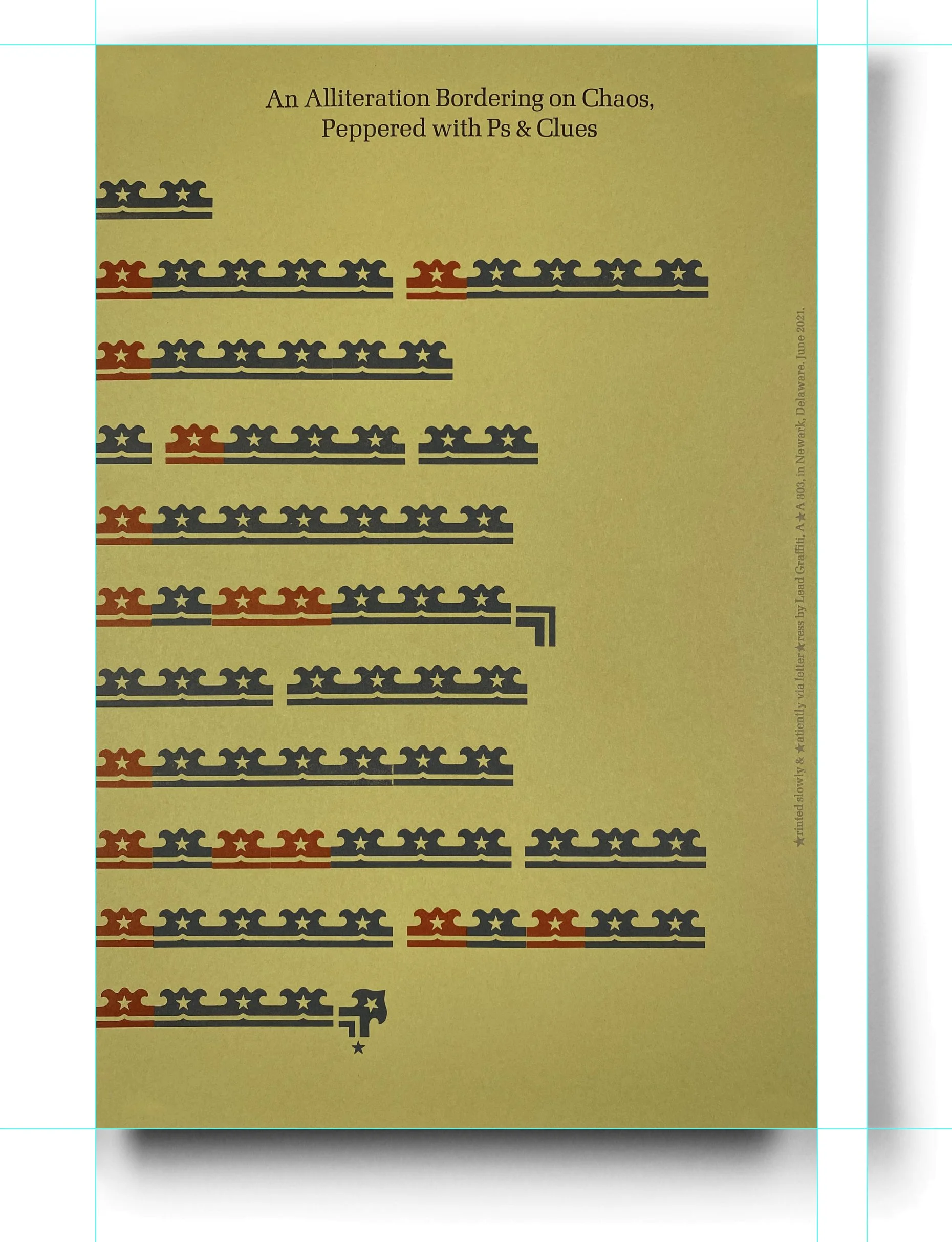
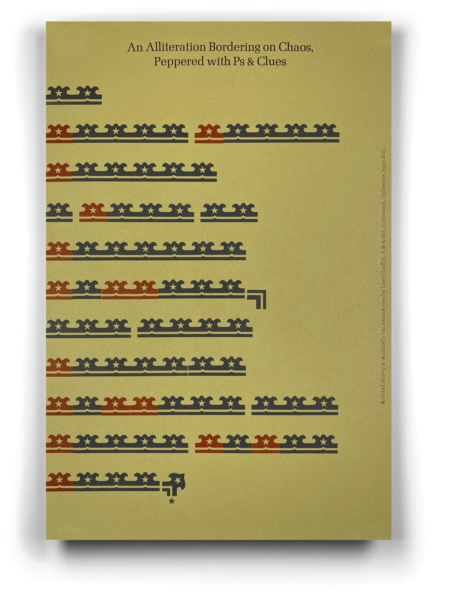
The image below is the result.

Step 3 was sorting out the right image we could live with for a while. As of April 1, 2022, we are on the 4th modification. Given this image, a couple of things that occurred in the photoshoot are things we would never have considered ahead of time were
The slight thinning of the middle of the shadow on the sides. You might complain about that, making the broadside look a bit curved. We like that. It gives the feel of “paper.” And we avoid any hint of the mechanical quality of a computer-generated drop shadow. The lights are generally more focused on the center of the image area, so the lighting is more intense by a “little.”
If you look below the bottom left corner, you’ll notice a slightly lightened area at the start where that bottom shadow gets dark. That is the light bouncing up underneath the sheet. We also love that. You don’t get that with a “drop shadow” filter.
Step 4 was retouching the image to get a good balance in the tonal value of the 4 sides, so they were all different and where the shadow from each side flowed smoothly into the white background. In the image below, you can see all of the “white” selected outside of the image area using the “magic wand. tool” set to “0” in Adobe Photoshop.

Step 5 was to cut a perfect white rectangle out of the center where the project image would end up residing and to put guidelines very accurately to the edge of that area. We significantly enlarged the image to set those guides.
We will call the white rectangle the print area (where the image of our print goes).
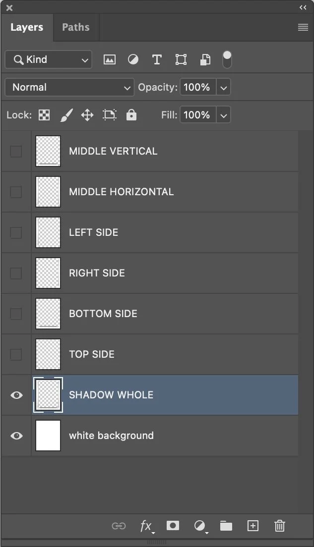
Step 6 starts the hard part. We took the final SINGLE image and created a layered Photoshop file. These are the 6 layers.
Middle vertical - the entire width of the shadow image that encompasses from the top to the bottom of the print area and not a pixel, more or less. You’ll find out later why this is called “vertical,”
Middle horizontal - the full height of the shadow image that encompasses from the top to the bottom of the print area. You’ll find out later why this is “horizontal,”
Top - the entire width of the shadow image from the absolute top to the top of the print area.
Bottom - the entire width of the shadow image from the absolute bottom to the bottom of the print area.
Left side - the full height of the shadow image from the absolute left side to the left side of the print area.
The right side is the full height of the shadow image from the absolute right side to the right side of the print area.
Those shapes must be EXACTLY accurate.
You also need to save this image and NEVER OVERWRITE IT. YOU CAN NEVER HIT COMMAND-S WHILE WORKING WITH IT, OR IT IS GONE. Best to consistently duplicate the file AND RENAME IT BEFORE ALTERING IT. And keep a copy of it somewhere else, so you don’t accidentally change it.
In Photoshop, we created another layer of natural shadow in one layer, just in case. We also created a white background layer that resides as the bottom layer.
Here is what our “Layers” window looks like.
In Photoshop, you need to make your image as exact as a rectangle. We typically set the rectangle tool to the correct proportion, draw a shape corresponding to the image, and then use the DISTORT option to pull the corners into the right shape. We use the warp tool to adjust inconsistent areas along the edge of the piece to match the rectangular goal. We will often drag the shape until it is about 5 pixels too wide on all sides. After we finish, we will crop the image to the guidelines, which will trim off problems along the sides.
COPY your image and PASTE it into your shadow file. Remember to work on something other than your original file. Rename it now.
You want the image to be set precisely against guides. Again, could you enlarge the image significantly to ensure the alignment is perfect? I ALWAYS zoom in on the upper left corner as the “snap-to-guides” is often slightly inaccurate, and I have no idea why. Once I’m zoomed in, I’ll usually use the cursor to perfect the positioning of the pixel.
You also want to move the layer the image is on to the top of the Layer window.
It doesn’t matter which layer you start working with. We usually are on the “SHADOW WHOLE” layer to see more of where we are going.

Note the guidelines that I’ve put around the white rectangle. I’ve blown the image up a lot (maybe 1200% or even more), so I can put those guides EXACTLY in the right spot.
I’ve enlarged my working shadow file, so it is larger than the image I usually get from my iPhone. I also make photos of our work as large as I can, making them in-camera with little room for cropping, squaring up, warping, etc.
Then, using “Transform > Scale,” we hold down the COMMAND key (we use Apple) and drag the lower right corner until it touches either the bottom or right side of the print area, whichever it hits first.
We then always zoom in, and usually a lot, to make sure it is EXACTLY right.

Being careful to maintain the correct proportion of the image of your work, you drag the lower right corner until it hits the guide for either the right side or the bottom of the desired space. You now have your piece's width or height correct and match your shadow.
In the image above, you can see that we have a white VERTICAL shape that is left white.
The key now is to activ (Hmmm. Something is left out here.)