
One of the things we always say to say to students is that if they are interested in letterpress (or honestly just interested in design), they need to find real projects they can do for real people. This was one of those we could have just as easily not done.
Read moreSaul Bass, Masters of Design exhibition at SVA - October 1995

It was the 1st of 2 Visual Communications fall semester field trips we took to New York City back in October of 1995. Saul Bass, a designer in the Art Directors Club of New York’s Hall of Fame, was the subject of a “Masters of Design” exhibition, part of a regular series SVA sponsored and on itinerary.
Read moreChris Fritton, The Itinerant Printer

And this is the the story about Chris' week he spent at Lead Graffiti.
Read morePorter Garnett 10 commandments for craftsmen
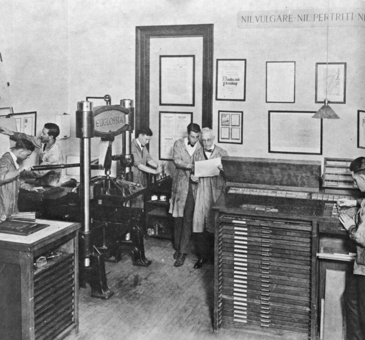
After finding our Harrild & Sons Albion iron hand press had been part of Laboratory Press at the Carnegie Institute of Technology back in the 1920s, we recently visited the Hunt Library at Carnegie Mellon University to see some of the things printed back in the day.
Porter Garnett who initiated the fine press program at CIT wrote out these 10 commandments printed in a small booklet printed at the New Laboratory Press, College of Fine Arts, Carnegie Institute of Technology. Handset in Hunt Roman, a type designed by Hermann Zapf, Printed 18 June 1963.
. . .
DECALOGUE FOR CRAFTSMEN
by Porter Garnett of the Laboratory Press
Thou shalt not imitate.
Thou shalt not cater.
Thou shalt not seek effectiveness for its own sake
Thou shalt not seek novelty for its own sake.
Thou shalt not employ expedients.
Thou shalt not exploit thyself nor suffer thyself to be exploited by others.
Thou shalt not concern thyself with the opinions of any but the sensitive and the informed.
Thou shalt not give to anyone the thing he wants unless for thyself the thing that he wants is right.
Thou shalt not compromise with popular taste or with fashion nor with machinery nor with the desire of gain.
Thou shalt not be satisfied — ever.
Top 10 Lead Graffiti moments of 2015
These are the top 10 events relating to Lead Graffiti & letterpress that happened during 2015 in chronological order.
Not a single event, but we had 155 workshop participants this year, bringing our total to 1,184. New groups included Art Conservation at the University of Delaware, Arcadia University, and James Mason University (where we also did a talk).
. . . O N E : March & April

First 2 books of our story series, “Moments Carved in Paper,” were published. The Librarian Made Us Do It (Ray’s “moment of clarity” for letterpress) and eifleS! the original idea for the series with Ray’s 2 favorite stories about his parents that started us on the project.
. . . T W O : April

We participated in the Manhattan Book Fair through the Fine Press Book Association. We were hoping to do enough business to pay for the booth, the drive up, a nice hotel room, and an intimate Italian dinner. Dinner ended up being Dopo East. We did 4 times that well. It is great fun telling our stories to anyone that would stop for a moment and look. We will also be doing the fair in April 2016. We may try to do the same hotel and restaurant.
. . . T H R E E : May

Jill took two long-desired, leather binding workshops from Don Rash. She ended up with 3 nice books. Don was the bookbinder that did the 12 leather-covered versions of our Histories of Newark: 1758 - 2008 back in 2007. He did an amazing job embedding a coin minted in 1758 with the head of King George II (he signed the charter for the city) so that you could see both sides of the coin. Don does really amazing work German style.
. . . F O U R : June

We were invited to exhibit 35 Tour de Lead Graffiti posters from 2011 - 2014 at the AIGA / SPACE Gallery in Philadelphia. Met some great new friends and, from the opening, pulled 7 great new collaborators in for stages in our Tour de Lead Graffiti 2015.
. . . F I V E : July

Tour de Lead Graffiti 2015 - our 5th edition of our 23 posters in 23 days while following the Tour de France. We had 35 collaborators spread over 21 of the 23 days who shared the Tour, the letterpress, and the dessert experience with us. Ray’s total time over the 23 days was 383 hours 28 minutes. There were 92 runs averaging 4 per poster, but some of them were doozies. “Endurance letterpress” at its most fun.
. . . S I X : July & August

We were invited to be the inaugural exhibition at the new gallery of the Hamilton Wood Type Museum in their new space. The 2-month exhibition included 48 of our Tour de Lead Graffiti posters from 2011 thru 2014. Special thanks to Jim Moran, director of the museum, for the invitation. I’m pretty sure Lead Graffiti got some new followers from the event.
. . . S E V E N : August

After watching it flounder along, Ray added some much-needed energy into the VC/UD - Then & Now Facebook group for former students from the Graphic and Advertising Design Group and the Visual Communications Group, 1968 to the present. Not exactly letterpress, but an important part of Ray’s life, and we’ll sneak some letterpress in every so often.
. . . E I G H T : October

The national conference of the American Printing History Association, which both Ray & Jill attended, was focused on printing on the iron hand press. The conference injected some energy into our efforts to get our 2 iron hand presses finished. We bought one in 2007 and one in 2008 and had to have missing parts fabricated and things like bent bolts straightened or replaced. At the conference, we experienced a new letterpress workshop based on the work of H.N. Werkmen (shorter time frame, for a good number of people, and loads of colorful, typographic fun). We used the workshop for our first VC homecoming reunion in November, which we’ve been wanting to do for a while. Everyone’s kids loved it and so did the adults. This also provoked a nice iron hand press workshop run by printer Steve Heaver from Baltimore. Also, see entry T E N.
. . . N I N E : October

From Crooked Crow Press, Rockville, Maryland, and on extended loan, we received a full 36-line Gutenberg Bible page composed of a reissue of Gutenberg D-K metal type cast by Mike Anderson. Additionally, there are 2 job cases of the recast Gutenberg D-K type that we can use to set new pieces. We are hoping to start a new series of workshops on our iron hand presses with the type.
. . . T E N : December

In the process of renovating our Harrild & Sons Albion, bought from the Museum of Printing in North Andover, Massachusetts, we’ve discovered it has a significant provenance as part of the first fine press program at a major U.S. university, Carnegie Institute of Technology, back in the 1920s. One of a pair, it was purchased to print a significant 12-volume catalog for The Frick Collection.
Things still seem to be happening that are very exciting to us.
2016
Setting up our Harrild & Sons Albion
Setting up our Harrild & Sons Albion
This links are not currently active. We plan on correcting that soon. Looking for advice setting up an Albion: | Part 1 | Part 2 | Part 3: reconstruction order | Part 4: naming the Albion pieces
. . .
We’ve been doing some work on our Harrild & Sons Albion. We’ve been trying to explain the problems we are having and trying to get suggestions for correcting them from other hand press owners. If you would like to see the process you can take a look.
An interesting new development is that we think 2 photos from Richard-Gabriel Rummonds’ book Printing on the Iron Handpress” are of our press and/or its brother.
We originally bought ours from the Museum of Printing in North Andover, MA back in 2008. There were two identical presses. The serial number of ours is 8112. As best I can tell from the one photo that shows it on the other one ended in “113″ (cannot read the 8).
Here are the two photos.

Above: This one shows the press feet/legs to the cheeks so we have a much better idea that the photo matches our press. The caption in Rummonds’ book reads…
Photo 13: Pressmen printing The Catalogue of the Frick Collection on two Albion presses back to back. Laboratory Press, Carnegie Institute of Technology, Pittsburgh, PA, 1949. (Photo courtesy of Cary Graphic Arts Collection, RIT.)

Above: Photo 14: Pressmen printing The Catalogue of the Frick Collection on a Harrild Albion Press. Laboratory Press, Carnegie Institute of Technology, Pittsburgh, PA, 1949. (Reprinted, by permission, from American Printer, March 1950.)
Paul Ritscher of Devil’s Tail Press, through the iron hand press listserv where we’ve been getting the advice for our Albion setup, offered this bit of information about the presses.
“In a glance at Porter Garnett: Philosophical Writings on the Ideal Book, Book Club of California 1994 (a book that should be in every hand-press library), Porter Garnett describes the purchase of the two presses specifically for the purpose of printing the Catalogue of the Frick Collection for the Museum of Modern Art, a project begun in 1928, and not completed until after he left Carnegie in 1935 by Bruce Rogers.”
After bit of online searching we found that the University of Delaware (just down the street) has a copy of the catalog of the Frick Collection. The colophon from volume 1, “The printing … was begun in 1929 by Porter Garnett who designed the basic format of the text, and who printed the sheets through page 168 … The work was laid aside in 1932. Printing was begun again in the spring of 1949 under the direction of Bruce Rogers, who designed the two volumes of illustrations, and the title page, section headings, and accessory pages for the volume of text. The sheets of text were completed on the hand-presses of the University of Pittsburgh … One hundred and seventy-five sets have been made”–Colophon of v. 1.
The story just keeps getting better.”
Information on PORTER GARNETT who may have been the first purchaser of our press (until we know better we are going to start giving the date of construction of our press as the 1920s).
Variously a playwright, critic, editor, librarian, teacher, and printer, Porter Garnett (1871-1951) was born in San Francisco and was for many years an active figure in the Bay Area literary scene. A member of the Bohemian Club for many years beginning in the 1890s, he wrote and produced plays and masques for the Club, whose members included his good friends Jack London and George Sterling. Like many members of the Club, he was involved in journalism, working as a newspaper critic and editor. With Gelett Burgess, he founded the magazine The Lark in 1895. From 1907 to 1912, he served as an assistant curator at the Bancroft Library at the University of California at Berkeley. In 1922, he became a professor of graphic arts at the Carnegie Institute of Technology in Pittsburgh, Pennsylvania. There, he founded the Laboratory Press, where he taught and practiced fine printing until the press closed in 1935.
Art Directors Club of New York's Grandmasters Award
I’m not sure I ever saw the Art Directors Club of New York annual which announced the inaugural awarding of the title of Grandmasters to design instructors. At this point I had retired and had quit adding the books to my collection. I was Googling something and the article suddenly appeared. I looked up the book on Abebooks.com and there were copies easily available, so I bought two of them—one was for DCAD, who received a good number of the design books from my library, and the other was for Lead Graffiti’s library. I thought I would share the wonderful page designed for ADC88 back in 2009.
Nine of my absolute favorite projects ever along with my favorite portrait were shown on the double-page spread. Truly a great honor.
From upper left clockwise:
Rethinking 2009 — This was the first notion we had of doing our Boxcards using recycled boxes as the stock.
Histories of Newark: 1758-2008 — A 300-page hardback which we designed. We also took hundreds of photos for the book, most notably the “citizens band” that runs through every page and includes more than 3,700 townspeople.
All preservation is merely theoretical if you can’t keep the roof from leaking. poster for the American Printing History Association’s national conference at Columbia University. A copy was given to every attendee. The type is from our orphan wood type collection.
Can you have too much good typography — The poster celebrated a visit and talk by Justin Howes from London about his digitizing Caslon from original printings. The image is a single piece of 18″ x 24″ wood type that we made for the poster.
Think Small. Again. — Poster for a Visual Communications year-end exhibition reflecting back on the 25th anniversary of Volkswagen’s “Think small” ad. It was included in an exhibition of Volkswagen advertising at The One Club in New York.
Don’t let another art director beat you to the punch — This poster was the tipping point for my own feeling that I could complete on an equal level with other people and schools which I had envied from afar. Mounted in the Art Directors Club of New York exhibition on the same panel as one of Stephen Frykholm’s Herman Miller barbeque chicken picnic poster.
Yes 2005 — Poster printed via letterpress for a Visual Communications year-end exhibition. There are 11 pieces cut with a laser from a 1/4″ sheet of Plexiglas.
On October 5 we fished all day but didn’t catch the big one — Poster directed toward Saul Bass who called us about the piece.
The whole world is talking — The 3 versions of an 8-foot poster silkscreened in 2′ segments of voice bubbles for a Visual Communications year-end exhibition. Printed on a roll of paper 0.7 of a mile long. The stacked posters were handcut (total length was 2.8 miles). There were 36,000 rubber stamped impressions. Yes, it was a job, but a killer piece that won us a bunch of design awards.
Everyone of those is a nice moment in my life and reminds me how good a run I had with a bunch of amazing students, friends, and design professionals.
APHA / Chesapeake Chapter 2016 calendar
Jill and I were participating in a collaborative 2016 calendar project for the Chesapeake Chapter of the American Printing History Association and I thought a black & white photo would work nicely to show the production of my July effort.
Read moreHamilton Wood Type Museum Exhibition / July - August 2015
A selection of our Tour de Lead Graffiti 2011 - 2014 broadsides was the inaugural exhibition in the new gallery space at the Hamilton Wood Type Museum in Two Rivers, Wisconsin. We watch the daily broadcast of the Tour de France and then translate those events into a broadside designed and printed the same day. Using handset wood & metal type & other objects, we print the old fashioned way via letterpress to create 23 broadsides in 23 days. We call it “endurance letterpress.”
We were very pleased and excited to display such a large quantity of our project and we thank museum director Jim Moran, for offering this honor to Lead Graffiti.
The new gallery has a 50′ wall which is perfect for hanging 42 broadsides very close together. You’ll see below that the exhibit looks kind of like a high-speed peloton on a long, flat stage across central France. The Museum, adding a special touch to the display, included a nice 40-year-old racing bike to hang with the work.
Jill and I traveled to the Hamilton Wood Type Museum 10 years ago or so. They’ve since moved into a new space which we hope to get out and see. The museum represents a major component in the history of printing & typography and it is great that there is some serious effort at preserving it.
For this show, we built a new set of frames designed specifically to hold the tour posters, and painted them awarm grey. The 14.5″ x 22.5″ posters are printed on Somerset Textured White 300 gsm paper, which is lush and sexy. The frame shown below is the wooden version which we have hanging in our studio. The frame slightly curves the poster which helps keep it locked in and also creates a slight angle change which helps show the impression we get from letterpress. The posters are works on paper, and we like them to feel like it.
All of the work (except for the date / stage / signature block in the lower left corner) is printed from handset wood and metal type. Many of the runs (Majka wink wink! above) are handrolled directly on the type to produce a more painterly quality.
Here are some photos from the exhibition taken by Lead Graffiti friend, photographer and letterpress lover, Lauren Rutten. Special thanks to Lauren for letting us share her photos.

Lauren Rutten with the opening panel of the exhibition.

A grouping of some of our favorite colorful posters from 2014. The labels explain how the events in the stage helped form the visuals for each poster.

Another group of favorite broadsides from 2013.

Yep, that’s the way Ray Nichols would suggest hanging the broadsides—a long line running at high speed. It looks like the museum did a great job of getting them straight, drafting one another just like the peloton headed across central France.

Another gallery view from a little less acute angle.

A closer look at the opening panel with our Lead Graffiti logo.