
Several people have complained about the calendars not being useful and that they should be more gridlike. I suspect they were talking about some of my more experimental months over the past several years.
Read morePorter Garnett 10 commandments for craftsmen
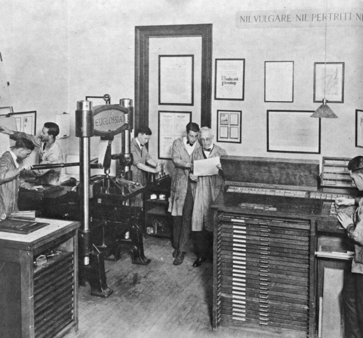
After finding our Harrild & Sons Albion iron hand press had been part of Laboratory Press at the Carnegie Institute of Technology back in the 1920s, we recently visited the Hunt Library at Carnegie Mellon University to see some of the things printed back in the day.
Porter Garnett who initiated the fine press program at CIT wrote out these 10 commandments printed in a small booklet printed at the New Laboratory Press, College of Fine Arts, Carnegie Institute of Technology. Handset in Hunt Roman, a type designed by Hermann Zapf, Printed 18 June 1963.
. . .
DECALOGUE FOR CRAFTSMEN
by Porter Garnett of the Laboratory Press
Thou shalt not imitate.
Thou shalt not cater.
Thou shalt not seek effectiveness for its own sake
Thou shalt not seek novelty for its own sake.
Thou shalt not employ expedients.
Thou shalt not exploit thyself nor suffer thyself to be exploited by others.
Thou shalt not concern thyself with the opinions of any but the sensitive and the informed.
Thou shalt not give to anyone the thing he wants unless for thyself the thing that he wants is right.
Thou shalt not compromise with popular taste or with fashion nor with machinery nor with the desire of gain.
Thou shalt not be satisfied — ever.
APHA / Chesapeake Chapter 2016 calendar
Jill and I were participating in a collaborative 2016 calendar project for the Chesapeake Chapter of the American Printing History Association and I thought a black & white photo would work nicely to show the production of my July effort.
Read moreJuly 4th coasters

We did an interesting coaster this past month to celebrate the American Revolution and the July 4th holiday that resulted from it. I had wondered how you might register a round coaster on the press.
Instead, I decided I would design one that didn’t need to be registered.
We had a photopolymer plate made of the word “revolution”, centered it in the coaster and printed it using only two registration pins. The idea was that I would never care how it was positioned. We did this for the July APA bundle. Fun and they make nice gifts today. We will use them at lunch at the Glass Kitchen today while working on our Tour de Lead Graffiti project.
APHA National Annual Meeting program

Maybe as a joke on the new guy, Mike Denker volunteered Ray (the new president of the Chesapeake Chapter of the American Printing History Association) to print the program for APHA’s annual meeting held in January 2011 in New York City.
There are always ideas floating around Lead Graffiti that would be interesting to try and a project such as this provides a great forum for giving them a try. We wanted to do something different (we think our ideas of how we can use letterpress are often different from the normal letterpress you see around) for this particular group who are committed to the history of printing, so we designed the piece to include two of those ideas.
The first came to mind with our Boxcards™. We print their backgrounds in opaque silver ink on packaged-goods boxes to let the printing on the package show through as the type. We though it might be interesting to handroll the paper beforehand and then overprint the silver to essentially trap the type the same way.

Above you can see a sample of Jill’s handrolling using three 3-inch brayers. We decided we needed to seal off the paper under the silver to try and keep the edges of the handrolled areas from showing, so this image is after we had printed two runs of transparent white. Because we had just done the handrolling and the ink was wet the color was coming off and contaminating the transparent white giving it that orange cast. This didn’t matter as we were going to be immediately overprinting with the opaque silver anyway. If you look hard you can see a hint of the type to come.
Below is the outcome after double printing the silver. In case you are wondering, Jill wanted to have some white show through in the type. When she was handrolling and completely covered the type area she thought the color looked too mechanical and she wanted there to be a sense of the handmade which we like in our work.

The second thing we wanted to try was printing right to the edge of the deckle-edged paper. That took a little extra packing as the very edge of the deckle is much thinner than the paper itself. We also had to use a sheet under every print as the ink printed off the edge and would print onto the tympan which would likely offset onto the back of the following print. This part worked great and added a nice touch to the piece as the edge had a nice knife-like quality and was quite stiff with the two layers of ink.
When we stacked the programs to be picked up by those attending the meeting, we put them in four separate stacks so everyone would see that the pieces were different. When we were thanked for our effort at the meeting they even asked for an explanation as to how it was printed. Several people confided in us that they had taken a couple extra for library collections or to show students. Hmmm. We like it.
You might compare it to this sample of handrolling for Columbia University that was finished the same week.