

Jill led an excellent book-making workshop on constructing and binding a “concertina spine” book. The 13 Upper Chesapeake Book Arts Group members who attended seemed to have a good time, and the results looked professional.
If you live within comfortable driving distance of Newark, Delaware, and are interested in making books (either with or without content), consider joining our group. We don’t have a membership fee, though there may be a small fee for materials when doing an event like this or making paste paper. We typically meet on the third Wednesday of the month from 6:30 to 8:30. Email us to double-check.
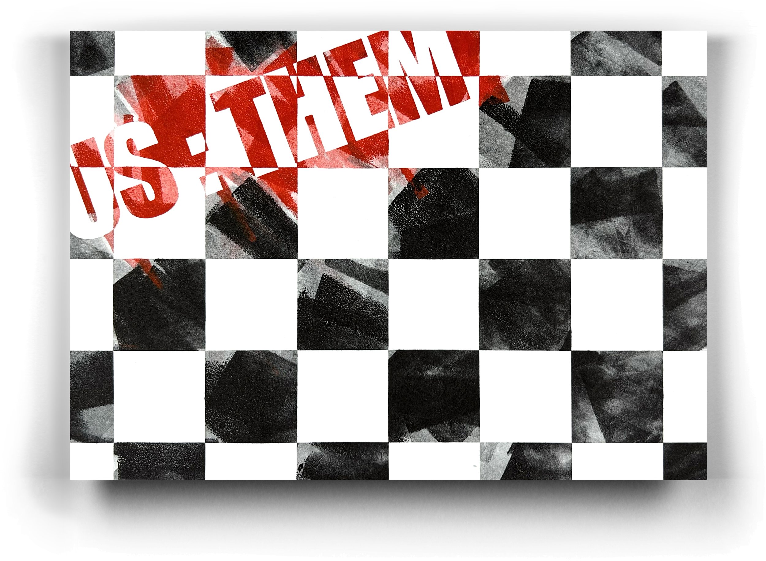
New broadside series using "ink pulls" and laser-cut typography with acrylic sheet using "Shahn Torn"

We’ve been playing with a new base from which to print. We produced a broadside using Lead Graffiti’s “Shahn Torn” typeface and an Edgar Allan Poe quote. We were also using some of our “ink pulls” that we’ve been collecting from the initial stage of cleaning the ink off of our Vandercook after a run. Here are four more that we especially liked.
I love the intrusion into readability on the third one.

⬇ Below shows an image of me working on the bed of our #5 Washington iron hand press, looking at one of the ink pulls, figuring out which way to turn it to best interact with the type.

⬇ This image shows me aligning the pull to the type before printing.

⬇ Below is a large image of #3 above so you can see the impact of the ink pull with the inking.

“Liar, Liar. Pants on fire.” A new book.


At least as of Tuesday, September 17, 2024, this hasn’t been written very carefully.
The photo above was taken at the end of our first day of Coptic stitching. The photo below was 2 days later.

We are Jill Cypher and Ray Nichols, and we operate Lead Graffiti, a letterpress lab and bookmaking studio in Newark, Delaware. We constantly seek connections between our creative letterpress and bookwork and how our work is conceptually conceived. In recent years, we’ve been moving more into bookwork, but it is often hard to find a way to make the book’s content and physical form both join together and oppose each other simultaneously. We love typography and like to play with bending the normal rules of both readability and understandability.
Early this past summer, the nearby Delaware College of Art & Design shuttered its doors. Over the past decade or so, we have donated hundreds of books related to design, typography, art, and creative problem-solving for the use of its students. Meegs Johnson, the final librarian at DCAD, offered to open the library and let us take any books we wanted, and we selected about 30.
Just before leaving DCAD with our new shelf of books, Meegs mentioned an unusual book she had in her office that she thought we, as bookmakers, would appreciate. She showed us an 8.5” x 5.5” book with a startlingly wide 30” spine sewn with a Coptic stitch. This physically massive object lay like an uncoiled snake in her window.

Astounded at the piece, we talked for a few minutes about its possible provenance and purpose, then collected our box of books and drove back to our studio. For the next couple of days, the book fermented in Ray’s head. What would be a good reason to use this book form as a point of departure for a new project? When we looked at the book initially, we hardly peeked at the inside. We knew most pages looked blank, like pages retrieved from the trash or recycling bin at a large office of some sort. The first several pages had text, but it was clearly not a single cohesive story.
That curious volume haunted Ray such that before the end of the week, we called Meegs back. We asked to see the book again and, if possible, borrow it for a few days to examine it more thoroughly and take photos. We had been so caught up in the physical mass of the book that we had not studied the contents or construction details. Instead of a temporary loan, Meegs was happy to find a new home for it.
We mentioned our excitement and curiosity about this book to our friend Casey Smith, a former DCAD faculty member. Casey said he had originally donated it to the DCAD library and knew about the book’s maker.
Ema Ishii Holdredge, one of Casey’s BFA students, made the book originally when he taught at the Corcoran School of Art in Washington, DC. Ema made the book for her BFA degree show at the Corcoran in 2008. She went on to get an MFA at Cranbrook in 2010. Casey said Ema had given it to him because she was moving and didn’t have space for the 30-pound art object. We aren’t sure if the book had some alternative intention to just being what it is.
Generally, the book is blank, initially seeming to be assembled from random sheets of folded white copier paper. Looking closer, we noticed sheets of various color stock are tucked at intervals inside the signatures and bound. We liked the visual punctuation that the colors gave to the book's overall appearance.
With Lead Graffiti having been voted as the Favorite Newark, Delaware Artist of 2024 in a recent citizen poll, we have been looking for ways to prove that the recognition is deserved.
Now a new influence enters this story. The Newark Arts Alliance announced an exhibition of social cause work entitled “Visual Messages: Socially Engaged Art.”
Hmmm.
What if we borrow the idea of the gigantically spined coptic stitch book but fill it with some type of significant social commentary?
As committed Democrats who operate a letterpress studio, we have taken many opportunities to produce politically motivated broadsides and postcards. But we haven’t done so in our bookwork. As committed book artists, we are also part of Upper Chesapeake Book Arts, a group of artists who like to explore the nature and the making of various kinds of books.
So, how can we make a book that is visually and SOCIALLY ENGAGED? And make it about a relevant topic that has considerable volume? And produce it in 6 weeks?
Hmmm.
Trumps Lies.
Maybe name it “Liar, liar, pants on fire.”
It turns out we can quote—not exactly an article, but a Washington Post listing of—30,000+ lies from then-President Donald Trump from January 20, 2017, to January 19, 2021. Our first issue was whether the list would supply a book with enough pages to fit our original intent. That turns out not to be a problem.
So here is our book. And we invited others to add to their bookmaking résumés to help us with the bookbinding process.
Special thanks to Ema Ishii Holdredge for her original killer stepping stone artist book. Thanks for the recording, fact checking and posting of the lies goes to the Washington Post. The conceptual connection for this book is by Ray Nichols & Jill Cypher. Many binding thanks go to Carol Maurer, Anne Hessel, Rebecca Johnson Melvin, ….
AND SO THE LIES BEGIN.
Lead Graffiti Labyrinth
How does an idea like this get started?
Jill likes birds and wanted to fill our front yard with plants that attract and feed birds. Blueberry bushes were a significant choice. She wanted them randomly placed. Random set me onto the math of such a system. Our friend Carol mentioned that she had designed and built a labyrinth for the Delaware Art Museum, and things started to fall together.
Most labyrinths have a symmetrical structure with the circle divided into quarters, which position the turnarounds required to make the walking path work. Hmmm. Random turnarounds, and we were off to the races. Here is our first drawing showing the general idea.
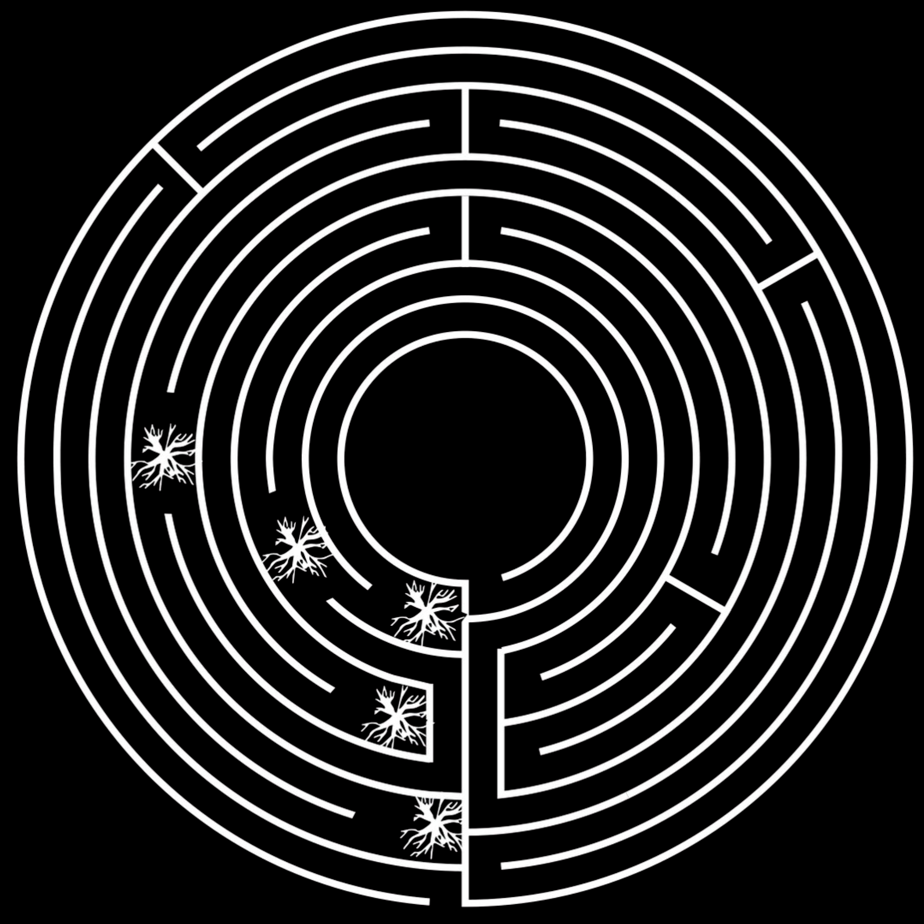

We’ve finally spray painted our idea for a labyrinth in our front yard. The labyrinth kept getting bigger and bigger as we adjusted the number of the circuits and their width to accommodate our electric lawn mower (22” wide + an additional 1.5” on each side). The idea is only to mow the walking area and let the outlines grow reasonably wild. We didn’t want to make it too small. We found out this weekend that the University of Delaware had one, so we tried that one out. We think ours will feel less like you just bought one and way more hand-made.
We settled on outlining the circuits with 3” concrete half-spheres spaced 6” apart. A new element to making the dots (and we ordered an additional 40 molds so we can make 72 at a time) is that we are just going to insert a nail before they dry, which we hope will keep them pretty well locked in place when the ground freezes and thaws. We will let the grass grow around the dots, which we figure we may have to weed wack a bit to keep things from going too wild.
Our first calculations list the number of concrete dots required at around 1,700. While that seemed reasonable, when we started actually making the dots, 1,700 turned out to be a pretty large number.
We want to letterpress a small chapbook that people can take that explains the history of labyrinths and our motive for wanting to build one.
We have to dig up that ground cover to the lower left.
⬆ Photo above shows the silicon “pinch bowls” we bought at THE CONTAINER STORE. each will provide a half-sphere that we refer to as “dots.” These will outline the circuits.
⬇ Photo below shows the bowls after they’ve been filled with concrete and with a heavily galvanized 3D nail set in the center of the bottom. The nail should help keep the dots in position with rain and freezing ground.

Here is a short video of us pouring the concrete dots.
And a video showing the adding in the nails after about 30 minutes to let the quick-dry concrete set up a bit.
A timelapse video of us placing dots on the labyrinth.
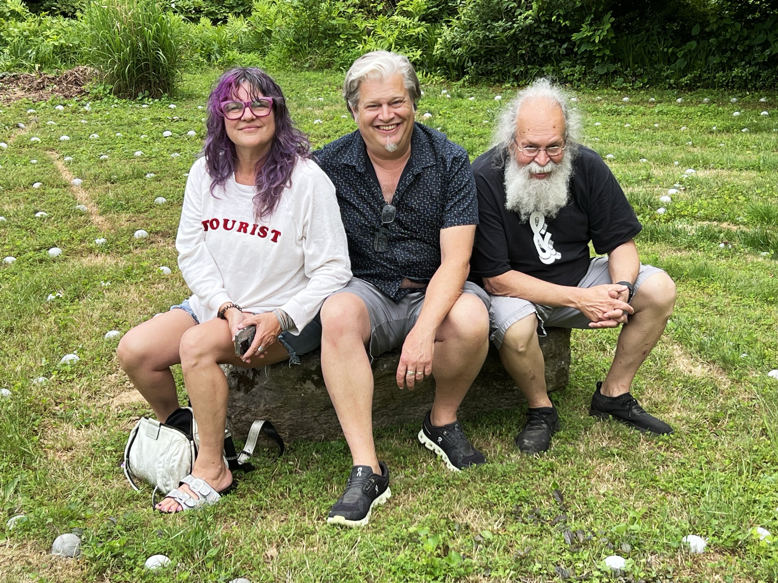
Then, we wanted to move that 1,230-pound rock to the labyrinth’s center. We thought some walkers, having gotten halfway through, might want to sit and think about things, so we were happy to oblige.
To start the process, Ray and Jill levered the rock onto two 12’ 4x4s
Then, Ray and their 12-year-old granddaughter moved the rock, the first leg of the 35” path, to the labyrinth’s center.
You might ask why we didn’t just get somebody with a tractor to move it for us. So, let’s do the math. Is it more fun to pay someone you don’t know $250 to bring a machine over, pick the rock up, and set it perfectly vented in the middle of a 6’ circle or move it yourself with your wife and granddaughter? 2 + 2 = 4. Easy peasy.
Below is a timelapse of Jill and me moving the rock to the center. It requires more effort to get it centered and rotate the desired amount. We used metal pipes, the material of choice when moving letterpress equipment. Done! Now, we need to determine the exact placement of all the turnarounds and plant the blueberry bushes we bought.
And an impromptu VC’88 class reunion at the rock. Left to right: Terre Nichols, Andy Geroski, and Ray Nichols.
The photo below shows the first 5 blueberry bushes that were planted at the points where the “walker” made either a 90° or 180° turn.

Jill & Ray with Alexey Brodovitch
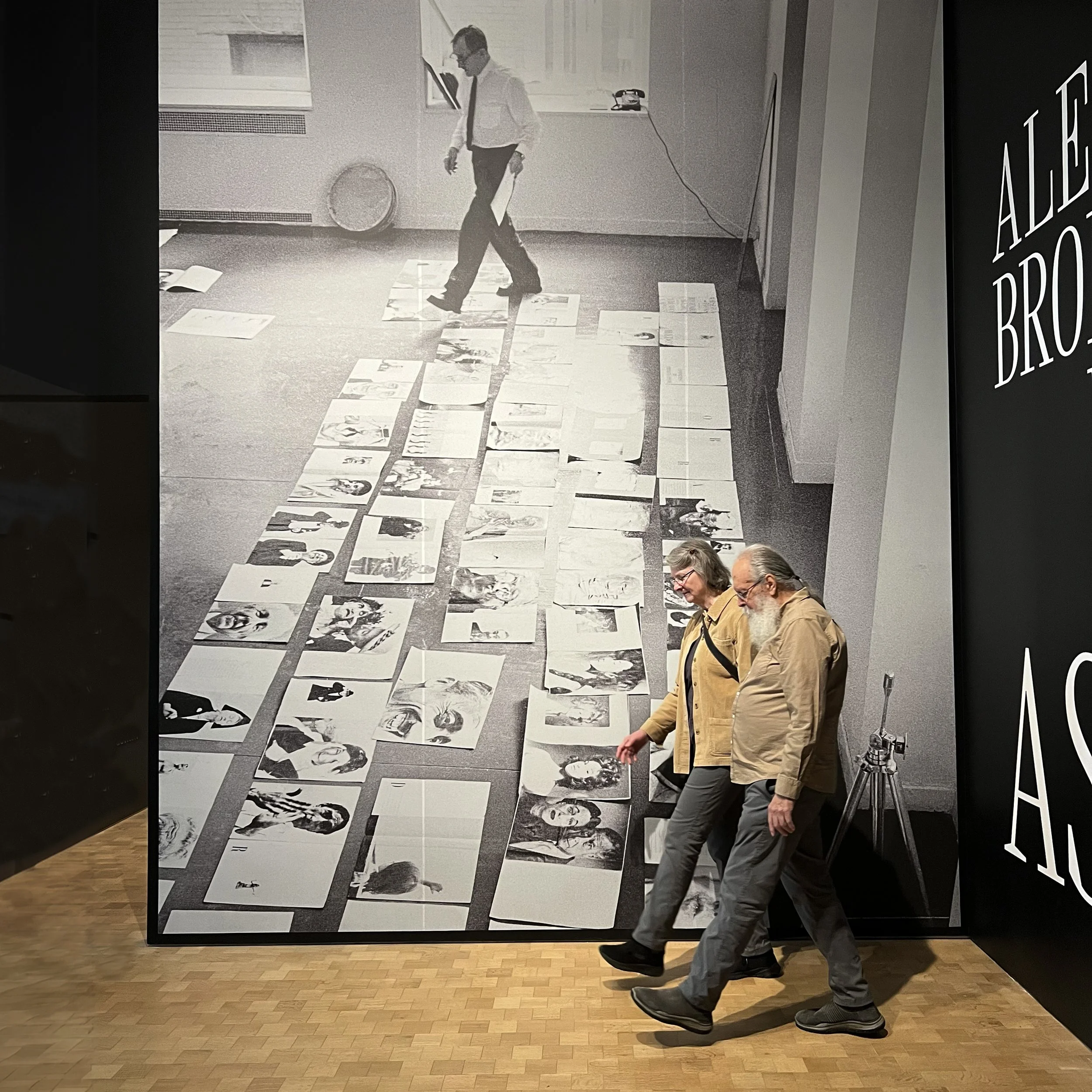
Six members (Chuck, Monique, Carol, Anne, Jill, and Ray) of Upper Chesapeake Book Arts visited the Alexey Brooovitch exhibition at the Barnes in Philadelphia. Brodovitch (1898 – 1971) was a Russian-American photographer, designer, and instructor most famous for his art direction of the fashion magazine Harper's Bazaar from 1934 to 1958.Ray took the opportunity to take a new double self-portrait of himself and Jill, which was fun.
We have a copy of his wonderful and pretty rare book entitled, “Ballet.”
We stopped in the Free Library and got a tour of their Special Collections, along with lunch in the Italian Market.
Lead Graffiti's first self-designed wood type

Lead Graffiti purchased a Boss LS-1420 laser cutter to produce some of our wood types. We’ve taken a first run at a typeface I’ve been calling “Shahn Torn.” The image shows the typeface in the middle of the image with a spacing text showing on the laptop to the right. The typeface will be introduced in a book being produced for a book swap held by Upper Chesapeake Book Arts in October 2023.
Jill has suggested “Reacshahn,” which I like.
The incentive to start the typeface came with purchasing a Ben Shahn poster from 1968. That was the year I started taking my undergraduate design courses at Louisiana Tech University.

The image below gives you an idea of how the two faces connect visually. Mine are a little more “goofy” at times. You’ll notice the “H,” which has a torn paper element. The original idea was to do the whole typeface with those torn edges, but more recently, I have found a happy medium with just making some letters like that.

UCBA Meander Book workshop / July 2023

⬆ During the summer of 2023 Lead Graffiti ran our Meander Book workshop with fellow Upper Chesapeake Book Arts members. The unifying idea was to start all statements with “In my humble opinion…” but use the text message letters IMHO (a lot of bang for the buck, so to speak), and then finish the statement. The image above shows the finished broadside that will be folded and torn to produce a hard-back accordion book.
This was the first time we allowed people who wanted to just design the page digitally and then have photopolymer plates made. This created a new wrinkle which allowed us to print one of the pages upside down mistakenly (it made sense when we positioned it for the first color). We won’t say which one.
Several members opted to hand set their page with wood & metal type, and a couple of people did a hybrid version combining handset with photopolymer. Thinking 2 heads are better than 1 a number of people chose to work in teams, while others decided to go it commando style.
Pages in the photo have been rotated to make the readability better.
The lines and contributors were
In Our Humble Opinion “a little kindness will not kill u” - Rebecca Johnson Melvin, Doris Miklitz
IMHO 2 beers are better than 1 - Anne Hessel
IMHO Brussels Sprouts R 144 - Carol Maurer
It has never been more important to defend copyright - Mark & Cynthia Batty
IMHO humble opinions have gone the way of album covers - Ray Nichols
IMHO there’s nothing cooler than breathing under water - Caroline Coolidge Brown
IMHO that’s not my type - Deborah Arnold & RD Burton
IMHO dancing is an underrated form of therapy - Betsy Molina Mortenson
IMHO it is perfectly normal to keep company with a dozen cats - Deb Mackie
IMHO every which way is symmetrical - Martha Carothers, Bruce Bigatel
IMHO type is more fun to play with than to spel wiht! - Jill Cypher
IMHO life is too short to not sing out Loud! - Stephanie Isenberg
IMHO this page iz outta order - Monique Benesvy, Chuck Dressner
IMHO books are magical - Michelle Tilford
We allowed a month for the design and production of the lockups or preparation for plates. We made one order for the plates and glued them up to on oak blocks bring their height to the required 0.918” for printing. Our July meeting was devoted to printing and assembling the covers.
Doris Miklitz and Jill Cypher formed the color committee and came up with the Salmon and Steel Blue ink combo.
Our August meeting will be spent taking the group through the folding and tearing steps to assemble 3 books for each participant.
A video of the UCBA "Opposites" book
This is from the flutter-bound “Opposites” book that was a collaboration with 14 members of Upper Chesapeake Book Arts, each producing a spread.
We produced the type treatment using Apple’s Keynote, allowing us to utilize its “fly-in” transition, which we overlayed over the page-turning video.
We are collecting roughly 20-second statements from each collaborator, which we weave into the video. It should be fun.
Waldorf School of Philadelphia diplomas 2023
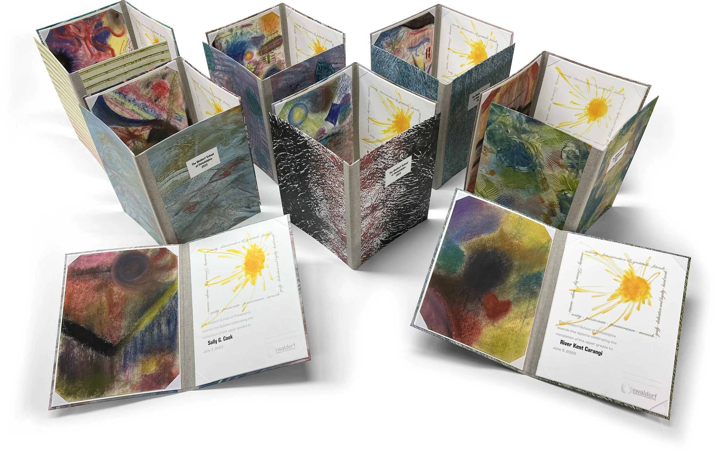
The graduation diplomas for the 8th-grade class of the Waldorf School of Philadelphia are easily our favorite project we do for a client. After a break for Covid, this year brought the students back into our studio to print THEIR NAMES onto THEIR DIPLOMAS.
The physical production has a lot of parts, starting with the 14 students and 2 teachers coming to the Lead Graffiti studio. The physical diploma comprises 3 elements and our original design was based on the Nobel Peace Prize.
The 1”: x 14” diploma itself
A 10” x 14” piece of artwork
A folder that binds everything together.
We divide the st
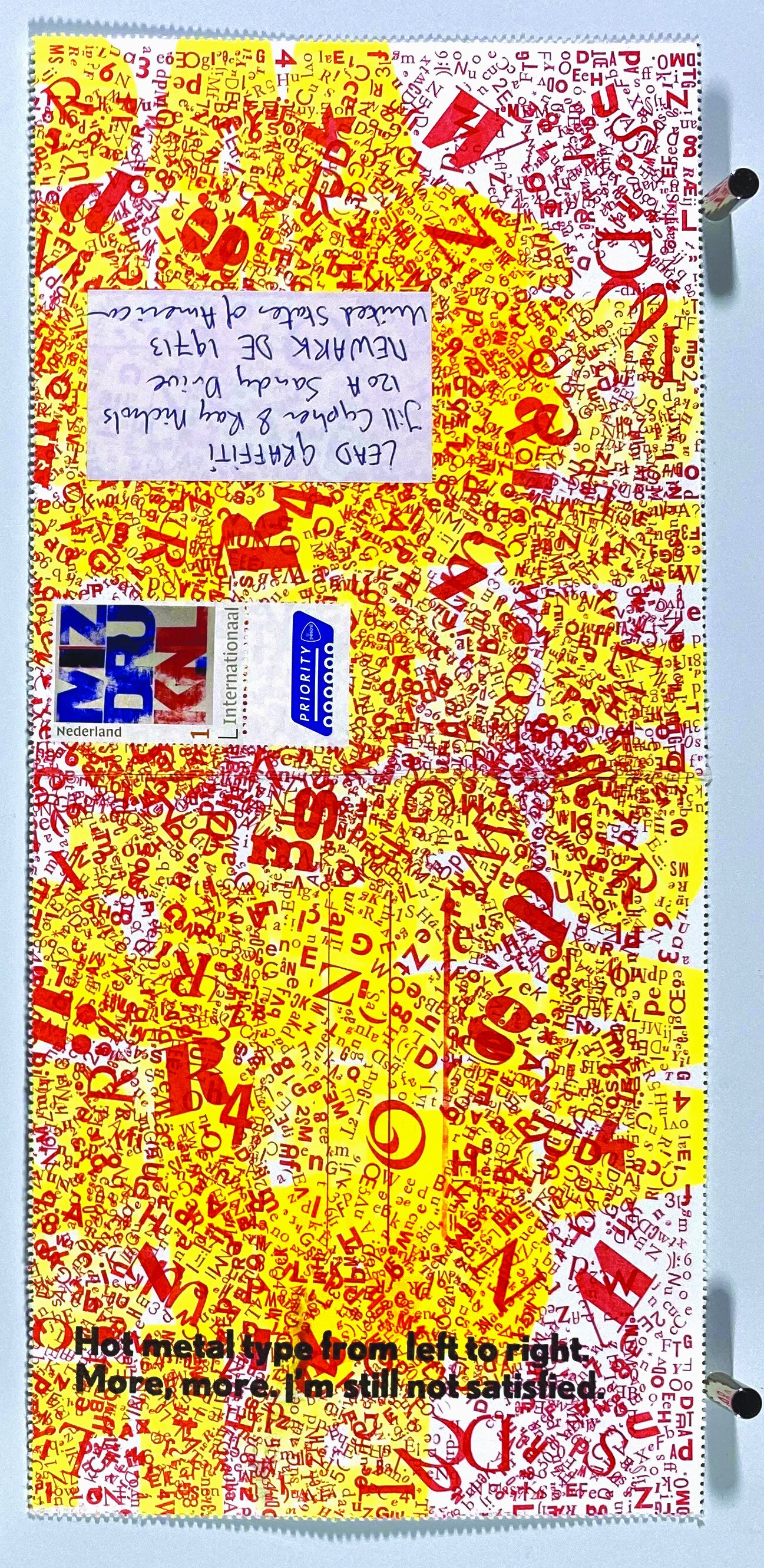
MISDRUK, APHA & Lead Graffiti

This is a story that should likely share between Lead Graffiti and APHA. But it is much easier to put these long stories with many photos on Lead Graffiti’s website.
Ray is a member of the programming committee of the Chesapeake Chapter of the American Printing History Association. As part of sharing that responsibility, he engaged one of Lead Graffiti’s favorite letterpress printers, Jan-Willem van de Looij (which seems to be pronounced like “Louie”), who is from The Netherlands. We have a strong connection with a former letterpress printer, H.N. Werkman, and the link to the country strengthened.

⬆ Jan-Willem van der Looij of Misdruk in The Netherlands.

⬆ Jan-Willem demonstrating his incredible Johannisberg Schnellpresse (maximum papersize 110 x 74 cm) from 1906. I might have to think about getting new pants, but then I don’t tend to shop in stores that have that kind of pants. I did do a letterpress spread that used the same pattern.
⬆ Ray’s spread in a collaborative book by 14 Upper Chesapeake Book Arts members.

⬆ This was the result of his printing demo. The last line of the broadside is “you don’t need.”

Misdruk’s story :
Misdruk starting with small-offset printing assisting my dad with his leaflets on beekeeping. Later on I did some screenprinting ending up in letterpress printing for the last 26 years as a hobby in our garage.
Becoming a bad printer didn’t take up much time for me I have to admit... I probably always was:-) I have been connected with printing all of my life in one way or another. Starting with small-offset printing assisting my dad with his leaflets on beekeeping. Later on I did some screenprinting ending up in letterpress printing for the last 26 years as a hobby in our garage. I always had a fascination for aspects in production that went wrong. When I visited print-factories in the past I discovered that I was always looking in the recycle bins. The misprints I found in there intriguied me. For me these ‘bad’ prints carried an extra dimension: some sort of disobedience to the printer and graphic designer or so. In the professional world these misprints are always discarded whilst being of an exiting beauty I think. Some 8 years ago I saw the light and I quit my professional career and I started with my “Mizdruk” printshop in Eindhoven, Holland. Mizdruk means misprint in Dutch. Here started my adventure into the world of imperfect beauty in print. At first I thought I was the only one in the world having this weird kind of interest in misprints. Later on I discovered that there were more lovers and likers of printed shit. Well let’s call it Bad Printing. Fortunately this interest is not limited to Europe nor The United States but also the Southern Americas and Australia are getting more and more involved. 4 years ago this resulted in the founding of “The School of Bad Printing” together with Ro Barragán and Amos Paul Kennedy Jr. We have just started this venture and there is much more to come. I just moved all my gear from Eindhoven to my new premises in Aarle-Rixtel a cute small village nearby. Time for a new chapter in my Bad Printing experiments.
Below are a few Misdruk samples we’ve collected over the past half-dozen years.


⬆ Misdruk is made up of 3 letterpress printers on 3 different continents.
Jan-Willem van der Looij, The Netherlands, Europe / Instagram
Ro Barrigán, South America / Instagram
Amos Kennedy, Detroit, North America / Instagram
Try Misdruk’s website.
Try his Instagram site. Recently including a visit from Amos Kennedy.
The image above is by Amos Kennedy.