

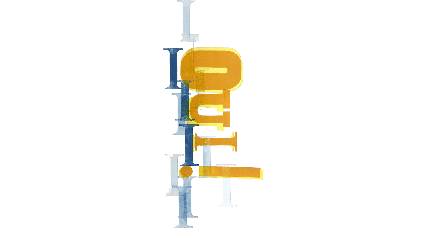
It occurred to us that it might be interesting to buy Die Kunst Der Typographie and see how Paul Renner would use his own typeface, Futura. I did buy it. You can see that the letterspacing is wide letterspacing is incredibly wide by today's standards.
Read moreLead Graffiti calendar pages

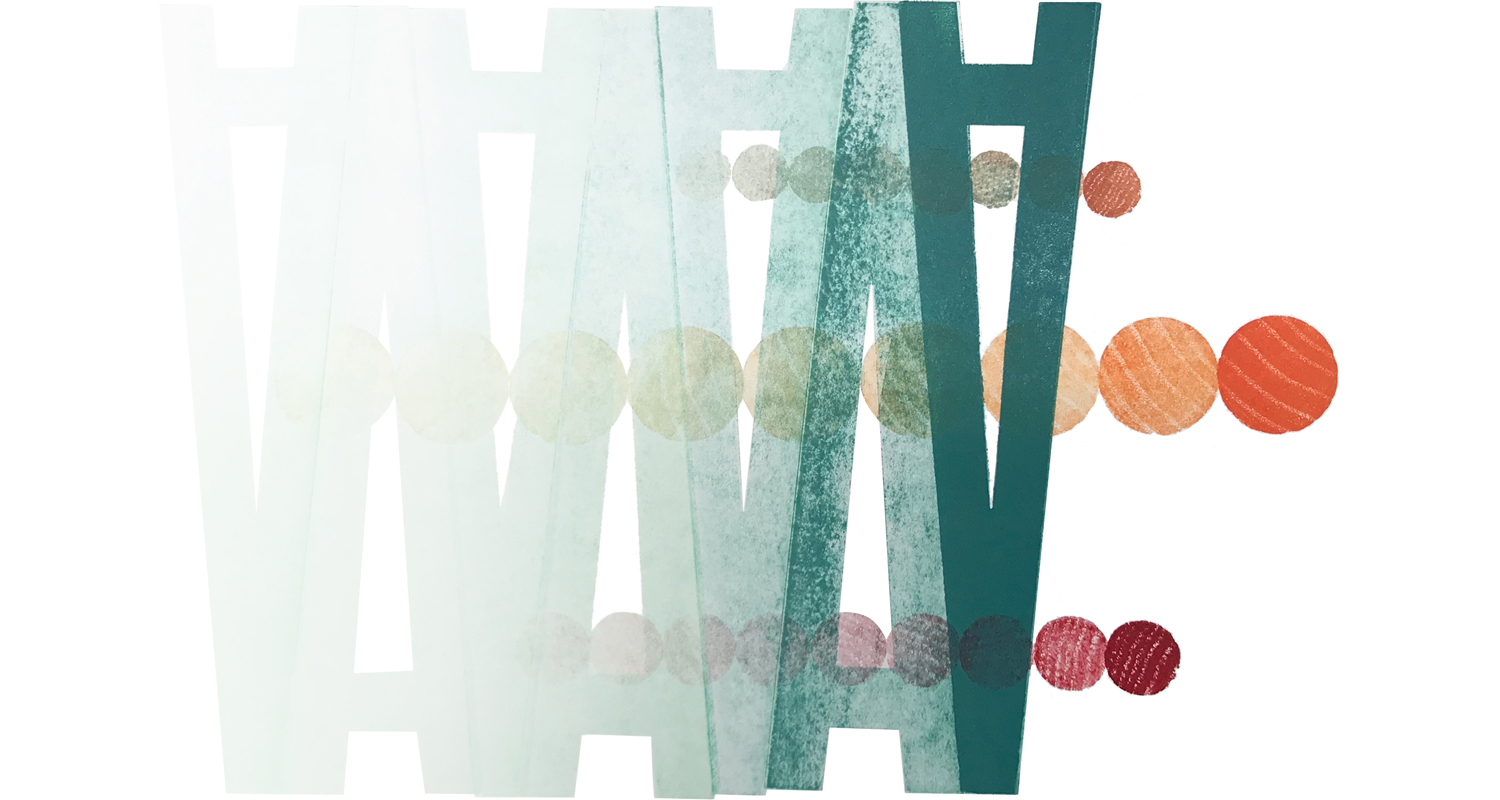
We’ve often collaborated with groups to produce calendars. We often use the projects as an opportunity to experiment with a printing technique we’ve had banging around in our heads.
Read moreAlone in Berlin with a stack of blank postcards

THIS POST IS NOT SPECIFICALLY ABOUT LETTERPRESS, but it has good tentacles into our letterpress lives and our love of postcards, especially political ones.
Read moreAlan Kitching VCUK letterpress workshops

Broadside size : 25.25” x 35.25”
In late 2000 or early 2001, before our interest in printing slowly and patiently via letterpress, germinated, Bill Deering and I had a group of Visual communications students on the field trip to Ogilvy, an advertising agency in New York City. We had set up to meet with Nigel Kent, Ogilvy’s Director of Typography. Nigel was from London and we were in the process of scheduling our first VCUK trip that summer. We asked if he could suggest anyone outstanding that could talk to our group about typography. Nigel suggested an instructor at the Royal College of Art named Alan Kitching.
Read moreFavorite work rejected by clients
It is often hard to sell an idea you think is a good one. Most often as a designer you go into a meeting after having thought long and hard about your idea. And I mean LLLLOOOONNNNGGGG and HHHHAAAARRRRDDD. You are best friends. You are in love.
I remember when the gasoline company, ENCO, changed its name to EXXON.
No way that is going to work.
But the problem is often just being confronted with an idea that’s completely new and more importantly, completely out of a familar context. In my world of service stations EXXON just didn't exist. Even in our language, there just weren't words that had double XXs in them. Nothing about it fit into my world. We know how that turned out? It would difficult today to think that there is even a small, inconsequential way that ENCO is a better product name than EXXON.
It reminds me of something the great advertising art director George Lois said to me about presenting ideas to clients. Tell them what you are going to show them, show them, then tell them what they saw.
I think I have often given the client too much credit for the ability to look at an idea I've poured hours into, contemplating miniscule elements, exploring the "legs" of the ideas, how it morphs into other applications, how it works on trucks, in film, on a website. That they would feel what I feel and would just jump onboard.
Back to George Lois, sometimes as a designer, you have to walk into an office and present an idea to someone that is carrying a dozen other issues with them, none of which have even the remotest connection to the problem you are trying to solve. Here are 6 ideas from our design careers where we needed to present better, because we just did not sell an idea that we should have sold.
WASHINGTON POST
it was Craig Cutler’s idea and Lead Graffiti’s execution. The problem was that they chose one of Craig’s other ideas. Actually, the one they bought was a good idea, but the one we thought the one we worked on more thoughtfully stated the Democratic Party’s problem. The cover of the P\Wp magazine would have been cool.
This one won.
This was our solution.
HOLOGIC
Hologic had just bought Direct Radiography, one of the first companies to develop filmless X[rays. It was a really innovative technology. the idea was to just make that first O a Target. Honestly it is really hard to get some one to buy a new logo when all thy want you to di is mke the type a little thinner.Then you could just add the target wherever you needed ro make your point. Say the statistic “5% of the population would need an X-ray to radically help their lives.” Show a crowd in a football stadium with 5% of them overlayed with a target. We ere imagining an ad campaign that wouldn’t even need the advertisers name on the ad. We even imagined a clear, adhesive target you could stick on a letter to target a typo. The concept was “taking aim.” We thought the logo would also present a constant reminder to the Hologic staff that they should “take aim” with their tasks as well,
INTERNATIONAL STUDENT COFFEE HOUR
We thought this was a fun idea for the University of Delaware International Students Office. Weekly meet-n-greet and a poster to make it look fun. We bid the job for 2, and maybe 3, colors. In the end we designed it to be 8 colors for the same price. We presented thr\e proposal to the 4 members of the client, as I remember. By all appearances they loved it. They had a meeting scheduled later that day with an advisory group of students.
Got an email the next day that the students “didn’t get it.” PROJECT CANCELLED.
ADTV
A television network about & for advertising. There have been some great stories written about advertising. Almost every advertising campaign is worth a 30- or 60 minute story. Ray figured that the advertising agencies themselves could make them. We had seen shows about about filming the 1984 Macintosh Superbowl ad, Michael Jackson for Pepsi, and The history of Volkswagen advertising.These were all ads we could have just run as part of the industry’a history, I don't have any idea how many advertising agencies there are, but every one of them has at least one good story. Big agencies would have a hundred. Every winner in every design and advertising competition was a good subject for one.
There are hundreds of short industrial films that would be relevent. How books were made in the 1940s. How newspapers (Remember those?) were printed. History of Lin-o-type
There could be related stories about psychology, photography, writimg, history, and the list goes on and on.
We presented the idea to Donny Deutsch of Deutsch, an advertising where my daughter worked as an art director. Two elements that we really loved was 1) that there would be no commercial break scheduled into the show as cool commercials would just appear sporatically with about a 2-second intro and 2) any paifd for advertising would be juried as worthy of being shown. Hell, some mighr be good enough that we wouldn’t even charge for them. Somehow those 2 ideas ended uo being a kind of dealbreaker for the whole project. Also residuals for celebrities was a sticking point.
The meeting killed our enthusuasm for the project. If you want to hear the presentation in person we would need our expensesd papd and at least something of an honorium..
UNIVERSITY OF DELAWARE AMPERSAND LOGO
UNIVERSITY OF DELAWARE LEFT COLUMN LETTERHEAD
While nobody writes letters any more the idea seems applicable to websites. Feel free to adapt this idea to your own purposes.
Back in the day when companies had letterheads Cypher + Nichols + Design came up with what we thought was a pretty cool idea for the University of Delaware's letterhead. We presented to about 5 people, including the President. Here is what the general layout of the letter was.
Address was at the top left and then imagine the leftmost 1.5" all he way down the page being left blank. Any text that was in the letter would start a bit inside of that.
The idea was that the department could control whatever they wanted in that 1.5" column. Some ideas.
English Department
Poem by one of the faculty
Short story by one of the faculty that could actually extend onto a second sheet
Art Department
Image of a painting by a faculty member or perhaps a piece of student work with an explanatory caption
Listing of exhibitions, talks or articles by faculty in the last month
Music Department
Show the musical notation of a composition by someone in the department
Admissions
Depending on who you were writing to you could include a quote by someone that would be interesting to the intended audience.
We thought it would be cool to show our portfolio of the letterheads once they had printed 3,000 different versions of them. Turns out that wasn't going to happen. We weren't quite laughed out of the room, but essentially we were told they weren't giving that much control to the faculty, which strangely took me by surprise.
PRODUCT NAMING FOR DIRECT RADIOGRAPHY
names of artists / Cezanne, Degas, Seurat, DaVinci
72 point Empire metal type

This was the first item of Empire type I've seen come up on eBay. With about 5 days to the end of the auction, I figured out the maximum I wanted to pay and set it. If someone went over it, so be it.
Winterthur "Dining by Design"

We are working to expand knowledge of our letterpress and bookmaking workshops and have accepted a request to participate in Winterthur Museum’s ‘Teaching Tuesdays.”
Read moreDrawing with caulk : printing via letterpress

We always like working with techniques that have some lack-of-control built into them.
Read moreDrexel University, friends, & fathers

A group of graduate students and friends connected with Drexel University in Philadelphia wanted a field trip and chose a Father's Day Werkman workshop at Lead Graffiti for the experience.
Read moreLaboratory Press Projet No. 43 added to collection

"Projets,” like the one shown here, were student projects we composed of metal type at the Laboratory Press at Carnegie Tech University. The fine press printing program was the first of its kind in the U.S., started in 1922.
Read more